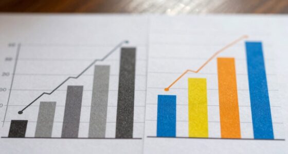
Why Color Accuracy Matters in Data Visualization More Than You Think
Optimize your understanding of data visualization—discover how color accuracy can transform your insights and why it matters more than you might realize.
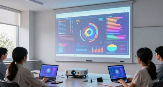
10 Best Projectors for Classroom Data Visualization in 2026
With innovative features and high-quality visuals, these top projectors for 2026 will revolutionize classroom data visualization—discover which one suits your needs best.
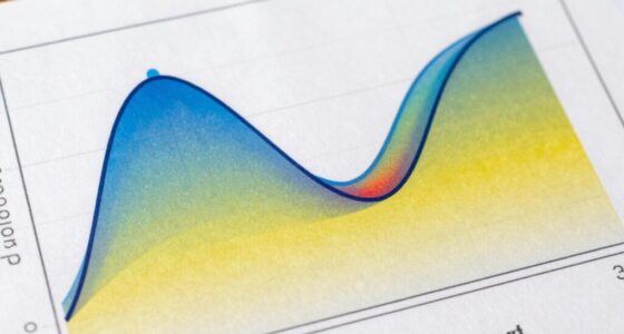
Wisdom about skewness and kurtosis unlocks deeper data insights, helping you understand distribution shapes and uncover hidden patterns worth exploring further.
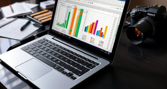
Turning Data Into Stories: Tips for Project Presentations
Harness the power of visuals to transform data into compelling stories that captivate your audience—discover how to make your presentation unforgettable.
Fascinating insights await—learn how effective visualization transforms complex big data into clear, actionable visuals that can revolutionize your decision-making process.