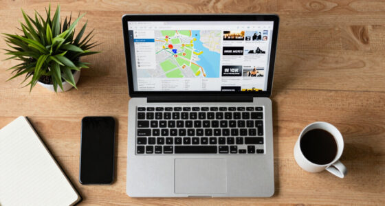
Stenvrik introduces a new news platform visualizing stories by geography on a 3D globe, offering real-time insights into regional developments with near-zero costs.
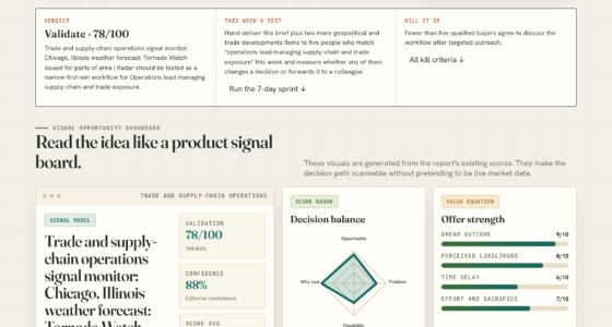
Trade and supply-chain operations signal monitor: Chicago, Illinois weather forecast: Tornado Watch issued for parts of area | Radar
A tornado watch issued for parts of Chicago prompts supply-chain and trade operation alerts, highlighting the need for role-specific weather monitoring.
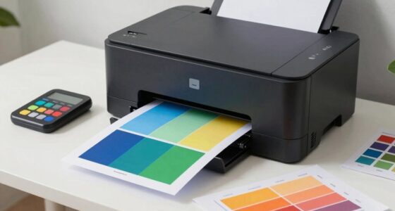
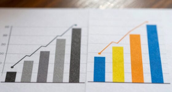
How to Print Charts and Graphs Without Ruining the Colors
Color accuracy is crucial when printing charts and graphs; discover essential tips to ensure your visuals pop perfectly on paper. What will you learn next?
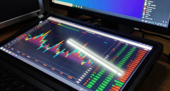
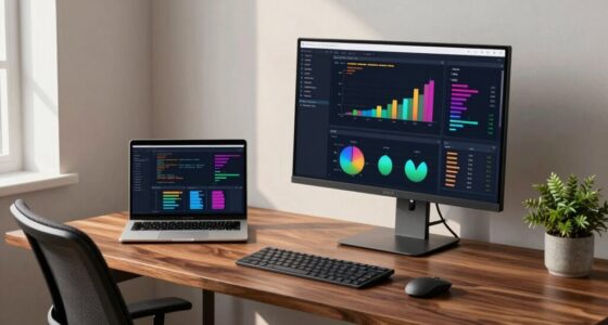
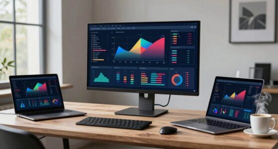
How to Choose a Monitor for R, Python, and Dashboard Work
Selecting the right monitor for R, Python, and dashboard work can elevate your productivity—discover essential tips that will transform your workspace.
Why Color Accuracy Matters in Data Visualization More Than You Think
Optimize your understanding of data visualization—discover how color accuracy can transform your insights and why it matters more than you might realize.
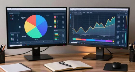
Ultrawide vs Dual Monitors for Statistics Students
The choice between ultrawide and dual monitors can significantly impact statistics students’ productivity; discover which setup suits your study habits best.
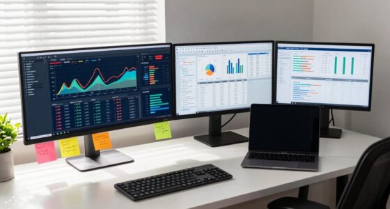
Busting the myth of 4K necessity in data analysis reveals surprising insights that could transform your workflow—discover what truly matters in your setup.