To make your scatter plots pop, use vibrant, contrasting colors to highlight key groups and outliers. Incorporate distinct shapes like triangles or diamonds to add layers of meaning and aid viewers with color vision deficiencies. Balance visual hierarchy by emphasizing important points while avoiding clutter, and select harmonious palettes for clarity. Combining thoughtful colors and shapes creates engaging, easy-to-interpret visuals—exploring these elements further will help you elevate your data presentation.
Key Takeaways
- Use bright, contrasting color schemes to highlight key data clusters and outliers effectively.
- Incorporate distinct shapes alongside colors to enhance visibility and differentiate categories.
- Apply a harmonious yet contrasting color palette to guide the viewer’s eye and prevent visual clutter.
- Ensure accessibility by combining color with shape variations for viewers with color vision deficiencies.
- Leverage visual hierarchy through color intensity and shape size to emphasize important data points.

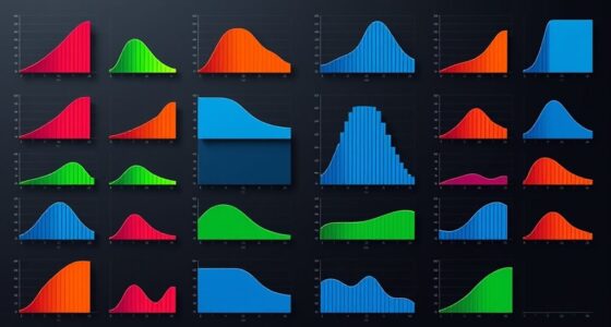
Scatter plots are powerful tools for visualizing relationships between two variables, but their impact depends on how well they’re designed. When you’re creating a scatter plot that truly pops, paying attention to details like color schemes and data point shapes can make all the difference. These elements help you communicate your message clearly and make your data more engaging. If you choose color schemes thoughtfully, you guide the viewer’s eye to key patterns or clusters, making trends easier to spot. Bright, contrasting colors can highlight specific groups or outliers, while subtler shades help in displaying less critical data without overwhelming the viewer. The key is to select colors that are distinct enough to differentiate points but harmonious enough to avoid visual clutter. For instance, using a consistent palette with variations in hue and saturation allows your audience to quickly interpret the plot without confusion. Additionally, considering visual hierarchy ensures that the most important data stands out effectively. Data point shapes are equally important. Instead of sticking to standard circles or dots, consider using different shapes to represent categories or variables. Triangles, squares, or diamonds can encode additional information, allowing you to present multidimensional data in a single plot. This technique is especially useful when color alone isn’t sufficient to distinguish groups, or when viewers might have difficulty perceiving color differences due to color blindness. Combining distinct shapes with a well-chosen color scheme creates a layered visual effect that enhances comprehension. It makes your scatter plot stand out and helps viewers quickly identify relationships, outliers, or clusters.
Frequently Asked Questions
How Can Scatter Plots Be Used in Business Decision-Making?
You can use scatter plots in business decision-making by visualizing relationships between variables, like sales and marketing efforts. They help identify patterns for market segmentation, showing which customer groups respond best to different strategies. With sales analysis, scatter plots reveal trends and outliers, guiding you to optimize campaigns and allocate resources effectively. This visual approach makes complex data easier to interpret, leading to smarter, data-driven decisions.
What Are Common Mistakes to Avoid When Creating Scatter Plots?
Imagine you’re an artist, and your scatter plot is your canvas. To avoid mistakes, make sure your axis scaling is appropriate, so data isn’t distorted or misleading. Watch out for data overlap, which can hide important patterns. Don’t scatter points randomly—organize them thoughtfully. By maintaining proper axis scaling and minimizing data overlap, you create a clear, insightful visualization that truly reflects your data’s story, avoiding confusion or misinterpretation.
Which Tools Are Best for Designing Eye-Catching Scatter Plots?
You should explore interactive tools like Tableau, Power BI, or Plotly to design eye-catching scatter plots. These platforms follow solid design principles, helping you create clear, engaging visuals that highlight key insights. Use features like dynamic filtering and hover effects to make your data come alive. By choosing user-friendly, versatile tools, you can craft scatter plots that not only look great but also communicate your message effectively.
How Do Color and Size Enhance Scatter Plot Readability?
You enhance scatter plot readability by using color and size through effective visual encoding, making data points easier to distinguish. Color adds aesthetic enhancement, highlighting categories or trends, while size emphasizes significance or magnitude. By thoughtfully applying these elements, you create a more engaging and informative visualization, guiding viewers’ attention and improving understanding at a glance. This approach guarantees your scatter plot communicates insights clearly and attractively.
Can Scatter Plots Be Effectively Used for Large Datasets?
Your curiosity about large dataset visualization is spot-on; scatter plots can handle impressive amounts of data, but they’re not magic. When it comes to scatter plot scalability, they might turn into a visual traffic jam, making insights hard to find. To manage this, consider techniques like data sampling or interactive zooming. These methods help you effectively use scatter plots for large datasets without sacrificing clarity or insight.
Conclusion
Now that you know how to make your scatter plots truly pop, remember that visuals can boost understanding by up to 80%. For instance, adding color or size variations can reveal patterns hidden in data. Did you know that colorful, well-designed scatter plots are 60% more likely to engage viewers? So, don’t just present data—craft visuals that captivate and clarify. Your audience will thank you for it, making your insights both memorable and impactful.