Boxplots are powerful visual tools that show the overall shape, spread, and central tendency of your data at a quick glance. They highlight key stats like median, quartiles, and outliers, making it easy to identify data patterns and anomalies. Outliers stand out as dots beyond the whiskers, helping you understand unusual points. If you keep exploring, you’ll uncover how to interpret these features for effective data analysis and insight.
Key Takeaways
- Boxplots visually summarize data distribution, highlighting median, quartiles, and spread in a compact format.
- Whiskers extend to the smallest and largest data points within 1.5× IQR, with outliers shown as dots outside whiskers.
- Outliers indicate unusual data points and are essential for accurate analysis and detecting anomalies.
- Interpreting boxplots helps compare distributions, identify skewness, and understand data variability across groups.
- Boxplots facilitate quick insights into data shape, spread, and potential outliers without complex calculations.

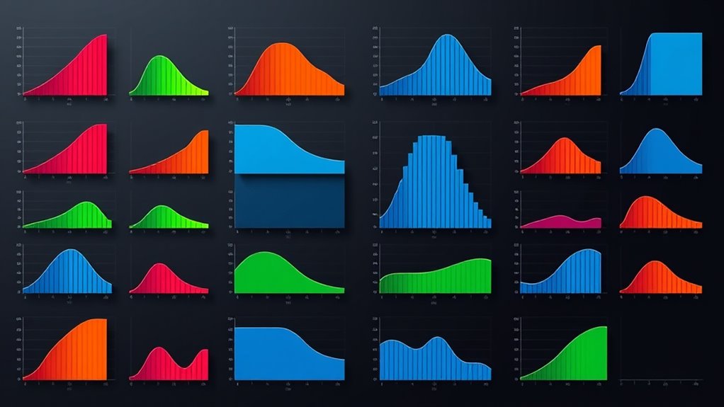
Have you ever wanted a simple way to visualize the distribution of your data? If so, boxplots are a perfect tool to help you do just that. They provide a clear, concise summary of your data’s spread, central tendency, and variability, all in one compact graphic. When you’re working with datasets, understanding how your data is distributed is vital, especially if you’re trying to identify patterns or anomalies. Boxplots excel at data distribution visualization because they display key statistics at a glance, allowing you to see the median, quartiles, and potential outliers with ease.
One of the most valuable features of boxplots is their ability to aid in outlier detection. Outliers are data points that deviate markedly from the rest of your data, and spotting them is essential to avoid skewed results or incorrect conclusions. In a boxplot, outliers are typically marked as individual dots beyond the whiskers, which extend from the quartiles to the minimum and maximum values within a reasonable range. When you see these dots, you immediately recognize data points that don’t fit the general pattern, prompting you to investigate further. Whether these outliers are errors, rare events, or meaningful anomalies, boxplots give you a straightforward way to flag them.
Understanding the importance of contrast ratio is also crucial when interpreting the visual clarity and detail in your data representations, much like their role in enhancing image quality in projectors. Using a boxplot, you get a visual summary that captures the essence of your dataset’s distribution. The central box shows the interquartile range (IQR), representing the middle 50% of your data. The line inside the box indicates the median, giving you a quick sense of the dataset’s center. The whiskers extend to the most extreme data points within 1.5 times the IQR from the quartiles, helping you understand the spread and variability. Any points outside this range are considered potential outliers, and their placement reveals how your data is dispersed. This makes boxplots an invaluable tool when comparing multiple groups or time periods, as they instantly communicate differences in distribution shape, spread, and outliers.
![Express Rip Free CD Ripper Software - Extract Audio in Perfect Digital Quality [PC Download]](https://m.media-amazon.com/images/I/41xx28xHa+L._SL500_.jpg)
Express Rip Free CD Ripper Software – Extract Audio in Perfect Digital Quality [PC Download]
Perfect quality CD digital audio extraction (ripping)
As an affiliate, we earn on qualifying purchases.
As an affiliate, we earn on qualifying purchases.
Frequently Asked Questions
How Do Boxplots Compare to Histograms?
When comparing boxplots to histograms, you focus on how each visualization reveals data distribution. Boxplots provide a clear summary of spread, median, and outliers, making it easy to compare groups quickly. Histograms, on the other hand, show the shape and frequency of data, giving you a detailed view of distribution. Your choice depends on whether you need quick summaries or detailed distribution insights.
Can Boxplots Be Used for Categorical Data?
Thinking of boxplots as a Swiss Army knife, you might wonder if they can handle categorical data. Unfortunately, boxplots aren’t suited for categorical visualization because they’re designed to show numerical data distributions. Their limitations become clear here—they can’t display categories or frequencies effectively. For categorical data, bar charts or pie charts are your best tools. Boxplot limitations make them unsuitable for anything but numerical data analysis.
What Are Common Mistakes When Interpreting Boxplots?
When interpreting boxplots, you might mistake outlier detection for normal data points, so double-check if those points are true outliers. Also, avoid ignoring skewness analysis; a longer whisker on one side indicates data skewness, which affects your understanding of distribution. Be cautious not to overinterpret the median or quartiles, and always consider the overall data context to guarantee accurate insights from your boxplot.
How Are Outliers Determined in a Boxplot?
Outlier detection in boxplots relies on statistical thresholds to identify unusual data points. Typically, you look for points beyond 1.5 times the interquartile range (IQR) from the quartiles. These are your outliers, which stand apart from the main data distribution. Recognizing them helps you understand data variability and potential anomalies. Remember, outliers can reveal interesting insights or errors, making this a key step in accurate data interpretation.
Are Boxplots Suitable for Small Sample Sizes?
When considering if boxplots are suitable for small sample sizes, you should think about sample size considerations and visual clarity. Small samples can make boxplots less reliable because they may not accurately reflect data distribution or outliers. If you choose to use a boxplot with a small sample, be aware that it might lack the detail needed for meaningful insights and could mislead your interpretation.

Storytelling with Data: A Data Visualization Guide for Business Professionals
Wiley
As an affiliate, we earn on qualifying purchases.
As an affiliate, we earn on qualifying purchases.
Conclusion
Now that you understand boxplots, you’ll see how they reveal your data’s distribution at a glance. Some might argue they oversimplify complex datasets, but with careful interpretation, boxplots provide powerful insights into variability and outliers. By mastering their nuances, you can confidently communicate your findings and make informed decisions. Don’t dismiss their value—embrace boxplots as a versatile tool for clear, concise data visualization that enhances your analytical skills.

Graphical Data Analysis with R (Chapman & Hall/CRC The R Series)
As an affiliate, we earn on qualifying purchases.
As an affiliate, we earn on qualifying purchases.

Getting Started with the Graph Template Language in SAS: Examples, Tips, and Techniques for Creating Custom Graphs
As an affiliate, we earn on qualifying purchases.
As an affiliate, we earn on qualifying purchases.