To get instant insights from histograms, start with data normalization to guarantee consistent scaling, making patterns clearer. Carefully choose bin sizes—using rules like Freedman-Diaconis or Sturges’—to balance detail and simplicity, revealing important distribution features. Use visual tools to tweak bin widths and contrast ratios for better clarity. These quick hacks transform basic histograms into powerful analysis tools, and if you keep exploring, you’ll uncover even more effective techniques to master data visualization.
Key Takeaways
- Normalize data before plotting to ensure consistent scaling and better comparison across datasets.
- Use adaptive bin sizing techniques like Freedman-Diaconis or Sturges’ formula for optimal data grouping.
- Adjust bin width interactively to balance detail and clarity, revealing meaningful distribution patterns.
- Incorporate contrast ratios and visual tools for real-time histogram refinement and deeper insights.
- Combine normalization and bin optimization to create clearer, more informative histograms quickly.

Histograms are powerful tools for visualizing data distributions, but many people don’t realize how simple yet effective hacks can improve their clarity and insight. One of the most impactful techniques is understanding how to properly perform data normalization before creating your histogram. Data normalization ensures that your data is scaled consistently, especially when you’re working with datasets that span different units or ranges. By normalizing data, you prevent skewed results caused by outliers or vastly different magnitudes, making the histogram more representative of true data patterns. This step is essential because it allows you to compare distributions accurately and identify meaningful trends without being misled by data scale issues.
Normalize data to ensure consistent scaling and clearer, more accurate histograms.
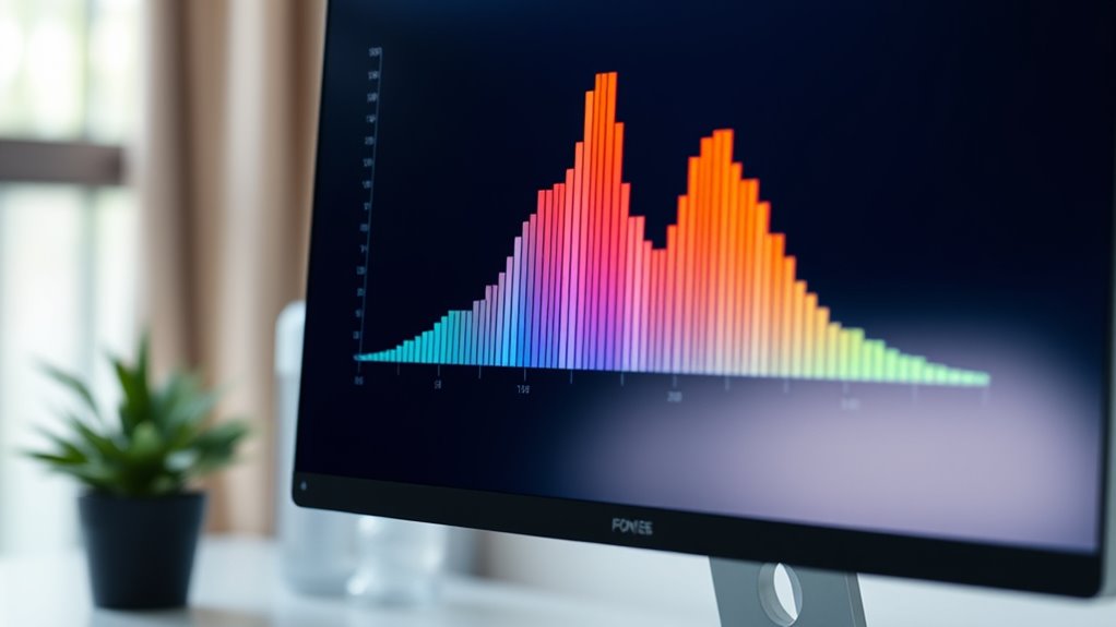
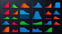
Another key hack involves bin size selection, which directly influences how your data is grouped and visualized. The bin size determines the width of each bar in your histogram, impacting how clearly you can see the underlying distribution. If your bins are too wide, you risk oversimplifying the data, missing important details like multiple peaks or subtle variations. Conversely, if the bins are too narrow, the histogram may become cluttered, highlighting noise rather than genuine patterns. The goal is to find a balance—sometimes called the “sweet spot”—where the bins are just right to reveal the true shape of your data. Techniques like using the Freedman-Diaconis rule or Sturges’ formula can help you select suitable bin sizes objectively rather than relying on guesswork.
Additionally, understanding the contrast ratio in your data can help you interpret the variability and differences within your dataset more effectively, especially when analyzing image-related data or visual outputs. Many visualization tools allow you to tweak bin numbers interactively, giving you immediate feedback on how your data’s story unfolds. This iterative process helps you discover the most insightful binning strategy tailored to your dataset’s specific characteristics.
Ultimately, mastering these hacks empowers you to extract clearer insights from your data. Data normalization ensures consistency and comparability, while careful bin size selection fine-tunes the level of detail in your visualization. By applying these simple yet effective techniques, you’ll turn a basic histogram into a powerful analytic tool that reveals the true story behind your data with minimal effort.
Frequently Asked Questions
How Can I Improve Histogram Clarity for Large Datasets?
To improve histogram clarity for large datasets, you should focus on bin width optimization—adjusting bins to balance detail and readability. Additionally, consider data smoothing techniques to reduce noise and highlight important patterns. By fine-tuning bin sizes and applying smoothing, you make your histogram more insightful and easier to interpret, ensuring you quickly grasp the data’s underlying trends without overwhelming your audience.
What Are Common Mistakes to Avoid When Creating Histograms?
Ever feel like your histograms are speaking in riddles? Avoid common mistakes like binning errors, which can hide important details, and improper axis scaling that skews interpretation. You should select appropriate bin sizes and guarantee axes are scaled to reflect true data distribution. These tweaks make your histogram clearer and more accurate, so your audience can easily grasp insights without confusion or misinterpretation.
How Do I Choose the Best Bin Size for My Data?
When choosing the best bin size, you want a bin width that clearly represents your data distribution without oversimplifying or overcomplicating it. Start by experimenting with different bin sizes and observe how they reveal patterns. Smaller bins show detail but can be noisy, while larger bins smooth out the data but may hide important features. Aim for a balance that accurately reflects your data’s underlying distribution.
Can Histograms Be Used for Categorical Data?
Think of a histogram as a bridge between numbers and categories. While histograms are great for showing distributions, they’re not designed for categorical data, which is like sorting flowers by color. Using histograms for categorical vs. numerical data has limitations, since categories lack a natural order or range. For categorical data, bar charts are more effective, as histograms may obscure the distinct differences between categories.
What Software Tools Are Best for Advanced Histogram Analysis?
When choosing software for advanced histogram analysis, you want tools that excel in software comparison and offer extensive histogram customization. Programs like R and Python provide powerful libraries such as ggplot2 and Matplotlib, giving you complete control over customization. Excel and Tableau are user-friendly options with solid features for creating and customizing histograms. Consider your data complexity and skill level to select the best tool for precise, insightful analysis.
Conclusion
By applying these histogram hacks, you can instantly grasp complex data. For example, a well-designed histogram might show that 60% of your sales come from just 20% of your products, highlighting key revenue drivers. Visual insights like this help you make smarter decisions quickly. So, start experimenting with these tricks today, and watch your understanding of data sharpen—turning raw numbers into clear, actionable stories in no time.