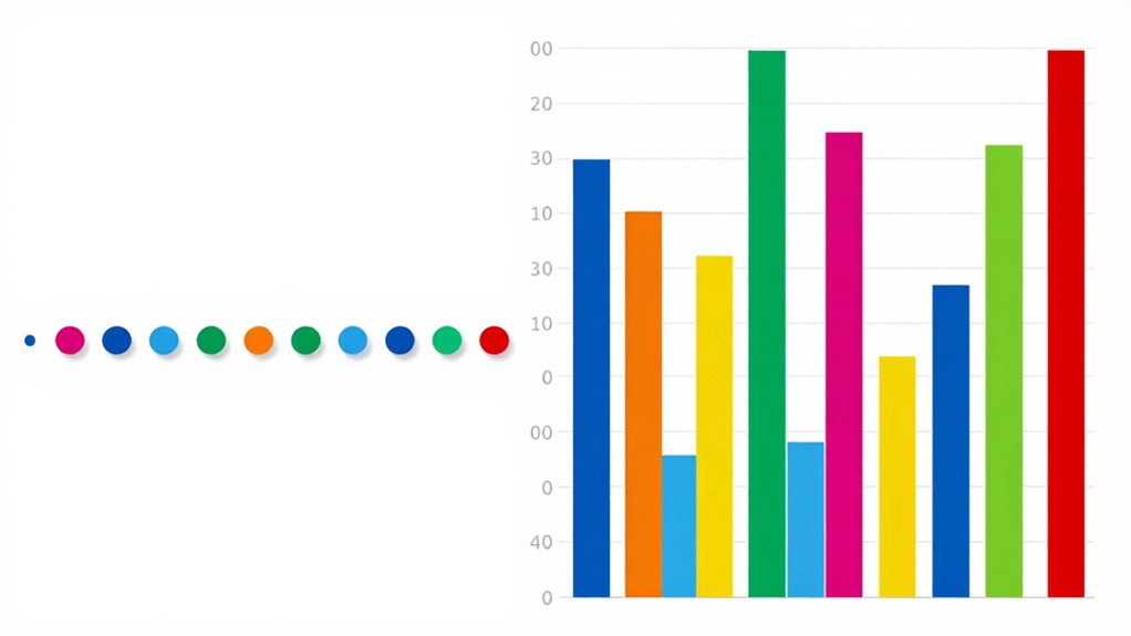

Choosing between dot plots and bar charts depends on your data’s size and the story you want to tell. If you aim to show each data point’s detail, identify outliers, or focus on data accuracy, go with a dot plot, especially for small datasets. For larger or categorical data, bar charts make comparisons clearer and simplify complex information. To determine the best fit for your situation and see how to make your visuals more effective, keep exploring further.
Key Takeaways
- Use dot plots for small datasets requiring detailed view of individual data points and distribution.
- Choose bar charts for larger datasets or categorical comparisons needing simplified, easy-to-understand visuals.
- Opt for dot plots when data accuracy, outliers, and density are important; prefer bar charts for trend summaries.
- Prioritize clarity: cluttered dot plots may hinder understanding; simple bar charts aid audience comprehension.
- Match visualization to goal: detailed analysis favors dot plots; overall comparison favors bar charts.
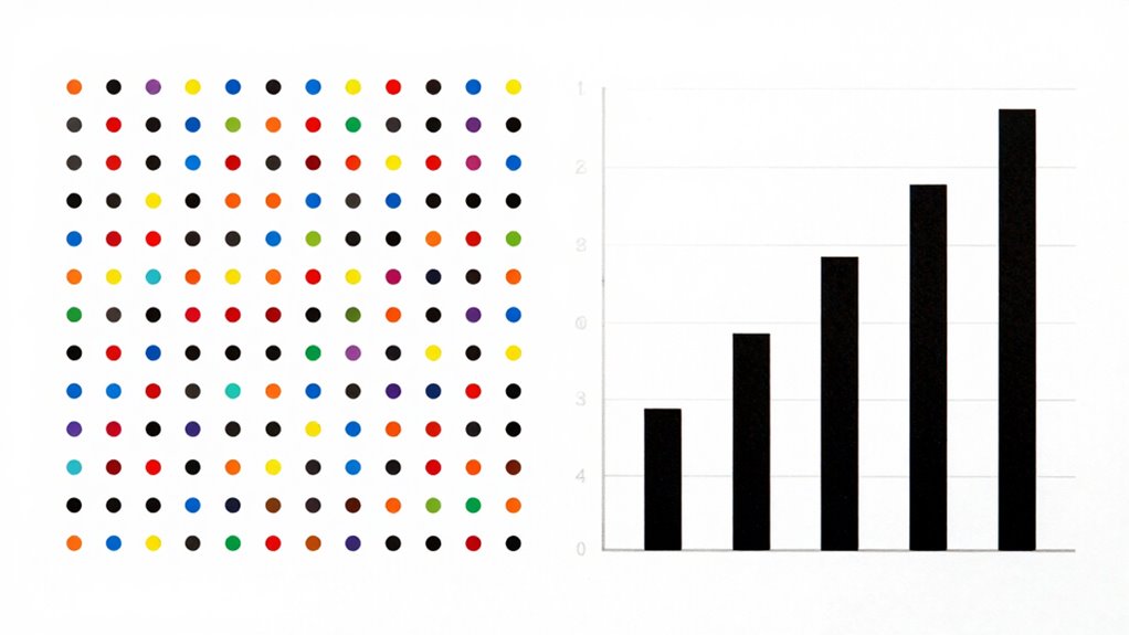
When choosing how to visualize your data, understanding the differences between dot plots and bar charts can make a significant impact. Both tools serve to represent information visually, but they do so in ways that affect data accuracy and visual clarity. Your choice depends on what you want to emphasize and how your audience will interpret the information. Dot plots excel in situations where pinpointing individual data points is essential, providing a clear view of data distribution and allowing you to see the spread and density of values. They preserve data accuracy because each dot corresponds to a specific data point, making it easier to identify outliers or clusters. Conversely, bar charts are better suited for summarizing categorical data, offering a straightforward comparison of group sizes or frequencies at a glance. They provide visual clarity by organizing data into easily digestible bars, but they can sometimes obscure finer details, especially if categories have overlapping or similar values.
If your goal is to highlight the precise distribution of a small dataset, a dot plot is often the better choice. It allows you to see each data point individually, which enhances data accuracy and prevents misinterpretation that can occur when data is aggregated into broader categories. This is particularly useful for small sample sizes or when identifying anomalies is important. On the other hand, bar charts are more effective when you’re working with larger datasets or categorical variables. They simplify complex data, making it easier for viewers to grasp overall trends or differences among groups without getting lost in minute details. The visual clarity of bar charts helps prevent confusion, especially when presenting to audiences unfamiliar with the data. Additionally, understanding the visualization techniques behind each chart can help you better communicate your message effectively.
Furthermore, knowing the appropriate chart types for different data scenarios is crucial for effective data storytelling. However, keep in mind that the appearance and effectiveness of either visualization depend heavily on how well you organize your data. For example, a cluttered dot plot can become hard to read, reducing clarity, while overly simplified bar charts might overlook important nuances. When prioritizing data accuracy, select a visualization that preserves the integrity of each data point—dot plots are preferable here. For clarity, especially with larger or more categorical data, bar charts tend to communicate findings more efficiently. Ultimately, understanding your data and your audience’s needs will guide you toward the best choice. Whether you opt for the detailed precision of dot plots or the straightforward comparison of bar charts, aligning your visualization with your goals ensures your message is both accurate and clear.
As an affiliate, we earn on qualifying purchases.
Frequently Asked Questions
When Is a Dot Plot More Effective Than a Bar Chart?
A dot plot is more effective than a bar chart when you want a clear alternative visualization for showing individual data points, especially with small datasets. It’s great for highlighting data distribution and differences between categories without clutter. You use it in data storytelling when you want to emphasize data variability or outliers, providing a straightforward, engaging way to communicate detailed insights that a bar chart might obscure.
Can Dot Plots Handle Large Datasets Efficiently?
You might find that dot plots struggle with large datasets because of lower data density and slower rendering speed. When dealing with thousands of points, the chart can become cluttered and hard to interpret. While dot plots excel with small to medium datasets for clarity, they’re less efficient at handling vast amounts of data. For large datasets, bar charts often provide quicker, clearer insights, especially when simplicity and speed matter most.
Are Bar Charts Better for Showing Percentage Comparisons?
Bar charts are often better for showing percentage comparisons because they clearly display differences, especially with good color contrast. To make your comparisons even clearer, guarantee label clarity by using concise labels and consistent formatting. This way, your audience can quickly interpret the data. Bar charts excel at highlighting percentage differences, making them a strong choice when you want to emphasize proportional variations visually.
How Do Dot Plots Display Data Variability?
Dot plots display data variability by showing individual data points, making it easy to see data density and distribution. You can quickly identify clusters, gaps, and outliers, which enhances visual clarity. Unlike bar charts, which summarize data with bars, dot plots give a detailed view of how data points spread across values. This makes them especially useful for understanding variability within small datasets or when comparing multiple groups.
Which Chart Type Is Preferable for Categorical Data?
For categorical data, bar charts are preferable because they enhance visual clarity and help you compare categories easily. They clearly display data accuracy by showing precise values through the length of bars, making differences straightforward to interpret. Dot plots can also work but might clutter when categories are numerous. Overall, bar charts provide a cleaner, more accurate visualization for categorical data, especially when clarity and precision matter most.
As an affiliate, we earn on qualifying purchases.
Conclusion
Choosing between dot plots and bar charts is like picking the right paintbrush for your masterpiece. Dot plots offer a clear, detailed view when comparing individual data points, while bar charts provide a quick, colorful summary of categories. Think of them as tools in your toolkit—you’ll pick the right one based on your data story. With the right choice, your data visualization will shine brighter than a lighthouse in the fog.
small dataset visualization tools
As an affiliate, we earn on qualifying purchases.
As an affiliate, we earn on qualifying purchases.
As an affiliate, we earn on qualifying purchases.