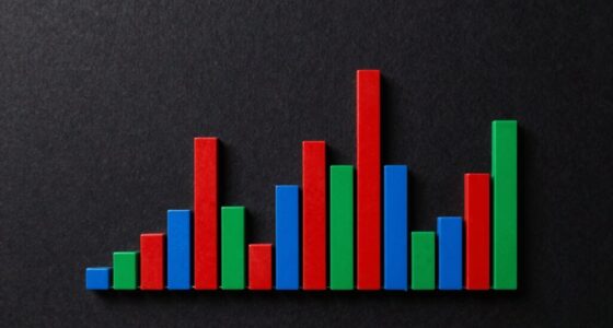
Dot Plots vs Bar Charts: Which Should You Choose?

No matter your data size, understanding when to use dot plots or bar charts can significantly enhance your visual storytelling—discover which to choose next.

Lollipop Charts Explained: When Bars Are Too Heavy

Meta description: “Many prefer lollipop charts over traditional bars for clarity and style, but understanding when and how to use them can transform your data visualization.

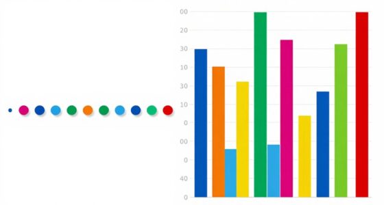
Small Multiples: The Simple Visual Trick That Clarifies Trends

What makes small multiples so effective in clarifying trends, and how can they transform your data analysis skills? Keep reading to find out.

Data Journalism: Telling Stories With Statistics

Harness the power of visuals to transform complex data into compelling stories that captivate and inform—discover how in data journalism.

Animations in Data Visualization: When to Use Them

More impactful data stories often rely on animations to highlight trends, but knowing when to use them is key—continue reading to find out how.