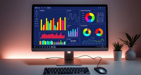
Small multiples are a simple yet powerful visual trick that helps you compare data sets side by side. By using similar charts with consistent scales and normalization, you can quickly spot patterns, trends, and differences without switching visuals. This technique reduces clutter and makes complex data more accessible. It’s especially useful in dashboards or reports for fast insights. Keep exploring to discover how mastering small multiples can enhance your data analysis skills.
Key Takeaways
- Small multiples enable direct comparison of multiple data sets side by side, making trends and differences immediately visible.
- Consistent axes, scales, and visual styles across charts ensure clear, accurate trend identification.
- Data normalization prevents distortions, allowing fair comparisons regardless of dataset size or scale.
- They simplify complex data, breaking it into uniform parts for easier pattern recognition.
- Proper implementation highlights insights quickly, supporting faster decision-making and clearer trend analysis.
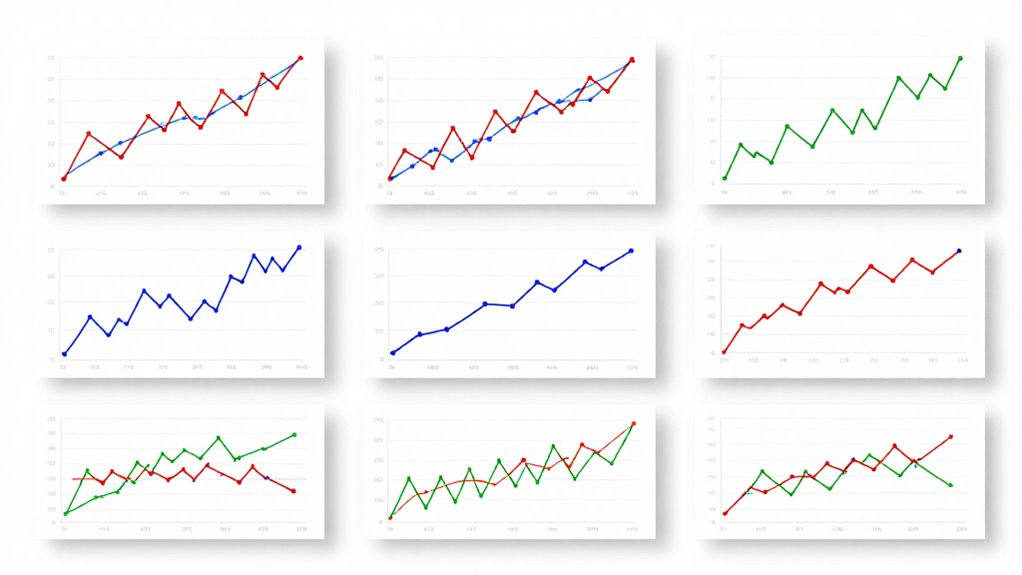
Have you ever wished you could compare multiple data sets side by side easily? Small multiples are the perfect solution, allowing you to view different charts or graphs next to each other in a compact, organized way. This technique makes it easier to spot patterns, trends, and differences across datasets without flipping between separate visuals. When you use small multiples, you’re fundamentally creating a series of similar visualizations that share the same axes and scale, making comparisons straightforward and intuitive.
One reason small multiples work so well is because of their emphasis on visual consistency. By keeping the design uniform across all charts, you remove unnecessary distractions, helping your eyes focus on the actual data. This consistency enhances clarity and makes it easier for you to interpret subtle variations. But for this to be effective, you need to guarantee data normalization. Data normalization standardizes data points across different datasets, adjusting for scale differences so that one doesn’t overshadow another. Without normalization, a dataset with larger values could distort your perception, making smaller datasets seem insignificant. Normalization levels the playing field, enabling your brain to compare trends and patterns directly, without being misled by disparities in magnitude. Additionally, visual cues like color schemes and axes can further improve understanding and highlight key differences.
Using small multiples also simplifies complexity. Instead of overwhelming your audience with a single, cluttered chart, you break the data into digestible parts. Each small chart maintains the same visual structure, which means you’re not constantly reorienting yourself as you move from one dataset to another. This uniformity fosters a better understanding of how data behaves over different periods or categories, especially when combined with visual cues like consistent color schemes and axes. The result is a clean, organized presentation that emphasizes the data, not the design. Incorporating visual consistency helps maintain clarity and focus across all charts, making your comparisons even more effective. Additionally, understanding the importance of data normalization ensures that your comparisons remain accurate and meaningful, avoiding misinterpretation caused by scale disparities. This approach aligns with principles found in sound healing science, where consistent frequencies and vibrations are used to promote clarity and balance, showing how consistency enhances understanding across fields.
Moreover, small multiples are highly versatile. You can adapt them to compare time series, geographic regions, product categories, or any other variables relevant to your analysis. They’re particularly useful in dashboards or reports where clarity and quick insights matter. When you implement small multiples correctly, paying attention to data normalization and visual consistency, you empower your audience to see the story behind the numbers at a glance. This simple visual trick transforms complex data into clear, compelling insights, making trends obvious and decision-making more informed.
As an affiliate, we earn on qualifying purchases.
Frequently Asked Questions
How Do Small Multiples Compare to Traditional Line Graphs?
Small multiples often outperform traditional line graphs by making data comparison easier. They normalize data across multiple small charts, keeping scales consistent for clear trend visualization. You’ll notice color consistency across each small chart, helping you quickly identify patterns without confusion. This setup reduces clutter and highlights differences more effectively, enabling you to analyze multiple datasets simultaneously without losing clarity—something that’s often tricky with traditional line graphs.
What Are Common Mistakes When Designing Small Multiples?
When designing small multiples, you often make mistakes like causing data distortion or adding visual clutter. To avoid this, guarantee each small graph is scaled consistently to prevent misleading comparisons. Keep labels clear but minimal, and don’t overcrowd the layout. Using too many small multiples can overwhelm viewers, so select relevant categories carefully. These steps help maintain clarity and avoid confusing your audience with cluttered or distorted visuals.
Can Small Multiples Be Used for Qualitative Data?
You can use small multiples for qualitative data, especially for categorical visualization. Notably, studies show that visual comparisons across categories improve understanding by 35%. Small multiples excel at qualitative comparisons because they allow you to see differences and patterns across categories side by side. This makes them a powerful tool for highlighting trends or variations in non-numeric data, making complex categorical information more accessible and easier to interpret visually.
How Many Small Multiples Are Too Many?
You should avoid using too many small multiples because it can overwhelm your viewers and hinder understanding. Generally, 10 to 15 is a good upper limit, guaranteeing each chart has enough color contrast for clarity without creating excessive data density. When you add more, the visual clutter increases, making it harder to interpret trends. Keep your design simple to maintain focus and make sure your audience can easily compare the data.
What Tools or Software Are Best for Creating Small Multiples?
You can craft compelling small multiples using tools like Tableau, Power BI, or Excel. These platforms excel at creating interactive dashboards, letting you explore data dynamically. Focus on consistent color schemes for clarity, and leverage their templates to streamline the process. With these tools, you’ll visualize trends effortlessly, making insights immediately impactful. Immerse yourself in their features, and you’ll find small multiples become simple, striking solutions for storytelling with data.
As an affiliate, we earn on qualifying purchases.
Conclusion
Don’t let data overwhelm you. Small multiples are a simple, powerful way to see patterns clearly and make smarter decisions. They might seem like just charts, but they’re your secret weapon against confusion. If you’re worried about complexity, remember—clarity is worth the effort. By embracing this visual trick, you’ll gain confidence and insight, turning intimidating data into a story you can easily understand. Start using small multiples today and see the difference for yourself.
As an affiliate, we earn on qualifying purchases.
visualization tools for trend analysis
As an affiliate, we earn on qualifying purchases.
As an affiliate, we earn on qualifying purchases.