You shouldn’t trust a graph if it uses misleading axes, such as not starting at zero or truncating scales, which can exaggerate differences. Watch out for charts that extend data beyond actual ranges or omit important context, like seasonal changes. Be cautious of selective data or visual tricks, like 3D effects or pie charts with many slices, that distort proportions. Recognizing these red flags helps you spot when a graph might be manipulating the story; keep an eye out for more hints.
Key Takeaways
- Check if the axes start at zero to avoid exaggerating differences.
- Look for inconsistent or truncated scales that distort data interpretation.
- Be wary of selective data or omitted context that misleads viewers.
- Identify if the graph uses misleading formats, such as 3D effects or pie charts with many slices.
- Verify whether the data presentation includes unnecessary extrapolation or manipulated trends.
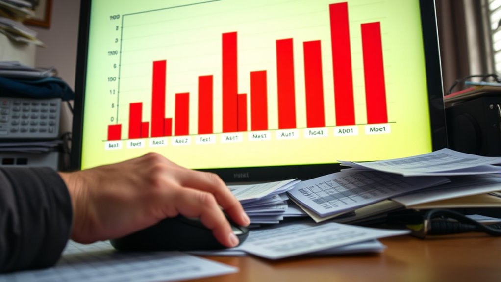
Graphs are powerful tools for visualizing data, but they can also be misleading if you’re not careful. One of the most common red flags is the use of misleading axes. When the axes don’t start at zero or are truncated, it can exaggerate differences or trends, making small changes appear dramatic. For example, a bar graph showing a 10% increase might look like a massive jump if the y-axis starts at 8% instead of 0%. This manipulation draws your attention to differences that aren’t as significant as they seem, leading to false impressions. Always check where the axes begin and whether the scale is consistent across comparable graphs. If the axes are skewed, it’s a sign that the graph might be trying to mislead you. Additionally, pay attention to the extrapolation of data and how it might be used to suggest trends beyond what the data supports. Another important warning sign is omitted context. Graphs often focus on a particular aspect of data, but they can leave out *vital* details that alter interpretation. For instance, a line graph showing rising sales might omit information about seasonal fluctuations or economic conditions that explain the trend. Without the full context, you might assume the trend is purely positive or negative, when in fact, external factors are at play. Be wary of graphs that don’t provide enough background or *detailed* labeling. The absence of context can distort your understanding and lead you to draw incorrect conclusions. Beyond axes and omitted context, pay attention to the data sources and the way data is presented. Sometimes, graphs cherry-pick data points or use selective periods to support a specific narrative. This can be subtle, like highlighting only the most favorable data or ignoring negative outliers. Additionally, consider the type of graph used; some formats, such as pie charts with too many slices or 3D effects, can distort proportions. Always ask yourself whether the visual accurately reflects the underlying data and whether the presentation is honest or potentially manipulative.
Amazon Product B0GLPB3SPT
As an affiliate, we earn on qualifying purchases.
Frequently Asked Questions
How Can I Identify Hidden Biases in Graphs?
You can spot hidden biases in graphs by looking for statistical illusions and design tricks. Watch for truncated axes that exaggerate differences, inconsistent scales that distort comparisons, and cherry-picked data that favor a specific narrative. Question the source and context, and compare with raw data. These tricks can mislead you, so stay critical and analyze the visual cues carefully to uncover underlying biases.
Are All Colorful Graphs Intentionally Misleading?
Colorful illusions can sometimes hide misleading aesthetics, but not all colorful graphs are intentionally deceptive. You might see vibrant visuals that simply aim to engage or clarify data, not deceive. However, bright colors can exaggerate differences or distract from key details, so always scrutinize the data critically. Just because a graph is colorful doesn’t mean it’s misleading, but it’s wise to check for biased axes, omitted data, or distorted scales.
What Role Does Data Source Credibility Play?
You should always consider data source credibility because it impacts your trust in the graph. Check for source validation and credibility indicators like author expertise, publication reputation, and data transparency. If the source seems unreliable or unverified, the graph may be misleading. By evaluating these factors, you ensure you’re interpreting accurate information and avoid being misled by visual data that lacks proper backing.
Can Simple Graphs Be Deceptive?
A simple graph can be deceptive if it oversimplifies data, leading you to misinterpret trends. For example, a bar chart showing only total sales without considering seasonal variations ignores important details. Graph simplification reduces visual complexity but can hide critical nuances, making you think the data is straightforward when it’s not. Always check for omitted information or misleading scales that can distort your understanding.
How Do I Verify the Accuracy of Graph Data?
You verify graph data by checking for statistical anomalies that might skew the information, like outliers or unusual patterns. Also, look for label omissions or unclear axes that could mislead you. Cross-reference the data with original sources or related reports to confirm accuracy. Always question inconsistencies, and consider how the graph’s design might influence your interpretation, ensuring you don’t accept it at face value.
Amazon Product B0GBWFFYWD
As an affiliate, we earn on qualifying purchases.
Conclusion
Remember, a graph can be a wolf in sheep’s clothing if you’re not careful. Always question what’s beneath the surface—look for distorted axes, cherry-picked data, or misleading scales. Just like a magician’s trick, visual data can deceive if you don’t stay alert. Trust your eyes, but verify with a critical mind. Only then can you see through the illusion and get to the real story behind the numbers.
Amazon Product B0FP1J2NGZ
As an affiliate, we earn on qualifying purchases.
Amazon Product B0GDRXBT3P
As an affiliate, we earn on qualifying purchases.