

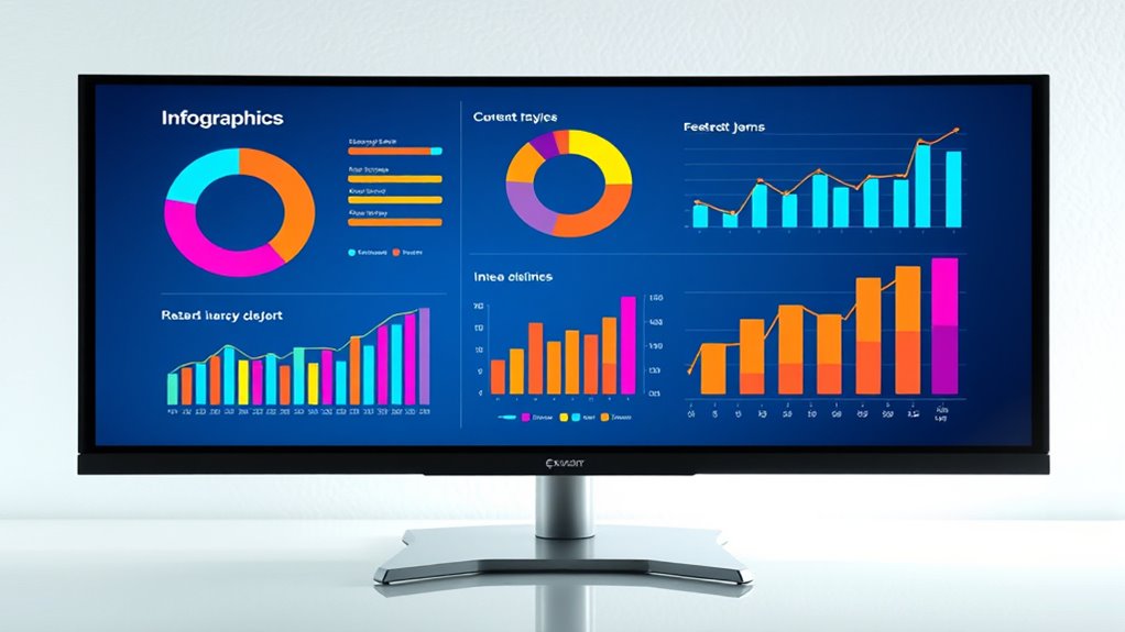
When designing infographics for statistical information, focus on using a cohesive color scheme that guides viewers and highlights key data. Choose visualization techniques like bar and pie charts to clearly compare and show proportions, while maintaining clarity with proper labels and visual hierarchy. Use contrast wisely to improve readability and focus attention. Balancing aesthetics with simplicity guarantees your message is impactful and memorable—exploring these principles further can help you create engaging, effective infographics.
Key Takeaways
- Select appropriate visualization types (bar, pie, line, scatter) to effectively display statistical data.
- Use contrasting and harmonious color schemes to differentiate categories and highlight key figures.
- Maintain clarity with clear labels, legends, and minimal clutter to enhance data comprehension.
- Apply visual hierarchy through size, color, or placement to emphasize important data points.
- Balance aesthetics and simplicity to create engaging infographics that communicate insights efficiently.
Have you ever wondered how to make complex statistical data more engaging and easier to understand? The key lies in effective infographic design, where choosing the right color schemes and applying smart data visualization techniques can transform overwhelming numbers into clear stories. When working with statistical information, you want your audience to grasp insights quickly, and that’s where colors and visualization methods come into play.
Color schemes are more than just aesthetics; they serve as powerful tools to guide viewers through your data. By selecting harmonious yet distinct colors, you can differentiate between categories, highlight key figures, or indicate trends. For example, using a consistent palette with contrasting shades can help viewers instantly recognize patterns or outliers without confusion. Bright, vibrant colors draw attention to critical data points, while muted tones can provide a calming background that doesn’t overpower the main message. Additionally, employing color psychology—like red for urgency or green for growth—can subtly influence how your audience perceives the data. Just remember, simplicity is essential; avoid overly complex color combinations that could distract or confuse.
Use harmonious yet distinct colors to guide viewers and highlight key data without causing confusion.
Furthermore, understanding how contrast ratio affects readability and visual impact is essential for creating effective infographics.
Equally important are data visualization techniques, which are the backbone of compelling infographics. Bar charts, pie charts, line graphs, and scatter plots each serve specific purposes. For instance, if you want to compare quantities across categories, bar charts make these differences immediately apparent. To show proportions, pie charts work well, but only if the segments are distinct and few in number. Line graphs excel at illustrating trends over time, making them perfect for time-series data. Scatter plots reveal correlations between variables, helping your audience understand relationships at a glance. When designing, focus on clarity—use labels, legends, and axes carefully to avoid clutter. Incorporate visual hierarchy—make the most important data stand out through size, color, or placement, guiding viewers effortlessly through your story.
Combining well-chosen color schemes with appropriate visualization techniques results in a powerful infographic that communicates statistical insights effectively. Think about your audience’s familiarity with data and aim to simplify complexity without losing nuance. Remember, the goal isn’t just to present data but to tell a compelling story that resonates. Clear, visually appealing infographics can make even the most intricate statistics accessible and memorable. When you master the art of combining color strategies with visualization methods, you’ll craft infographics that inform, persuade, and inspire action—all in a concise, impactful way.
infographic design software
As an affiliate, we earn on qualifying purchases.
As an affiliate, we earn on qualifying purchases.
Frequently Asked Questions
How Do I Choose the Right Colors for My Statistical Infographic?
To choose the right colors for your statistical infographic, consider color psychology to evoke the desired emotions and responses. Opt for a harmonious palette that maintains consistency and clarity, helping viewers easily interpret data. Use contrasting colors to highlight key points and guarantee readability. Avoid overly bright or clashing hues, and test your color choices across devices. This approach guarantees your infographic communicates effectively and visually engages your audience.
What Software Tools Are Best for Creating Statistical Infographics?
Think of software tools as your palette for data visualization mastery. Tools like Canva, Piktochart, and Adobe Illustrator shine for creating stunning statistical infographics, offering robust chart customization options. They let you turn raw data into visual stories, guiding your audience effortlessly through complex stats. With these, you can craft engaging, clear visuals that make your data pop and communicate insights effectively.
How Can I Ensure My Data Is Accurate and Reliable?
To guarantee your data is accurate and reliable, you should prioritize data validation by double-checking entries and calculations. Always verify your sources for credibility, selecting reputable and authoritative data providers. Cross-reference information from multiple sources when possible, and document your data collection process. This approach minimizes errors and builds trust in your infographic, ensuring your audience receives truthful and dependable insights.
What Are Common Mistakes to Avoid in Infographic Design?
You should avoid cluttering your infographic, which can confuse viewers and obscure key data. Focus on establishing a clear visual hierarchy by highlighting important information and using consistent colors and fonts. Simplify data to prevent overwhelming your audience, making complex statistics easy to grasp. Also, steer clear of misleading visuals or exaggerated scales that distort the data’s meaning. Keep your design clean, focused, and truthful for maximum impact.
How Do I Effectively Target My Audience With My Infographic?
To truly target your audience, focus on fostering audience engagement through tailored topics and visuals that resonate with their interests. Use clear, concise messaging to guarantee message clarity, making information easy to understand. Consider your audience’s age, background, and preferences, then craft content that connects directly with them. By blending bold visuals with relevant data, you boost engagement and deliver your message with precision, making your infographic both impactful and memorable.
data visualization tools
As an affiliate, we earn on qualifying purchases.
As an affiliate, we earn on qualifying purchases.
Conclusion
Remember, crafting an infographic is like painting a clear picture with data. When you use visual elements effectively, you turn complex statistics into a story that captures attention and sparks understanding. Keep it simple, engaging, and focused—your audience will appreciate the clarity like a gust of fresh air. By mastering these design tips, you’ll make your data not just informative but unforgettable, transforming numbers into visuals that speak louder than words.
color palette for infographics
As an affiliate, we earn on qualifying purchases.
As an affiliate, we earn on qualifying purchases.
chart and graph templates
As an affiliate, we earn on qualifying purchases.
As an affiliate, we earn on qualifying purchases.