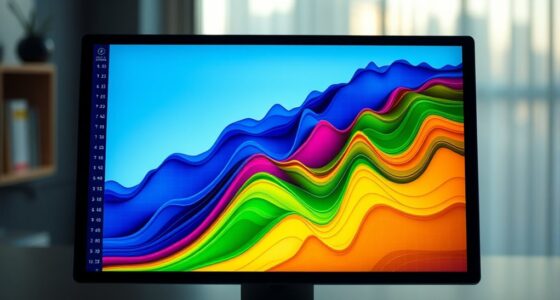

Heatmaps are simple yet powerful tools that visually show how visitors interact with your website or app. They color-code areas based on user activity like clicks, scrolling, and hovering, making complex data easy to grasp. High-engagement spots appear in warm colors, while less active areas look cooler. This helps you quickly identify what works and what needs improvement. Keep going to discover more tips on using heatmaps effectively.
Key Takeaways
- Heatmaps visually display user interactions like clicks, scrolls, and hovers to identify engagement patterns quickly.
- Color-coded zones in heatmaps show areas of high (red/orange) and low (blue/green) activity for easy interpretation.
- They help pinpoint underperforming elements and high-interest content to optimize website or app design.
- Customizable heatmaps focus on specific behaviors or pages, providing targeted insights for better decision-making.
- Using heatmaps simplifies complex data into intuitive visuals, making user behavior analysis accessible without technical skills.

Heatmaps are a powerful way to visualize data, revealing patterns and insights at a glance. When you look at a heatmap, you can immediately see where users are most active, which areas attract the most attention, and where engagement drops off. This makes heatmaps an essential tool for analyzing user behavior, especially when you’re trying to improve website design, app interfaces, or marketing strategies. By applying data visualization techniques effectively, you can turn complex data sets into intuitive visuals that tell a clear story. Instead of sifting through endless tables or raw data, a heatmap provides a visual summary that’s easy to interpret.
Heatmaps quickly reveal user activity, making data easier to interpret and optimize your digital strategies.
When you focus on user engagement, heatmaps become invaluable. They show you exactly how visitors interact with your content—where they click, hover, or scroll. For example, if you notice that certain buttons or links are rarely clicked, you can rethink their placement or design. Conversely, if a particular image or headline draws a lot of attention, you might want to highlight it further. Using heatmaps, you gain immediate insights into what captures your audience’s interest and what doesn’t, enabling you to optimize your content accordingly. Additionally, understanding user behavior through heatmaps can help you tailor your website to better meet your visitors’ needs.
In terms of data visualization techniques, heatmaps are both straightforward and powerful. You don’t need advanced coding skills to interpret them, which makes them accessible to marketers, designers, and product managers alike. They work by assigning different colors to various levels of activity—warm colors like red and orange indicate high engagement, while cooler shades like blue or green show less activity. This color-coding helps you quickly identify hotspots and cold spots on your pages or app screens. The simplicity of these visuals allows you to make data-driven decisions faster and with more confidence.
Moreover, heatmaps can be customized to suit your specific goals. You can generate click maps, scroll maps, or move maps, each revealing a different aspect of user interaction. This flexibility means you can tailor your analysis to focus on the most relevant behaviors for your project. As you experiment with these visualization techniques, you’ll find that heatmaps not only save time but also improve your understanding of how users engage with your digital assets. They empower you to make smarter design choices, enhance user experience, and ultimately, boost engagement.
Frequently Asked Questions
How Accurate Are Heatmaps in Predicting User Behavior?
Heatmaps are quite accurate in predicting user behavior, especially when you use eye tracking and analyze click density. Eye tracking shows where users focus their attention, while click density highlights popular areas on your page. Combining these tools gives you a clear picture of user engagement, helping you optimize your design. Keep in mind, though, that heatmaps work best when paired with other analytics to confirm patterns.
Can Heatmaps Be Used for Mobile App Analytics?
Yes, you can use heatmaps for mobile app analytics. Touch heatmaps visually show where users tap, swipe, or scroll, revealing user engagement and behavior. By analyzing mobile gestures, you identify which features attract attention or cause frustration. Incorporating touch heatmaps into your mobile app analysis helps you optimize design, improve user experience, and increase retention by understanding how users interact with your app’s interface.
What Are the Limitations of Heatmaps for Website Analysis?
Heatmaps for website analysis have limitations you should consider. Data interpretation can be tricky, as heatmaps often don’t reveal why users behave a certain way. Technical limitations also exist, such as inaccuracies with dynamic content or when tracking multiple devices. You might miss nuanced user motivations or struggle to analyze complex interactions. Keep these constraints in mind to make certain you interpret heatmap data accurately and avoid making misguided decisions based on incomplete insights.
How Do I Choose the Right Heatmap Tool?
To select the appropriate heatmap tool, start by considering its user interface—look for one that’s easy to navigate and understand. Guarantee it offers robust data visualization options, so you can clearly interpret user behavior. Check compatibility with your website platform and whether it provides features like click, scroll, or eye-tracking heatmaps. A user-friendly, insightful tool helps you make informed decisions to optimize your site effectively.
Are Heatmaps Suitable for Large-Scale Data Analysis?
You’ll be glad to know that heatmaps are quite suitable for large-scale data analysis, especially when you focus on data resolution. However, scalability issues can arise as your dataset grows, making it harder to process and visualize efficiently. To handle this, choose tools optimized for big data and consider aggregating data points to maintain clarity. With proper setup, heatmaps can reveal valuable insights even with extensive datasets.
Conclusion
Now that you’ve discovered how to create and interpret heatmaps, you’re like an artist with a new palette, ready to bring data to life. Just as Da Vinci saw the world in shades of light and shadow, you’ll see patterns hidden beneath the surface. With your new skills, you can uncover insights as effortlessly as a storyteller weaving a tale. Embrace heatmaps, and let your data speak volumes—your masterpiece awaits.