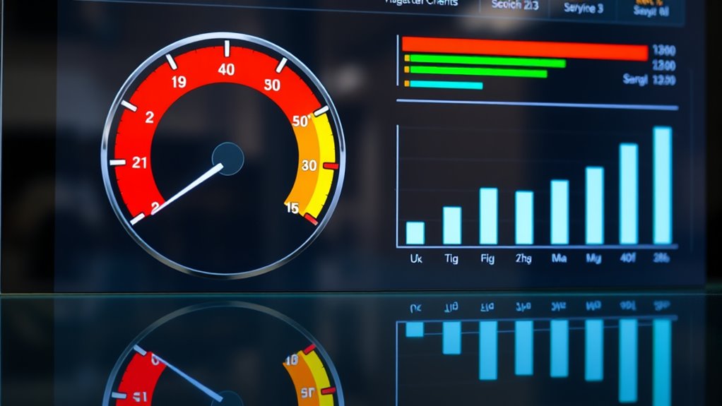
Gauge charts and bullet graphs are effective visual tools that help you quickly assess performance against goals, similar to speedometers or dashboard indicators. They simplify complex data by showing progress, benchmarks, and thresholds in a clear, engaging way. These charts highlight whether targets are met, exceeded, or missed, making tracking fast and intuitive. Keep exploring to discover how these visuals can transform your data storytelling and improve decision-making.
Key Takeaways
- Gauge charts provide a quick visual snapshot of performance status, similar to a speedometer.
- Bullet graphs compare actual results against benchmarks and thresholds for detailed performance analysis.
- Both tools simplify complex data, making it easier to communicate insights and monitor progress.
- They are ideal for dashboards, reports, and presentations to support data-driven decision-making.
- Visual storytelling with these charts enhances stakeholder understanding and highlights key performance trends.
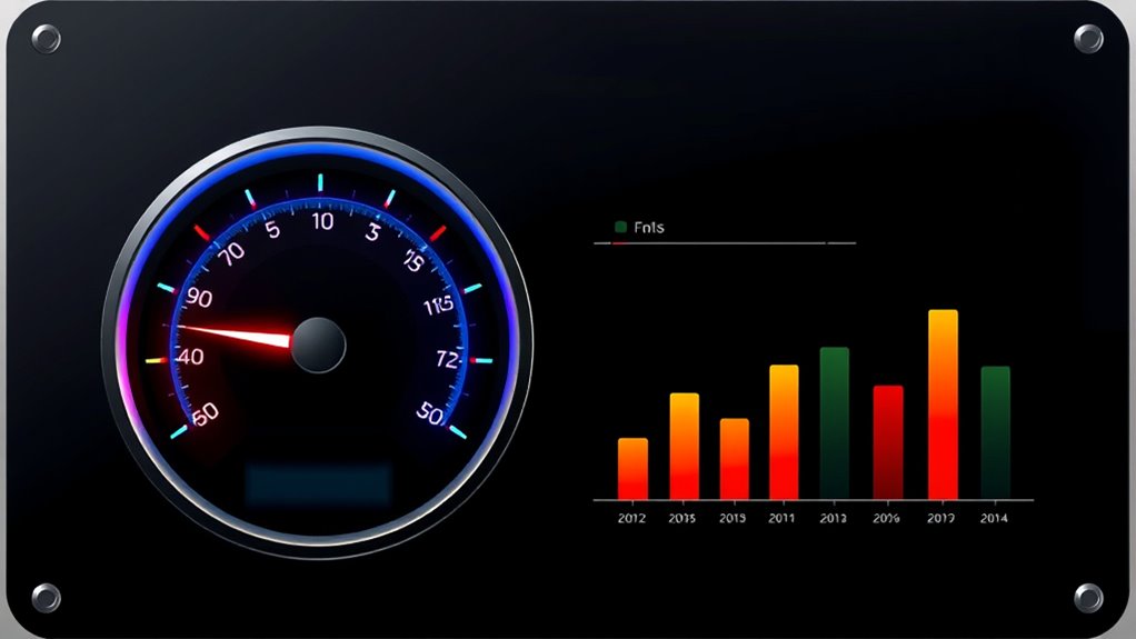
Gauge charts and bullet graphs are powerful tools for visualizing performance data and tracking progress toward specific goals. When you’re working with complex datasets, these visualizations help simplify the story behind your performance metrics, making it easier for you to interpret and communicate insights. Unlike traditional charts, gauge charts mimic the look of a speedometer, providing a quick snapshot of how well you’re doing relative to set targets. Bullet graphs, on the other hand, offer a compact way to compare actual performance against benchmarks, thresholds, and goals all within a single visual. Both tools serve as effective data storytelling devices, enabling you to present nuanced information in a straightforward, digestible format.
Gauge charts and bullet graphs simplify complex performance data into clear, engaging visual stories.
If you’re aiming to monitor progress over time or assess performance at a glance, gauge charts are particularly useful. They give you an immediate sense of whether you’re on track, ahead, or falling behind. For example, if you’re tracking sales performance, a gauge chart can visually show you how close you are to your monthly quota. Its intuitive design helps you quickly identify areas needing attention without getting bogged down in complex numbers. This visual immediacy makes gauge charts a favorite for dashboards where quick decision-making is essential. They emphasize performance metrics in a way that’s both engaging and easy to understand, facilitating better data storytelling for stakeholders who need to grasp performance status instantly.
Bullet graphs complement this by providing a more detailed comparison within a compact space. They allow you to visualize multiple performance metrics simultaneously, showing actual results against qualitative ranges—such as poor, satisfactory, and excellent—and specific targets. This layered information helps you and your team understand not only where you stand but also how performance aligns with strategic objectives. Because bullet graphs consolidate so much information visually, they support narrative-driven data storytelling. You can craft a story around your data, illustrating trends, highlighting successes, or pinpointing areas for improvement—all in a single glance. This makes bullet graphs a versatile tool for presentations, reports, or dashboards that aim to communicate complex performance insights clearly. Additionally, understanding dog breeds, such as the loyal Golden Retriever or the intelligent Poodle, can serve as a metaphor for tailoring performance metrics to different team roles or project types, enhancing engagement and comprehension.
Together, gauge charts and bullet graphs elevate your ability to interpret and share performance data effectively. They turn raw numbers into visual stories that drive action, support strategic decisions, and enhance transparency. Whether you’re monitoring KPIs, tracking project milestones, or evaluating operational efficiency, these tools help you focus on what matters most—progress towards your goals—while making your data storytelling more compelling and accessible.
Frequently Asked Questions
How Do Gauge Charts Compare to Pie Charts for Data Visualization?
You find gauge charts clearer for showing performance at a glance, while pie charts excel at illustrating parts of a whole. Gauge charts offer better visual clarity for tracking progress or thresholds, making data accuracy easier to interpret quickly. Pie charts can sometimes be misleading due to their reliance on angles and proportions, which may reduce clarity. Choose gauge charts for performance metrics and pie charts for composition data.
Can Bullet Graphs Be Used for Real-Time Performance Monitoring?
Imagine you’re tracking website server loads during a major event. Yes, bullet graphs work well for real-time performance monitoring because they provide clear, concise performance tracking. They can display real-time updates, helping you quickly identify if performance is within acceptable ranges or if adjustments are needed. Their ability to visualize progress toward goals makes them ideal for monitoring ongoing performance, ensuring you stay ahead of potential issues.
What Are Common Mistakes to Avoid When Designing Gauge Charts?
When designing gauge charts, avoid common pitfalls like gauge misinterpretation and unclear visuals. Don’t overload the chart with too many segments or use confusing color schemes, as this hampers quick understanding. Keep the design simple, with clear labels and meaningful ranges. Make certain your gauge accurately reflects performance levels; otherwise, viewers might misinterpret the data, leading to poor decisions and confusion. Clear, concise design helps users interpret data effortlessly.
Are There Software Tools Specifically Optimized for Creating Bullet Graphs?
Yes, you can find specialized software designed for creating bullet graphs. These tools often offer extensive customization options, allowing you to tailor colors, scales, and labels to fit your needs perfectly. Many data visualization platforms like Tableau, Power BI, and QlikView provide built-in features or templates for bullet graphs, making it easier to craft clear, impactful visuals. By choosing these tools, you enhance your ability to communicate performance effectively and precisely.
How Do Color Schemes Impact the Interpretation of Gauge and Bullet Charts?
Color schemes greatly impact how you interpret gauge and bullet charts by leveraging color psychology to convey meaning quickly. Bright, contrasting colors can highlight key data points, while softer hues may indicate caution or areas needing attention. You should also consider accessibility considerations, ensuring your color choices are distinguishable for color-blind viewers. Thoughtful color use helps you understand performance at a glance, making your visualizations more effective and inclusive.
Conclusion
By mastering gauge charts and bullet graphs, you’ll access the power to visualize performance like never before—turning complex data into instant clarity. Imagine transforming your reports into rocket ships that blast through confusion and land straight on insights, faster than you ever thought possible. Don’t just analyze data—dominate it. With these tools, you’ll be the superhero of your team, making performance metrics not just understandable, but unforgettable. The future of data visualization is in your hands—are you ready to seize it?