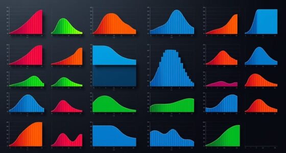
Animations in data visualization work best when you want to show changes over time, highlight trends, or clarify complex relationships. Use them to bring attention to key points or shifts, making data easier to understand and more engaging. Be careful not to overdo it, as excessive movement can distract. When used thoughtfully, animations can turn raw data into a compelling story. Continue exploring to discover how to apply these techniques effectively.
Key Takeaways
- Use animations to effectively illustrate time-series data or multiple dimensions for better understanding.
- Incorporate animations to highlight transitions, shifts, or trends in data over periods.
- Apply animations to clarify complex relationships or cause-and-effect interactions dynamically.
- Employ animations sparingly to enhance storytelling and engagement without causing distraction.
- Use animations when emphasizing specific points, progressions, or changes to guide viewer focus.

Animations in data visualization have become a powerful tool for making complex information more engaging and easier to understand. When used thoughtfully, they can transform static charts into dynamic stories that captivate your audience. One of the key advantages of animations is their ability to facilitate interactive storytelling, where viewers don’t just see data—they experience it. By animating transitions and highlighting key changes, you guide users through a narrative, helping them grasp trends, patterns, and relationships more intuitively. This approach boosts user engagement because it invites interaction, making viewers active participants rather than passive observers. When you incorporate animations effectively, you turn raw data into a compelling story that resonates with your audience. Additionally, choosing the right timing and pacing for animations ensures that the message remains clear and impactful without overwhelming viewers.
Animations transform static data into engaging stories, guiding viewers through trends and patterns with interactive, impactful visual transitions.
You should consider using animations when your data involves multiple dimensions or time-series information. For example, if you’re showing how sales figures evolve over several years, animated visuals can illustrate growth trajectories smoothly rather than presenting static snapshots. This continuous flow helps viewers understand the progression and context more clearly. Similarly, if your visualization compares different categories or segments, animations can emphasize shifts or changes, making it easier to see what’s happening and why. When users can follow these changes step-by-step, their comprehension deepens, and they’re more likely to remember key insights.
Animations are also particularly useful when emphasizing specific points or transitions. For instance, if you want to highlight a sudden spike or drop, animating that change draws attention precisely where you want it. This targeted focus enhances user engagement because it makes your message more impactful. Additionally, animated visualizations can help clarify complex relationships, such as cause-and-effect or correlations, by illustrating how variables interact over time. When viewers see these interactions unfold dynamically, they grasp the intricacies more naturally than with static images. Furthermore, understanding visual storytelling techniques can greatly enhance the effectiveness of your animated data presentations.
Nevertheless, you should avoid overusing animations, as excessive movement can become distracting or overwhelming. Keep animations purposeful: they should clarify, not complicate. When used sparingly and thoughtfully, animations enrich your storytelling and foster a more interactive experience. To conclude, incorporate animations in scenarios where storytelling, clarity, and engagement are priorities. They serve as a bridge, transforming data into a narrative that your audience can follow easily, remember longer, and connect with more deeply. This approach ultimately makes your data visualization more memorable, meaningful, and impactful.
Frequently Asked Questions
How Do Animations Affect User Engagement in Data Dashboards?
Animations boost your user engagement in data dashboards by enhancing interactive storytelling, making complex data easier to understand. They capture user attention quickly, guiding viewers through key insights seamlessly. When used thoughtfully, animations highlight trends and changes dynamically, encouraging users to explore further. This active visual approach keeps users interested, making your dashboard more memorable and effective at conveying information. Properly applied, animations turn static data into compelling stories that engage your audience better.
What Are Common Pitfalls When Implementing Animations?
You might think animations always enhance your dashboard, but beware of common pitfalls. Overusing them can cause visual fatigue, making it hard for users to focus, and increase distraction risk, pulling attention away from key insights. Subtle, purposeful animations work best. If you neglect these, your visuals may become cluttered or confusing, risking user frustration. Use animations sparingly, ensuring they support understanding without overwhelming or distracting your audience.
Can Animations Improve Data Comprehension for All Audience Types?
Animations can improve data comprehension for many audience types by reducing cognitive load and boosting viewer retention. They help highlight key points, making complex data easier to follow. However, overusing animations can overwhelm viewers, so use them strategically. When done well, animations guide your audience’s understanding, keeping their attention and making insights memorable. Be mindful of your audience’s familiarity with the data to guarantee animations enhance, rather than hinder, comprehension.
How Do Animations Impact Load Times and Performance?
Animations can considerably slow down load times and strain performance, causing loading delays that frustrate users. They demand extra processing power, which can hinder performance optimization, especially with large datasets or limited hardware. To keep your visualization fast and responsive, you should minimize unnecessary animations, optimize assets, and test performance regularly. Balancing visual appeal with efficiency ensures a seamless experience without sacrificing clarity or speed.
Are There Accessibility Concerns With Animated Data Visualizations?
You should be aware that animated data visualizations can raise accessibility concerns, especially regarding screen reader compatibility and motion sensitivity. People with motion sensitivity may experience discomfort or disorientation, so providing options to disable animations helps. Ensuring your visuals are compatible with screen readers and offering static alternatives makes your data more inclusive, allowing everyone to access and understand your insights without unnecessary barriers.
Conclusion
Think of animations like a storyteller guiding your eye through a map—highlighting key points, revealing surprises, and keeping you engaged. When used thoughtfully, they turn static data into a dynamic adventure, much like a roller coaster that builds anticipation before the big drop. If you want your audience to truly understand and remember your message, use animations sparingly—like a sprinkle of spice—enhancing rather than overwhelming your data narrative.


