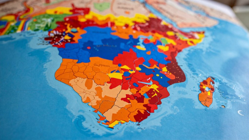

Choropleth maps show regional variations in data like income or population effectively when you use clear, contrasting color schemes and accurate, up-to-date data. They help you quickly identify patterns and differences across areas. However, they can be misleading if colors are poorly chosen, data is outdated, or if the map oversimplifies complex details through aggregation. If you want to understand how to interpret these maps accurately, there’s more to discover ahead.
Key Takeaways
- Choropleth maps effectively display regional data patterns using appropriate color schemes for quick visual interpretation.
- They can obscure local variations and disparities within regions due to data aggregation and averaging.
- The accuracy of the map depends heavily on current, high-quality data sources and proper data handling.
- Effective use of contrasting, intuitive color palettes enhances clarity, while poor choices cause confusion.
- Clear legends, labels, and understanding of visualization principles are essential for accurate map interpretation.
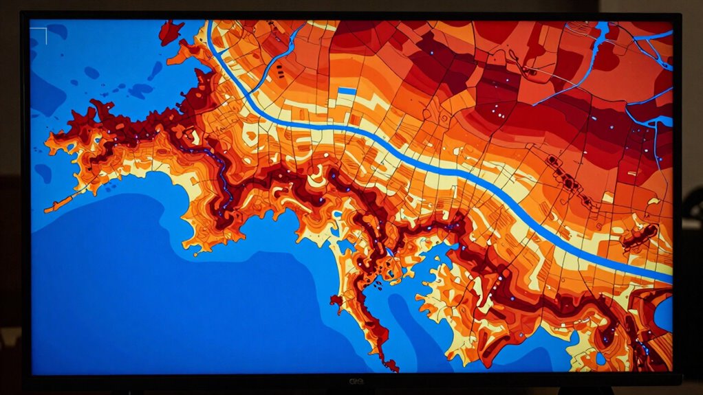
Have you ever seen a map that uses different shades or colors to show how data varies across regions? Those are choropleth maps, a powerful tool for visualizing geographic data. They rely heavily on color schemes, which help viewers quickly grasp patterns and trends. But while they can be eye-catching and informative, they also have limitations. Understanding what choropleth maps show well—and where they fall short—can help you interpret them more accurately.
When you look at a choropleth map, the color scheme is your primary guide. A well-chosen palette makes it easy to differentiate between data ranges, highlighting areas with higher or lower values. For example, darker shades might represent higher populations, income levels, or disease rates, depending on what the map depicts. Good color schemes are intuitive, ensuring that you can interpret the map’s message without confusion. However, if the colors are poorly selected—say, using similar shades for vastly different data points or colors that are hard to distinguish—you run the risk of misreading the information. That’s why choosing appropriate, contrasting color schemes is vital for accurate communication.
Another key aspect is data accuracy. Choropleth maps simplify complex data by aggregating it into geographic regions, which can sometimes distort the true picture. If the data within a region varies widely, a single color might hide important differences. For example, a state with both very wealthy and very impoverished areas might be shaded uniformly, giving you an average that doesn’t reflect the disparities. This aggregation can lead to overgeneralizations, making the map less reliable for precise analysis. Additionally, the accuracy depends on the quality of the underlying data. If the data sources are outdated or incomplete, the map’s visual story can be misleading. Moreover, understanding the importance of data visualization can help users better interpret the limitations and strengths of choropleth maps. Recognizing data aggregation effects is crucial for avoiding oversimplification and misinterpretation. Furthermore, being aware of the scale and resolution of the data can influence how accurately the map reflects reality. Incorporating knowledge about visual perception can also improve how viewers interpret color differences. It’s also helpful to consider how legend and labels guide viewers in understanding the data distribution effectively.
As an affiliate, we earn on qualifying purchases.
Frequently Asked Questions
How Do Choropleth Maps Handle Data Privacy Concerns?
Choropleth maps handle data privacy concerns by applying data anonymization techniques, which remove or obscure individual identifiers. They also use privacy thresholds, ensuring that data for small regions isn’t displayed if it risks revealing personal information. This way, you can visualize regional trends without compromising individual privacy, making the maps safer for sensitive data. Just remember, balancing detail and privacy is key to effective, ethical map design.
Can Choropleth Maps Display Time-Based Data?
Choropleth maps can indeed dance through time with the right choreography. Using animation techniques, you bring a dynamic pulse to static regions, capturing temporal accuracy as data shifts across periods. You can animate changes seamlessly, revealing trends and patterns that evolve. This visual storytelling makes complex time-based data more intuitive, turning static maps into living narratives that breathe life into your insights and keep your audience engaged.
What Are Common Mistakes to Avoid in Choropleth Map Design?
You should avoid common mistakes like choosing inappropriate color schemes that can mislead viewers, and neglecting data normalization, which skews the map’s accuracy. Use color schemes that are perceptually uniform and accessible, ensuring viewers can easily interpret differences. Also, normalize your data to prevent larger regions from appearing more significant solely due to size. These practices help create clear, accurate, and effective choropleth maps.
How Do Color Choices Impact Map Interpretation?
Your color choices greatly impact map interpretation because high contrast improves visibility, making differences easier to distinguish. Avoid using similar shades, as it can cause confusion. Make sure your legend is clear and matches the color scheme, so viewers understand the data accurately. Well-chosen colors guide viewers efficiently, preventing misinterpretation, especially for viewers with color vision deficiencies. Prioritize accessibility and clarity to make your map both effective and inclusive.
Are Choropleth Maps Suitable for Small Geographic Areas?
Small areas pose problems for choropleth maps because they often distort data accuracy. When you map tiny regions, you risk misleading viewers with exaggerated or sparse data, making the map less reliable. You should consider alternative visualizations for small areas, like dot maps or proportional symbols, to better represent data nuances. This approach guarantees your map’s message remains clear, accurate, and accessible, avoiding misinterpretation or misrepresentation.
geographic data visualization tools
As an affiliate, we earn on qualifying purchases.
As an affiliate, we earn on qualifying purchases.
Conclusion
Choropleth maps are like painted windows into data, offering clear visuals of patterns and disparities. However, they can also distort reality, making some areas seem more significant than they truly are. To navigate their strengths and weaknesses, use them as a compass rather than a crystal ball. When you do, you’ll find they guide you through the data landscape, illuminating truths without leading you astray.
interactive choropleth map software
As an affiliate, we earn on qualifying purchases.
As an affiliate, we earn on qualifying purchases.
As an affiliate, we earn on qualifying purchases.