
To use Google Sheets for basic statistics, start by calculating measures like mean with `=AVERAGE()`, median with `=MEDIAN()`, and mode by sorting data to find the most frequent value. You can assess data spread using variance and standard deviation with `=VAR()` and `=STDEV()`. Visualize distributions using histograms and explore relationships between variables with scatter plots. For more advanced insights, explore additional functions and tools—there’s plenty more to discover.
Key Takeaways
- Use built-in functions like `=AVERAGE()`, `=MEDIAN()`, and `=MODE()` to calculate central tendency measures.
- Apply `=VAR()` and `=STDEV()` functions to assess data variability and spread.
- Create histograms and scatter plots through charts to visualize data distribution and relationships.
- Utilize functions like `=QUARTILE()`, `=CORREL()`, and `=QUERY()` for advanced statistical analysis.
- Organize data with tables, named ranges, and data validation for accurate and efficient analysis.
Calculating Central Tendency With Google Sheets
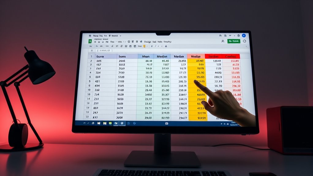
Calculating central tendency in Google Sheets is straightforward and essential for summarizing your data effectively. Central tendency measures reveal the middle point of your dataset, helping you understand its overall distribution. The most common measures are the mean, median, and mode. To find the mean, use the `AVERAGE()` function, like `=AVERAGE(A1:A7)`, which adds all values and divides by the number of cells. For the median, use `=MEDIAN(A1:A7)` to identify the middle value when data is sorted. The mode shows the most frequently occurring value, but since Google Sheets lacks a dedicated function, you’ll need to sort your data and find the most common entry manually. Additionally, understanding the role of contrast ratio in image quality can help you interpret and present your data more effectively. Recognizing the importance of personality assessments can also enhance your understanding of data related to individual traits. These tools allow you to quickly analyze data and gain insights for various fields.
Measuring Data Spread and Variability

Understanding data spread and variability is essential for interpreting your dataset’s overall distribution. In Google Sheets, you can measure this using variance and standard deviation.
To calculate variance, use `=VAR(data_range)` for a population or `=VARP(data_range)` for a sample. Variance shows how much data points deviate from the mean; higher values indicate more spread. Variance is a fundamental concept in statistics that helps quantify data dispersion.
Calculate variance with =VAR(data_range) or =VARP(data_range) to measure data deviation from the mean.
For standard deviation, use `=STDEV.P(data_range)` for the entire population or `=STDEV.S(data_range)` for a sample. Standard deviation expresses spread in the same units as your data, making it easier to interpret.
Both measures help you assess data consistency and variability. Remember, higher variance or standard deviation means more dispersed data points, providing insight into the overall data distribution and potential outliers. Essential oils for statistical analysis can help improve focus and clarity during data interpretation.
Creating and Customizing Histograms
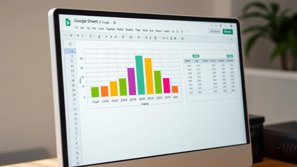
Creating and customizing histograms in Google Sheets allows you to visualize your data’s distribution effectively. To start, select a column of data, then go to “Insert” > “Chart.” Google Sheets will often suggest a histogram automatically, but you can also choose “Other” in the chart type menu to find the histogram option.
Once created, you can customize your chart with colors, axis labels, titles, and tick marks to improve clarity. You can also modify legends, gridlines, and the position of the title.
Histograms help you understand data distribution, identify skewness, detect outliers, and compare datasets. Using these customization options, you make your histogram more informative and visually appealing, ensuring it effectively communicates your data’s story.
Summing, Counting, and Finding Extremes

Google Sheets offers powerful functions to analyze your data beyond visualizations. To sum data, use the `=SUM()` function, which adds numbers in cells or ranges like `A1:A10`. It automatically updates when data changes and can handle multiple ranges. Creating organized sheets with effective storage solutions can help maintain accurate data and support your analysis. Additionally, understanding how to identify spoiled lemon juice can help ensure the integrity of your data, just as recognizing spoiled food prevents health issues.
For counting, the `=COUNT()` function tallies cells with numeric data, while `=COUNTA()` counts all non-empty cells. To find extremes, use `=MAX()` for the largest value and `=MIN()` for the smallest.
These functions ignore non-numeric data, ensuring accurate results. Combining them helps you summarize and analyze your dataset efficiently. All these functions recalculate automatically, making your analysis dynamic and up-to-date.
These functions update automatically, ensuring your data analysis remains current and reliable.
They’re essential tools for extracting meaningful insights from your data quickly and accurately.
Using Quartiles and Variance for Data Insights

Quartiles are a valuable tool for breaking down your data into meaningful segments, making it easier to analyze distribution and identify outliers. In Google Sheets, you use the `QUARTILE` function to find Q1, Q2 (median), and Q3 by specifying your data range and quartile number. These values help you understand the spread and central tendency of your data. Understanding how to interpret these quartiles can also assist in selecting appropriate summary statistics for your analysis. A good understanding of the Bedroom subtopics can also inspire better data organization and presentation in your spreadsheets. The interquartile range (IQR), calculated as Q3 minus Q1, measures the middle 50% spread and highlights variability. Combining quartiles with variance, which averages squared deviations from the mean, gives a thorough view of data dispersion. Variance shows overall spread, while quartiles reveal data segmentation. Together, they help you detect outliers, assess consistency, and gain deeper insights into your dataset’s distribution.
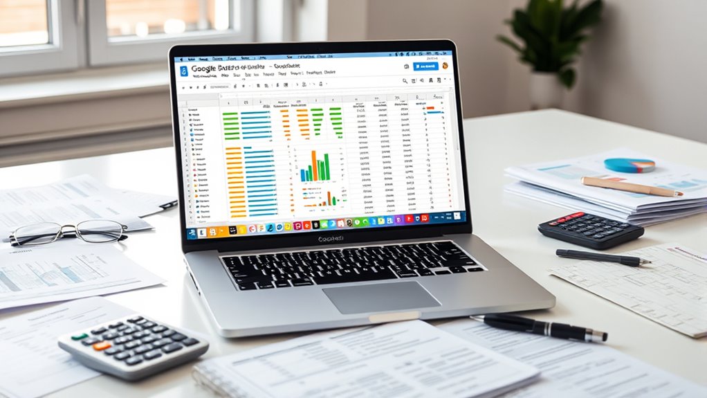
Visualizing Data With Charts and Graphs

Visualizing data with charts and graphs transforms raw numbers into clear, insightful visuals that make patterns and differences easier to understand. Google Sheets offers various chart types, including line, column, bar, area, pie, scatter, and combo charts, each suited for specific purposes. Bar charts excel at category comparisons, while line graphs highlight trends over time. Creating a chart is simple: select your data, then go to Insert > Chart. You can customize charts by changing colors, adding titles, and adjusting labels for clarity. Resizing and formatting enhance readability. Utilizing the appropriate chart type can also help in dust removal analysis and understanding how different vacuums perform in various environments. Choosing the right chart type can significantly improve data interpretation and presentation. Using the right chart type helps tell a compelling story with your data, making complex information accessible and easy to interpret for your audience.
Analyzing Relationships With Scatter Plots and Trendlines

Understanding relationships between variables is essential for meaningful data analysis, and scatter plots provide an effective way to visualize these connections. When you create a scatter plot in Google Sheets, each point represents a pair of data values, revealing correlations or outliers. In environments like New England, camping locations often show variable weather patterns that can influence your data collection. You can interpret whether variables have a positive, negative, or no correlation, helping you identify patterns. Adding trendlines enhances this analysis by illustrating the overall trend or pattern, whether linear, exponential, or polynomial. Customizing trendlines—changing color, opacity, or labels—improves clarity. Use the scatter plot to detect outliers, assess data quality, and test hypotheses about relationships. Properly establishing data accuracy ensures your analysis is reliable and meaningful. Guarantee your axes are labeled clearly and points are appropriately sized for readability. Scatter plots and trendlines are powerful tools for understanding how variables interact.
Employing Advanced Tools and Add-ons for Data Analysis

Building on your ability to interpret scatter plots and trendlines, employing advanced tools and add-ons in Google Sheets can considerably enhance your data analysis capabilities. With the QUERY function, you can perform complex data filtering and manipulation, making your analysis more efficient. Google Apps Script allows you to automate tasks and create custom functions tailored to your needs. Built-in functions help you perform statistical calculations quickly, while data import features enable seamless integration of external data sources. Conditional formatting visually highlights trends and patterns within your data. Integrating add-ons like statistical analysis tools, Power Tools, or AI-driven platforms such as ZohoSheet broadens your analytical options. These tools facilitate correlation analysis, predictive modeling, and advanced data mining, empowering you to extract deeper insights and make more informed decisions. Additionally, leveraging data integrity tools integrated with Google Sheets can automate report generation and campaign tracking, further enhancing your data-driven decision-making.
Managing Large Datasets Effectively
Managing large datasets in Google Sheets requires effective organization and navigation strategies to guarantee your analysis remains efficient and accurate. Start by using clear, concise column headers so you can quickly identify data. Freeze headers and key rows or columns to keep important information visible while scrolling. Setting up named ranges simplifies navigation and referencing within your sheet. Keep data consistent by applying uniform formatting and data types across columns. Use pivot tables to summarize large datasets without altering the original data, making analysis easier. Convert ranges into tables for straightforward filtering, sorting, and analysis. Remove duplicates regularly to prevent skewed results. Understanding data privacy challenges can help you better interpret complex data related to energy efficiency and cost savings in your datasets. Applying these techniques ensures you can manage and analyze extensive datasets efficiently, saving time and reducing errors in your statistical work.
Understanding Data Types and Applying Proper Statistical Measures

Recognizing the different data types in Google Sheets is essential for selecting appropriate statistical measures. Numbers enable calculations like mean, median, and standard deviation, while text data often represent categories or labels. Boolean values indicate true or false conditions, useful in logical tests. Additionally, understanding Fokos can provide insights into website analytics and user behavior, which may inform your data analysis. Dates are formatted based on your system and can be analyzed for trends over time. Arrays group multiple values, facilitating complex formulas.
Understanding data levels—nominal, ordinal, interval, and ratio—helps you choose suitable analysis methods. For example, nominal data like colors suits frequency counts, while ratio data like weight allows for meaningful averages.
Proper data formatting, validation, and understanding data types guarantee accurate calculations. Using functions like AVERAGE, STDEV, and CORRELATION, you can perform effective statistical analysis with confidence.
Frequently Asked Questions
How Do I Interpret Skewness and Kurtosis in Google Sheets?
You want to interpret skewness and kurtosis to understand your data’s distribution. If skewness is near zero, your data is symmetrical. Positive skew indicates a tail on the right, while negative skew indicates a tail on the left.
For kurtosis, a high positive value shows a peaked distribution with heavy tails. Conversely, a negative kurtosis suggests a flatter shape.
Use these insights to identify outliers, assess risk, or refine your analysis.
Can Google Sheets Perform Non-Parametric Statistical Tests?
You’re asking if Google Sheets can perform non-parametric tests, and the answer is, it’s a bit of a tall order. Google Sheets doesn’t have built-in functions for these tests, and support from add-ons is limited.
You can try developing custom scripts with Google Apps Script or use external tools like R or Python. In the meantime, it’s often easier to turn to specialized software for complex non-parametric analyses.
How Do I Handle Missing or Incomplete Data in My Analysis?
You’re asking how to handle missing or incomplete data in your analysis. First, identify gaps using functions like COUNTIF or VLOOKUP errors, and highlight them with conditional formatting.
Decide whether to leave cells blank or use NA() as placeholders. You can also filter out incomplete data or interpolate missing values.
Consistently document your approach, and consider how your choices impact your analysis for accurate, reliable results.
What Are the Best Practices for Cleaning Data Before Analysis?
You want to clean data before analysis to guarantee accuracy and reliability. Start by removing duplicates, eliminating irrelevant info, and checking data types.
Handle missing values thoughtfully—either fill or discard them. Enforce strict entry rules, use validation, and regularly audit your dataset.
Automate checks where possible, back up your data, and document every change. These steps create a solid foundation for trustworthy insights and smooth analysis.
How Can I Automate Repetitive Statistical Calculations in Google Sheets?
To automate repetitive statistical calculations, you should use formulas like `AVERAGE`, `MEDIAN`, and `STDEV`, and embed them into your sheets. You can also record macros to perform these tasks automatically, saving you time.
Leveraging dynamic ranges and smart referencing guarantees your formulas adapt as your data changes. Combine these techniques with automated data imports to keep your calculations current without manual updates.
Conclusion
Now, with these tools in your hands, you can paint a clear picture of your data landscape. Imagine your spreadsheets as a well-organized map, highlighting trends, differences, and patterns like landmarks guiding your way. As you explore and analyze, you’ll uncover insights buried beneath numbers, transforming raw data into compelling stories. Keep practicing, and soon, you’ll navigate Google Sheets’ statistical terrain with confidence, turning complex data into visuals that speak volumes.