
To build better tables in Excel for your statistics projects, focus on clarity and professionalism. Use clean, well-formatted tables with appropriate contrast and visual hierarchy, making key data stand out. Incorporate pivot tables to summarize large datasets quickly and efficiently. Apply data validation to reduce errors, and leverage visual elements to enhance readability. Combining these tools creates organized, error-resistant tables that communicate your findings clearly. Keep exploring to discover how to optimize your data presentation even further.
Key Takeaways
- Use clear, professional formatting with appropriate contrast and visual hierarchy for enhanced readability.
- Incorporate pivot tables to efficiently summarize large datasets and highlight key insights.
- Apply data validation rules, such as dropdown menus, to ensure accuracy and consistency.
- Design logical layouts and utilize visual elements to emphasize important data points.
- Combine tools like pivot tables and validation to create streamlined, error-resistant analysis workflows.
Ever wondered how to make your statistical data more clear and professional-looking? One of the most effective ways is by mastering the art of building better tables in Excel. Clear, organized tables not only make your data easier to read but also enhance your credibility when presenting your findings. To do this effectively, you need to leverage tools like pivot tables and data validation. These features help streamline your data analysis, reduce errors, and create a more polished presentation.
Enhance your data clarity and professionalism with Excel’s pivot tables and data validation tools.
Pivot tables are a game-changer when it comes to summarizing large datasets quickly. Instead of sifting through endless rows and columns, you can use pivot tables to automatically organize and analyze your data with just a few clicks. They allow you to group data by categories, calculate subtotals, and generate summaries that highlight key trends. For example, if you’re working with sales data, you can create a pivot table to compare revenue by region or product line without manual calculations. This not only saves time but also provides a dynamic way to explore different perspectives of your data. When building your tables, always consider how pivot tables can simplify complex data, making it more accessible and easier to interpret. Contrast ratios can also be useful in visually distinguishing different data groups within your tables, enhancing clarity. Additionally, understanding natural landscape features can help in designing tables that better reflect real-world data environments. Incorporating visual hierarchy principles can further improve the readability of your tables by emphasizing the most important information. Recognizing data visualization techniques can also help you communicate your findings more effectively through your tables.
Data validation is another essential tool for creating professional and reliable tables. It ensures that the data entered into your tables adheres to specific rules, minimizing errors and inconsistencies. For instance, you can set data validation rules to restrict entries to a predefined list, such as categories or dates, which helps maintain uniformity. This is especially useful in collaborative projects where multiple people input data. By setting validation rules, you prevent accidental typos or invalid entries that could skew your analysis. Additionally, data validation can include dropdown menus, which make data entry faster and more accurate. Incorporating these features into your tables ensures that your data remains consistent, trustworthy, and ready for analysis.
Combining pivot tables and data validation in your Excel workflow elevates the quality of your statistical tables. You create a more streamlined, error-resistant environment that facilitates clear communication of your findings. As you build your tables, always focus on clarity—use appropriate formatting, consistent headings, and logical layouts. These small touches make your data more accessible to your audience. Remember, a well-structured table is not just about aesthetics; it’s about making your data work effectively for your analysis and presentation. By mastering these tools, you’ll produce tables that are both professional-looking and highly functional, setting a strong foundation for successful statistics projects. Additionally, understanding digital concepts can further enhance your ability to create adaptable and long-term data structures.
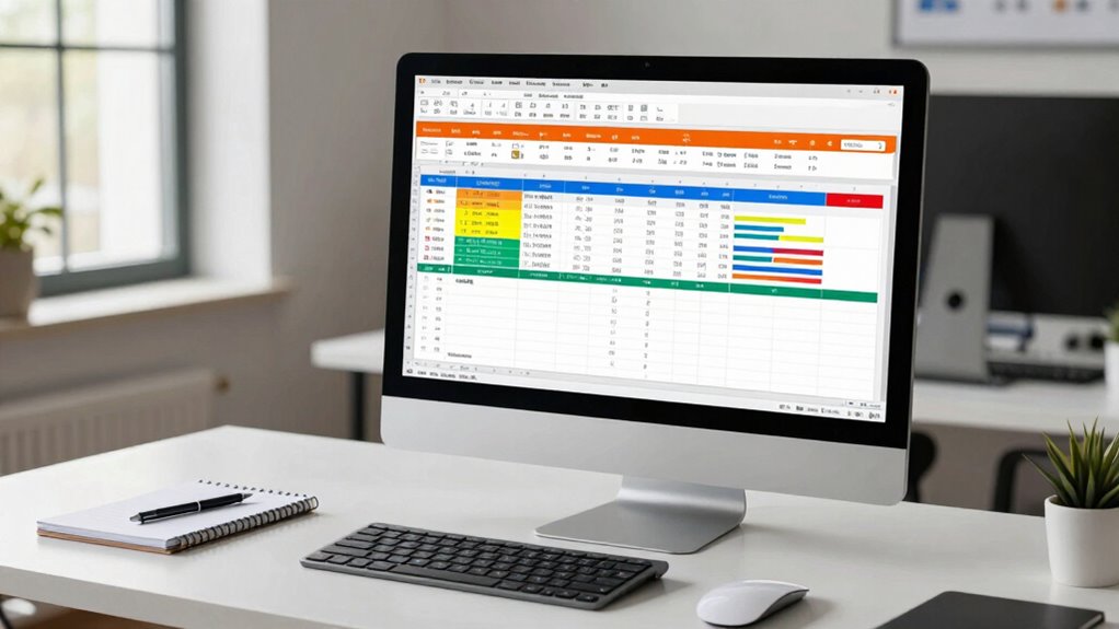
Excel pivot table organizer
As an affiliate, we earn on qualifying purchases.
As an affiliate, we earn on qualifying purchases.
Frequently Asked Questions
How Can I Automate Data Updates in My Excel Tables?
You can automate data updates in your Excel tables by setting up data validation rules to restrict inputs and guarantee accuracy. Use conditional formatting to highlight changes or errors automatically as new data comes in. Linking your tables to external data sources or using Power Query also helps refresh data regularly. These steps save time, reduce manual work, and keep your tables current without constant manual updates.
What Are the Best Practices for Handling Missing Data?
Imagine your dataset as a garden needing tender care—missing data are weeds that can distort your view. To handle them, use imputation techniques like mean, median, or more advanced methods to fill gaps. Pair this with data validation to prevent future weeds from sprouting. This way, your data remains healthy, reliable, and ready to support your statistical harvest, ensuring clear, accurate insights.
How Do I Create Dynamic Tables for Real-Time Analysis?
To create dynamic tables for real-time analysis, start with table design that adapts easily to new data. Use Excel’s Table feature and enable dynamic formatting to automatically update as data changes. Incorporate filters and slicers for quick insights, and consider formulas like OFFSET or structured references for live calculations. This approach guarantees your table remains flexible, visually clear, and ready for ongoing analysis without manual adjustments.
Which Excel Functions Are Most Useful for Statistical Summaries?
Think of Excel functions as your toolkit for painting a clear picture. Use AVERAGE, MEDIAN, and MODE to summarize data trends, while STDEV and VAR help measure variability. Combine these with data visualization tools like charts, customizing them for clarity. These functions and visual tweaks let you craft insightful statistical summaries, turning raw numbers into compelling stories that reveal patterns and support your analysis effortlessly.
How Can I Improve Table Readability for Presentations?
To improve table readability for presentations, you should use color coding to highlight key data points and differentiate categories. Apply consistent font styles and sizes to create a clean look, and avoid clutter by limiting the amount of text. Use bold or italics sparingly to emphasize important information. These visual cues help your audience quickly grasp the data, making your tables more engaging and easier to interpret during presentations.
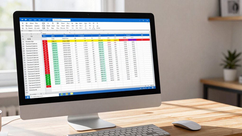
Excel data validation dropdowns
As an affiliate, we earn on qualifying purchases.
As an affiliate, we earn on qualifying purchases.
Conclusion
By mastering better table-building techniques in Excel, you transform chaos into clarity, turning cluttered data into insightful stories. While raw numbers may seem overwhelming, a well-structured table makes analysis straightforward and mistakes less likely. Think of your data as a puzzle—organized tables are the edge pieces that make the entire picture clearer. So, don’t settle for messy spreadsheets; build clean, precise tables and access your full statistical potential.
professional Excel table templates
As an affiliate, we earn on qualifying purchases.
As an affiliate, we earn on qualifying purchases.
Excel data visualization tools
As an affiliate, we earn on qualifying purchases.
As an affiliate, we earn on qualifying purchases.