

To interpret graphs and tables effectively, focus on identifying key patterns such as increases, decreases, or steady trends over time or categories. Look at the axes, scales, labels, and legends to guarantee accuracy and avoid misinterpretation. Recognize visual distortions that might mislead, and use contextual clues to deepen your understanding. Developing a keen eye for these elements helps you uncover meaningful insights quickly. Keep exploring, and you’ll soon master the art of visual data analysis.
Key Takeaways
- Focus on identifying overall patterns and trends over time or categories in graphs and tables.
- Check axes, scales, labels, and legends to ensure visual accuracy and avoid misinterpretation.
- Recognize whether data is increasing, decreasing, or steady to understand underlying insights.
- Be aware of potential visual distortions, such as manipulated scales or truncated axes, that can mislead.
- Use contextual clues and external knowledge to interpret data meaningfully and support informed conclusions.
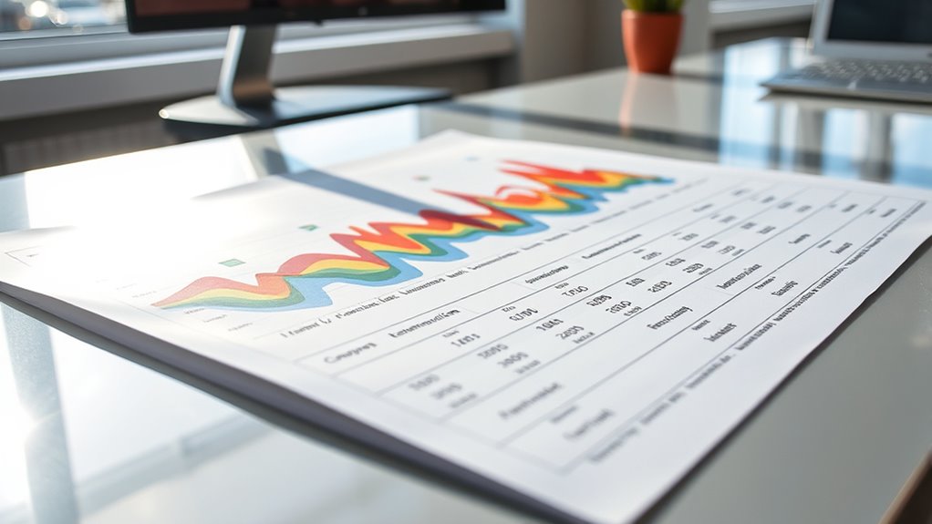
Have you ever wondered how to quickly understand the information conveyed by graphs and tables? When you’re faced with a complex chart or a detailed table, it can seem overwhelming at first. But by focusing on a few key strategies, you can efficiently interpret the data and uncover meaningful insights. Understanding data trends is central to this process. Look for patterns over time or across categories—are values increasing, decreasing, or staying steady? Recognizing these trends helps you grasp the story the data is telling. For example, a rising line on a graph might indicate growth, while a downward slope could signal decline. Spotting these patterns quickly allows you to make informed decisions or draw accurate conclusions without getting lost in the details. Additionally, being aware of the best beaches can provide context for understanding regional data patterns related to tourism or environmental conservation efforts.
Another essential aspect is chart accuracy. Not all visual representations are created equal, and some might be misleading if you don’t scrutinize them carefully. Always check the axes and scales—misleading charts often manipulate scales to exaggerate or minimize differences. For example, a vertical axis that doesn’t start at zero can make small changes look dramatic, skewing your perception of the data’s importance. Pay attention to labels, units, and legends, as inaccuracies or ambiguities there can lead to misinterpretation. Confirm that the data points align with the source, ensuring the chart accurately reflects the actual figures. Developing an eye for chart accuracy helps you distinguish between genuine insights and visual distortions, saving you from false assumptions.

Anatomy of the Organs: QuickStudy Laminated Reference Guide (Quick Study Academic)
As an affiliate, we earn on qualifying purchases.
As an affiliate, we earn on qualifying purchases.
Frequently Asked Questions
How Do Color Choices Affect Data Interpretation?
Color choices greatly influence how you interpret data by leveraging color psychology and contrast. Bright, bold colors can highlight key information, making it stand out, while softer shades may suggest subtler differences. High color contrast helps you distinguish between categories quickly, reducing confusion. By choosing appropriate colors, you guide your focus and improve understanding, ensuring you accurately interpret trends and relationships within the data.
What Are Common Pitfalls in Reading Complex Graphs?
Like steering through a maze, reading complex graphs can trip you up if you’re not careful. Watch out for misleading axes that distort perspective and overcomplicated legends that hide the story. These pitfalls can lead you to false conclusions or confusion. Stay alert to these visual traps, question what you see, and seek clarity. Clear, straightforward visuals help you interpret data accurately rather than getting lost in unnecessary complexity.
How Can I Create Accessible Visualizations for All Audiences?
To create accessible visualizations, you should focus on inclusive design by using high-contrast colors, clear labels, and simple layouts. Incorporate alternative text descriptions for screen readers and guarantee your font size is readable. Think about different abilities and tech needs, making your visualizations inclusive for all audiences. Test your visuals with diverse users to identify and fix accessibility issues, ensuring everyone can interpret your data confidently.
What Software Tools Are Best for Designing Data Tables?
You should consider tools like Microsoft Excel, Google Sheets, or Airtable for designing data tables. These software options excel at data formatting, ensuring your tables are clear and professional. For more dynamic presentations, explore platforms with interactive dashboards like Tableau or Power BI, which allow you to create engaging, accessible visualizations. These tools help you communicate data effectively, making your tables more understandable for all audiences.
How Do Cultural Differences Influence Graph Interpretation?
Think of a graph as a mirror reflecting cultural symbolism; your interpretation can be shaped by cultural biases. You might see different meanings or patterns based on your background, influencing how you perceive data. Cultural differences affect interpretation, causing biases that can distort understanding. To avoid this, you should consider diverse perspectives and contextual factors, ensuring your analysis accurately represents the data, regardless of cultural influences.

Storytelling with Data: A Data Visualization Guide for Business Professionals
Wiley
As an affiliate, we earn on qualifying purchases.
As an affiliate, we earn on qualifying purchases.
Conclusion
Now that you know how to interpret graphs and tables, you can read data like a pro. Think of it as unveiling a secret code that reveals stories behind the numbers. With practice, you’ll spot trends and insights as easily as a bird spots a worm. Remember, visual data is like a map guiding you through complex information—make sure to explore it carefully, and you’ll become confident in understanding what the numbers truly mean.

DGK Color Tools High Resolution 8.5×11 Chrome SD Professional Lens Test Chart, 3-Pack
SUPERIOR IMAGE QUALITY – Achieve optimal lens performance with these high-resolution charts, ensuring your photos and videos are…
As an affiliate, we earn on qualifying purchases.
As an affiliate, we earn on qualifying purchases.

NELOMO 11.8” X 7.9” Toolbox Reference Card Toolbox Accessories Conversion Chart Card SAE Metric Ruler Standard Metric Conversion Charts Tap Drill Sizes Wrench Conversion Chart
Toolbox Must Have: The toolbox reference card has tons of information, including SAE to metric units conversion, SAE…
As an affiliate, we earn on qualifying purchases.
As an affiliate, we earn on qualifying purchases.