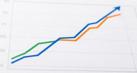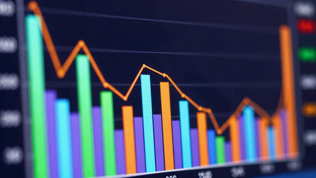

Waterfall charts are simple visual tools that help you understand how different changes, whether positive or negative, build up to a final result. They break down complex data into clear, step-by-step parts, making it easy for you to see what influences the overall outcome. These charts are especially helpful for non-finance people, turning numbers into stories you can easily follow. Keep going, and you’ll discover how these visuals can make financial data accessible for everyone.
Key Takeaways
- Waterfall charts visually show how initial values change through positive or negative steps, making complex data easier to understand.
- They break down overall totals into components, revealing the factors behind financial shifts or performance changes.
- Designed for non-experts, waterfall charts simplify data storytelling and improve communication of complex financial information.
- They highlight cause-and-effect relationships visually, helping audiences grasp insights without technical knowledge.
- Waterfall charts serve as an intuitive tool for presenting data, supporting better decision-making and strategic planning.
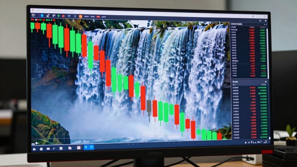
Have you ever wondered how to visualize incremental changes in a clear, straightforward way? That’s where waterfall charts come into play. They’re a powerful tool in data visualization, especially when it comes to financial analysis, because they help you track how an initial value is affected by a series of positive and negative changes. Whether you’re looking at a company’s revenue, expenses, or profit margins, waterfall charts make it easy to see the step-by-step progression without getting lost in complex numbers or cluttered spreadsheets. They’re designed to present data in a way that’s intuitive, so even if you’re not a finance expert, you can understand how different factors contribute to the final outcome.
Waterfall charts work by breaking down a total into its component parts. Imagine you want to show how a company’s net income changed from one year to the next. Instead of just presenting the starting and ending figures, a waterfall chart reveals each contributing factor—like increased sales, higher costs, or tax changes—that caused that shift. This visual breakdown allows you to grasp the story behind the numbers quickly, making it a handy tool for presentations, reports, or strategic planning sessions. You can see where improvements are happening or where challenges are arising, all at a glance. Additionally, understanding the incremental steps in these charts makes it easier for non-finance people to interpret complex data. Recognizing the importance of visual storytelling in data presentation can further enhance your understanding of these charts. Moreover, the ability to clearly display the cause-and-effect relationships makes waterfall charts especially useful for communicating insights to diverse audiences. Incorporating data visualization techniques like waterfall charts can significantly improve how you communicate complex information.
For non-finance folks, understanding these charts might seem intimidating at first, but once you get the hang of them, they become an invaluable way to interpret complex data. You don’t need to be a data scientist to appreciate how well a waterfall chart communicates the story behind the figures. It simplifies the process of financial analysis by turning abstract numbers into visual narratives. Plus, because these charts highlight the incremental steps, you can easily identify which actions or decisions led to specific results. That clarity helps in making informed decisions, whether you’re managing a project, analyzing sales performance, or budgeting. The clear visual representation of these charts makes even complex financial changes more accessible to non-experts.
In essence, waterfall charts bridge the gap between raw data and meaningful insights. They enable you to see the cause-and-effect relationship of financial changes clearly and efficiently. As a tool for data visualization, they empower you to tell a compelling story with your numbers, regardless of your familiarity with finance. The next time you need to explain a financial outcome or analyze a series of changes, consider a waterfall chart—it’s a straightforward, visual way to make sense of complex data and communicate insights effectively.
As an affiliate, we earn on qualifying purchases.
Frequently Asked Questions
Can Waterfall Charts Be Used for Non-Financial Data?
Yes, you can definitely use waterfall charts for non-financial data. They’re a great visual storytelling tool that helps you break down complex information into clear, step-by-step data visualization techniques. Whether you’re tracking project progress, sales growth, or other metrics, waterfall charts make it easy to see how different factors contribute to an overall result. They’re versatile, engaging, and perfect for making data more understandable across various fields.
What Are the Limitations of Waterfall Charts?
You might find waterfall charts have limitations; for example, only 60% of users report clear data accuracy when interpreting complex data. They can sometimes oversimplify or mislead, especially if data isn’t precise, affecting visual clarity. Additionally, waterfall charts struggle with large datasets or numerous categories, making it hard to interpret trends. So, for accurate insights, always verify your data and consider alternative visualizations if needed.
How Do I Interpret Negative Values in a Waterfall Chart?
When you see negative values in a waterfall chart, it indicates a decrease or negative impact on the total. These negative implications show data significance, helping you understand what contributed to the decline. You should interpret these values carefully, recognizing their role in the overall trend. Negative values highlight areas needing attention or improvement, providing a clear visual cue of where things are going wrong or where losses occurred.
Are Waterfall Charts Suitable for Real-Time Data Updates?
Yes, waterfall charts are suitable for real-time data updates, acting like a dynamic dashboard that keeps pace with your business. You need to guarantee data accuracy so your chart reflects the latest figures correctly. Also, take advantage of chart customization options to highlight key changes instantly. This way, you can spot trends and make timely decisions, making your waterfall chart a powerful tool for ongoing insights.
What Software Tools Can Create Effective Waterfall Charts?
You can create effective waterfall charts using software tools like Excel, Power BI, and Tableau. These tools let you build interactive dashboards, making it easy to explore data dynamically. They also offer custom templates, so you can tailor your waterfall charts to suit your specific needs. With these options, you get clear visualizations that help communicate complex financial or operational changes effectively and engagingly.
financial data visualization tools
As an affiliate, we earn on qualifying purchases.
As an affiliate, we earn on qualifying purchases.
Conclusion
Now that you’ve glimpsed the magic behind waterfall charts, you can confidently see how they gently guide your understanding of financial stories. With just a little practice, these charts can become your trusty companions, revealing insights with a subtle grace. Embrace their elegance, and you’ll find yourself uncovering the narrative behind the numbers, turning complexity into clarity. After all, sometimes it’s the quiet tools that speak the loudest.
As an affiliate, we earn on qualifying purchases.
data storytelling presentation tools
As an affiliate, we earn on qualifying purchases.
As an affiliate, we earn on qualifying purchases.