

Population pyramids show the age and gender distribution of a country’s population, giving insights into its demographic trends. They reveal how birth rates, aging, migration, and gender imbalances shape society over time. Shapes like broad bases or narrow tops indicate youthful populations or aging groups. Asymmetries can point to migration or gender issues. Understanding these visual patterns helps you grasp a country’s social and economic future—keep exploring to learn more about their stories.
Listen free for 30 days with Audible
Thousands of audiobooks and originals — cancel anytime.
As an affiliate, we earn on qualifying purchases.
Key Takeaways
- Population pyramids visually represent age and gender distribution, revealing demographic trends and social histories.
- The pyramid’s shape indicates birth rates, aging populations, and historical population changes.
- Urbanization shifts pyramids toward rectangular shapes, reflecting lower birth rates and increased longevity.
- Migration patterns create bulges or asymmetries, influencing gender ratios and age distribution.
- Analyzing pyramid shapes helps assess population health, future growth, and policy needs.
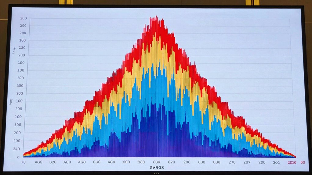
Population pyramids give you that visual snapshot, revealing the ages and genders of a nation’s inhabitants. They’re more than just charts; they tell stories about a country’s history, economy, and social trends. As you examine one, you’ll notice the shape it takes—broad bases indicate high birth rates, while narrow tops suggest aging populations. You might also observe asymmetries that hint at gender imbalances or migration patterns. These pyramids are invaluable tools for understanding demographic shifts over time.
Urbanization patterns play a significant role in shaping population pyramids. In rapidly urbanizing countries, you’ll see a shift from broad bases to more rectangular shapes, as birth rates decline and life expectancy rises. Cities attract working-age adults, leading to a concentration of younger populations in urban centers, while rural areas might see declining populations. This urban migration causes the pyramid to narrow at the bottom and become more uniform in the middle, reflecting an aging population in cities. Conversely, in countries where urbanization is still emerging, the pyramid may still display a wide base, signaling high fertility rates and a youthful demographic. Recognizing these patterns helps you understand how economic development influences population structure. Additionally, urban migration can accelerate changes in household structure and social dynamics, further influencing demographic trends. Understanding these processes can also shed light on the population growth trends that shape a country’s development.
Migration trends also dramatically impact the shape of population pyramids. When a country experiences significant migration, either inward or outward, it alters the age and gender composition. For example, an influx of young working-age migrants can create a bulge in the middle of the pyramid, indicating a surge in those age groups. This often results in a more rectangular shape, as the population becomes more balanced across different ages. Conversely, emigration of young adults can produce a narrower base, hinting at declining birth rates and a shrinking younger population. Additionally, migration can affect gender ratios, especially if more men or women tend to migrate for work or safety reasons. These shifts reveal how migration trends directly influence demographic structure, impacting everything from workforce composition to social services. A population pyramid can also illustrate the long-term effects of migration on a nation’s demographic balance and social fabric.
Furthermore, the contrast ratio in a population pyramid can provide insight into the overall health and future outlook of a country’s demographic profile. This ratio helps demographers assess whether a population is aging or youthful, which can influence policy planning and resource allocation.
As an affiliate, we earn on qualifying purchases.
Frequently Asked Questions
How Do Population Pyramids Influence Government Policy Decisions?
Population pyramids influence your government’s policy formulation by highlighting age distribution trends. If the pyramid shows a young population, policies might focus on education and employment opportunities. Conversely, an aging population prompts decisions on healthcare and retirement planning. You can see which age groups are growing or shrinking, helping policymakers allocate resources effectively and develop strategies that address current and future demographic needs.
Can Population Pyramids Predict Future Demographic Shifts Accurately?
Think of a population pyramid as a crystal ball, offering glimpses into future demographic shifts. While age distribution and birth rate trends help predict changes, they aren’t foolproof, like reading tea leaves. Unexpected events or policy shifts can alter trends quickly. So, you can forecast broad patterns, but precise predictions remain elusive, making population pyramids valuable tools but not infallible prophecy machines.
What Are the Limitations of Using Population Pyramids?
You should be aware that population pyramids have limitations like data accuracy issues, as outdated or incomplete data can lead to misleading interpretations. They also lack visual clarity when representing complex demographic trends, especially with small populations or rapid changes. These factors can hinder precise analysis, making it essential to supplement pyramids with other demographic data sources for a more thorough understanding of population dynamics.
How Are Population Pyramids Constructed From Census Data?
You start by collecting census data on age groups and gender for the population. Then, you organize this data into age brackets, such as 0-4, 5-9, etc. Next, you visualize the data by plotting age groups on the vertical axis and population counts on the horizontal, creating a mirrored bar chart. This process results in a clear, visual representation of population distribution, known as a population pyramid.
Do Population Pyramids Vary Significantly Across Cultures?
Yes, population pyramids vary considerably across cultures because of cultural differences that influence birth rates, family size, and aging trends. You’ll see these variations especially in the age distribution, with some cultures having a larger proportion of young or elderly populations. These differences reflect societal norms, healthcare access, and historical factors, shaping unique pyramid shapes that reveal much about each culture’s demographic dynamics.
demographic data visualization tools
As an affiliate, we earn on qualifying purchases.
As an affiliate, we earn on qualifying purchases.
Conclusion
Think of population pyramids as the heartbeat of a nation’s story—each shape revealing hopes, struggles, and future dreams. They symbolize more than numbers; they embody the people’s journey through time. By understanding these curves and edges, you reveal the soul behind demographic data, glimpsing the legacy we’re shaping today. So, look closer, and let these pyramids guide you through the silent, powerful narrative of a society’s past, present, and future.
age and gender distribution graph print
As an affiliate, we earn on qualifying purchases.
As an affiliate, we earn on qualifying purchases.
As an affiliate, we earn on qualifying purchases.
Fall Picks
fall essentials
As an affiliate, we earn on qualifying purchases.