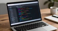
When choosing a monitor for R, Python, and dashboard work, focus on resolution, screen size, and color accuracy. A higher resolution, like 4K, improves clarity, while a 27-inch screen or dual monitors gives you ample workspace. Look for monitors with excellent color reproduction to enhance your data visuals. Ergonomic features are key for comfort during long hours, and sufficient connectivity options should be available for integration. Keep exploring to find more tips on selecting the perfect monitor.
Key Takeaways
- Opt for a higher resolution (at least 1440p) for clear visualizations of data sets and complex dashboards in R and Python.
- Choose a 27-inch or larger screen to provide ample workspace for coding and visualizing your projects effectively.
- Prioritize monitors with excellent color accuracy to ensure precise distinctions in data visualizations and dashboard elements.
- Look for ergonomic features like height adjustments and tilting to enhance comfort during long hours of analysis work.
- Ensure the monitor has necessary connectivity options (HDMI, DisplayPort, USB-C) for seamless integration with your devices and tools.
When diving into data analysis with R and Python, the right monitor can make all the difference. You’ll want to evaluate several factors to enhance your workflow. Start with resolution options; a higher resolution, like 4K, allows for clearer visuals and makes it easier to analyze complex data sets. If you’re working with intricate charts or dashboards, this clarity is invaluable. However, be certain to balance this with your budget considerations. High-resolution monitors can be pricey, so find a balance that suits your needs without breaking the bank.
Next, look at screen size. A larger screen can give you more real estate for your code and visualizations, allowing you to see more at once without constantly switching windows. A 27-inch monitor is often a sweet spot for many data analysts, striking a balance between usability and desk space. If you have the room, think about a dual-monitor setup; this can greatly boost productivity by allowing you to keep your code and visualizations visible simultaneously.
A larger monitor enhances visibility for code and visualizations, making analysis more efficient—consider a dual-monitor setup for optimal productivity.
Color accuracy is another vital factor. If your work involves data visualization where color differentiation matters, opting for a monitor that boasts excellent color reproduction can improve your analysis. Look for specifications that cover color gamut and factory calibration, as these can make a noticeable difference in your work. Additionally, understanding panel types like IPS, TN, or VA can help you select a display with the best viewing angles and vibrancy for your needs. Choosing a monitor with accurate color display can be particularly beneficial for visualizations that rely heavily on precise color distinctions.
Ergonomic design shouldn’t be overlooked either. You’ll likely spend long hours analyzing data, so a monitor that allows for height adjustments, tilting, or swivel features can help reduce neck and eye strain. Your comfort is essential for maintaining productivity over time.
When examining brand comparisons, take time to research well-reviewed brands that specialize in monitors for creative professionals. Look at user reviews and expert recommendations to help narrow down your choices. Each brand has different panel types—like IPS, TN, or VA—that affect viewing angles and color vibrancy. IPS panels typically offer the best color accuracy and viewing angles, making them ideal for data work.
Additionally, consider monitor calibration options and software support, which can further enhance color precision and overall display quality. This ensures your visualizations are consistent and reliable across different projects. Lastly, pay attention to connectivity options. Confirm your monitor has the necessary ports for your setup, whether it’s HDMI, DisplayPort, or USB-C. This will save you headaches down the line as you try to connect multiple devices. By weighing these factors carefully, you can choose a monitor that transforms your R and Python work into a more efficient and enjoyable experience.
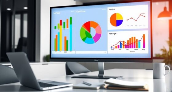
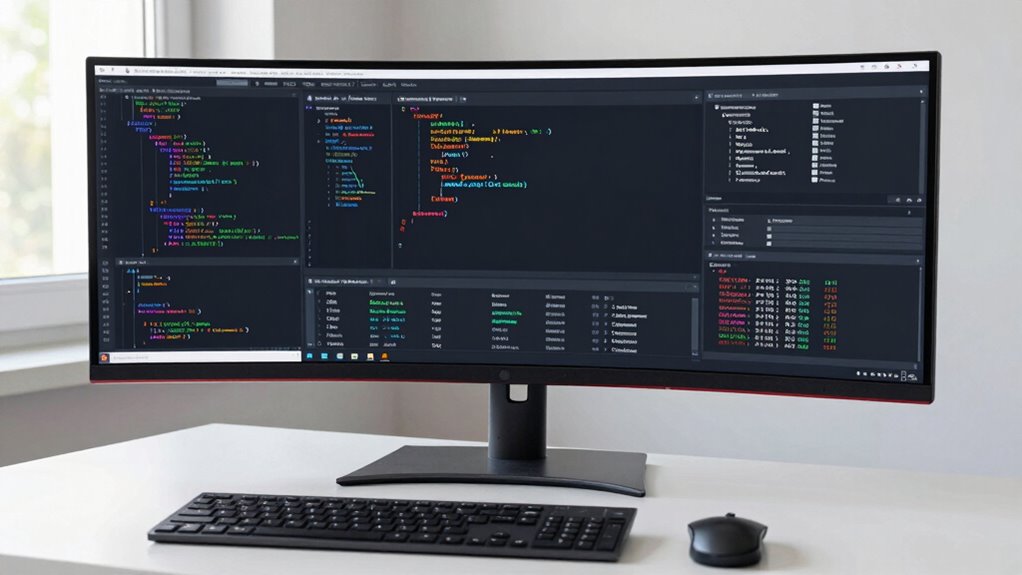
4K monitor for data analysis
As an affiliate, we earn on qualifying purchases.
As an affiliate, we earn on qualifying purchases.
Frequently Asked Questions
What Size Monitor Is Ideal for Data Visualization Tasks?
For data visualization tasks, a monitor around 27 inches is ideal. This size balances screen real estate with desk space, allowing you to view multiple charts and dashboards comfortably. Aim for at least 1440p screen resolution for sharp graphics, ensuring details are clear. Consider an IPS panel type for accurate color reproduction and wide viewing angles, which helps when sharing insights with others. This combination enhances your overall data analysis experience.
Should I Consider a Curved Monitor for Coding?
Absolutely, you should consider a curved monitor for coding! Ever thought about how a curved screen could enhance your productivity? The curved benefits include reduced eye strain and improved immersion, making it easier to focus on your code. This design wraps around your field of view, which can greatly boost your workflow, especially during long sessions. So, if you want to enhance your coding experience, a curved monitor might just be the way to go!
How Does Refresh Rate Impact Coding Performance?
Refresh rate greatly impacts your coding performance. A higher refresh rate improves coding efficiency by providing smoother visuals, which enhances your overall experience. You’ll notice reduced eye strain during long coding sessions, making it easier to stay focused. If you’re working with dynamic content or multiple windows, a higher refresh rate helps maintain visual comfort, allowing you to code without distractions. So, keep refresh rate in mind when choosing your monitor.
Are There Benefits to Dual Monitor Setups for Data Analysis?
Yes, dual monitor setups can greatly enhance your data analysis. Imagine juggling multiple datasets and coding—frustrating, right? With an extra screen, you’ll see a productivity boost as you efficiently compare results side by side. Plus, it helps with workspace organization, letting you keep your code open on one display while visualizing your data on the other. You’ll wonder how you ever managed without it, transforming your workflow into a seamless experience.
What Budget Should I Allocate for a Quality Monitor?
You should allocate between $200 and $600 for a quality monitor. This budget allows you to balance cost with essential monitor features like resolution, size, and refresh rate. By doing a budget comparison, you can find options that meet your needs without overspending. Look for at least 1080p resolution and consider IPS panels for better color accuracy. Investing wisely now can enhance your productivity and comfort in your data analysis tasks.
27 inch ergonomic computer monitor
As an affiliate, we earn on qualifying purchases.
As an affiliate, we earn on qualifying purchases.
Conclusion
In summary, selecting the right monitor can transform your R and Python work into a seamless experience. With the perfect display, your coding and dashboarding can feel as effortless as flying through the clouds. Remember to take into account size, resolution, and refresh rate to guarantee you’re getting the most out of your setup. So go ahead, invest in a monitor that’ll make your programming adventures as brilliant as a thousand suns! Happy coding!
color accurate IPS monitor for dashboards
As an affiliate, we earn on qualifying purchases.
As an affiliate, we earn on qualifying purchases.
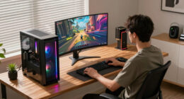
dual monitor setup for programming
As an affiliate, we earn on qualifying purchases.
As an affiliate, we earn on qualifying purchases.