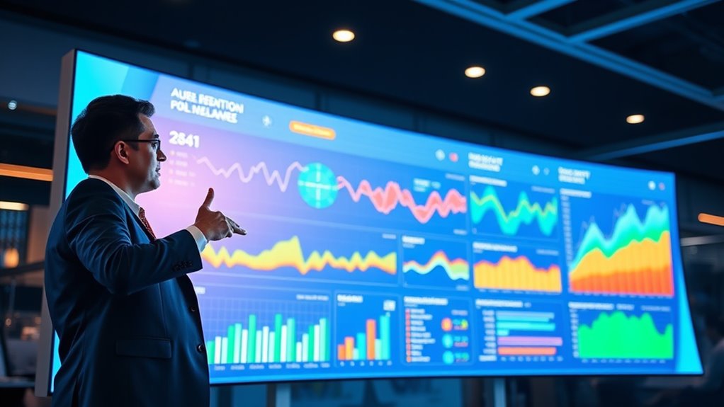
Interactive dashboards that wow turn complex data into stunning visuals that captivate your audience. They make information easy to understand by using real-time updates, engaging filters, and intuitive design. This empowers you to identify trends quickly, explore data effortlessly, and make smarter decisions on the spot. Whether you need detailed analysis or high-level summaries, these dashboards deliver a personalized experience. Keep exploring to discover how you can harness their power for your organization.
Key Takeaways
- Use visually appealing, real-time data updates to create engaging, dynamic dashboards that capture users’ attention instantly.
- Incorporate intuitive design elements like filters, drill-downs, and drag-and-drop features for seamless user interaction.
- Present complex data through compelling visuals such as interactive charts, maps, and graphs to tell a clear story.
- Tailor dashboards to different user needs, balancing detailed analysis for analysts and summarized insights for executives.
- Keep dashboards fresh and engaging with continuous updates, fostering active exploration and quick decision-making.

Have you ever wondered how businesses make quick, informed decisions? The secret often lies in the power of interactive dashboards, which leverage data visualization to turn complex data into clear, actionable insights. When you use these dashboards effectively, you’re not just looking at numbers—you’re engaging with data in a way that sparks understanding and drives strategic moves. Data visualization transforms raw data into visual stories, making it easier for you to spot trends, outliers, and opportunities at a glance. Instead of sifting through endless spreadsheets, you can interact with dynamic charts, graphs, and maps that respond instantly to your queries. This immediacy keeps you engaged, helping you stay focused and informed without feeling overwhelmed. Incorporating intuitive design principles enhances user engagement and facilitates better decision-making. User engagement is central to the effectiveness of interactive dashboards. When you’re actively exploring data through filters, drill-downs, and customizable views, you’re more likely to uncover insights that static reports might hide. These dashboards aren’t just passive displays—they’re designed to invite you to interact, experiment, and explore more deeply into the data. As you click and hover over different elements, the dashboard updates in real time, providing a personalized experience that keeps you invested in the analysis process. This continuous engagement ensures you don’t miss critical details, ultimately leading to smarter decisions faster. Additionally, the visual appeal of well-designed dashboards makes data exploration less tedious and more intuitive, encouraging frequent use and ongoing discovery.
Interactive dashboards turn complex data into visual stories, enabling quick, confident decisions through engaging, real-time insights.
The beauty of interactive dashboards is that they cater to different needs and skill levels. Whether you’re a data analyst looking for granular details or a business executive seeking high-level summaries, these dashboards adapt to your preferences. They often feature user-friendly interfaces with drag-and-drop functionalities, making it simple to rearrange data views or create new visualizations without technical expertise. This flexibility not only improves user engagement but also democratizes data access across teams, fostering a data-driven culture within organizations. As you become more comfortable with these tools, you’ll find yourself relying less on static reports and more on interactive dashboards for real-time insights.
In essence, interactive dashboards harness data visualization to captivate users, making complex information accessible and engaging. They transform passive reporting into active exploration, empowering you to make quick, confident decisions. The combination of visual storytelling and user engagement ensures that data isn’t just seen but understood, enabling your organization to stay agile, competitive, and informed in today’s fast-paced environment.
Amazon Product B07DD7YK8W
As an affiliate, we earn on qualifying purchases.
Frequently Asked Questions
What Are the Best Tools for Creating Interactive Dashboards?
When choosing tools for creating interactive dashboards, focus on those that excel in data visualization and enhance user experience. You might consider options like Tableau, Power BI, or Looker, as they offer intuitive interfaces and powerful visualization capabilities. These tools allow you to turn complex data into clear, engaging visuals, making it easier for users to interpret and interact with the data. Prioritize ease of use and customization to create impactful dashboards.
How Do I Ensure Data Security in Dashboards?
To guarantee data security in dashboards, you should implement strong data encryption to protect sensitive information. Also, control user access carefully, granting permissions only to authorized individuals. Regularly update security protocols and monitor access logs for suspicious activity. By combining data encryption with strict user access management, you create a secure environment that keeps your dashboard data safe from breaches and unauthorized viewing.
Can Dashboards Be Customized for Mobile Devices?
Yes, dashboards can be customized for mobile devices. You should focus on mobile responsiveness to guarantee your dashboard adjusts seamlessly to different screen sizes. Additionally, implementing touch optimization makes navigation easier on smartphones and tablets. By designing with these features in mind, you provide a smooth user experience, allowing users to access and interact with data anytime, anywhere, without sacrificing functionality or clarity.
What Skills Are Needed to Build Advanced Dashboards?
To build advanced dashboards, you need skills in data visualization, SQL, and understanding user engagement. Focus on dashboard aesthetics to create visually appealing layouts that draw users in. You should also know how to use tools like Tableau or Power BI to craft interactive, dynamic displays. By combining technical expertise with a keen eye for design, you’ll develop dashboards that effectively communicate insights and keep users engaged.
How Do I Measure Dashboard Effectiveness?
Oh, measuring dashboard effectiveness? Sure, it’s just about tracking user engagement, right? But don’t forget, it’s also about how well you tell a visual story. You might get lots of clicks, but if users leave confused, you’ve missed the mark. Focus on clarity, insights delivered, and user feedback. When your dashboard sparks action and understanding, you’ll know it’s truly effective—no fancy metrics needed.
Amazon Product B0FW4P9RW6
As an affiliate, we earn on qualifying purchases.
Conclusion
As you explore interactive dashboards, you’ll notice how seamlessly they turn data into insights, making every decision smarter. It’s no coincidence that those who leverage these tools often stay ahead — dashboards are designed to surprise you with clarity just when you need it most. In fact, the right dashboard can transform chaos into clarity, proving that sometimes, the best insights come when you least expect them. Embrace these tools, and watch your success unfold.
Amazon Product B0FGJD2P9Q
As an affiliate, we earn on qualifying purchases.
Amazon Product B07DD7XXTM
As an affiliate, we earn on qualifying purchases.


