
📊 Full opportunity report: How AI Can Render Signature Storm Data Without Visual Assets: Vortex Field Unit’s Approach on ThorstenMeyerAI.com — validation score, market gap, and execution plan.

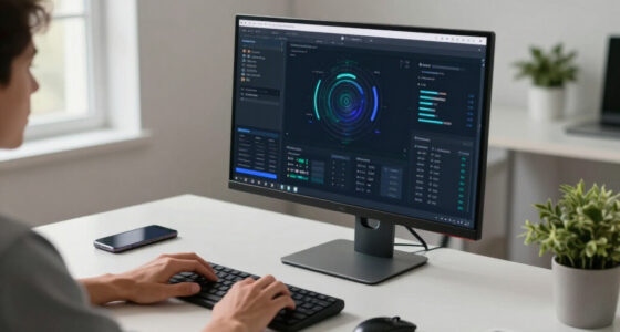
Get business pricing on monitors, keyboards and dev gear
- Business-only prices and quantity discounts
- Tax-exempt purchasing
- Multiple users, one account, clear invoices
TL;DR
An AI-driven system visualizes supercell storm data entirely through procedural graphics, eliminating the need for external images. This approach demonstrates new possibilities in weather visualization, as detailed in the original analysis.
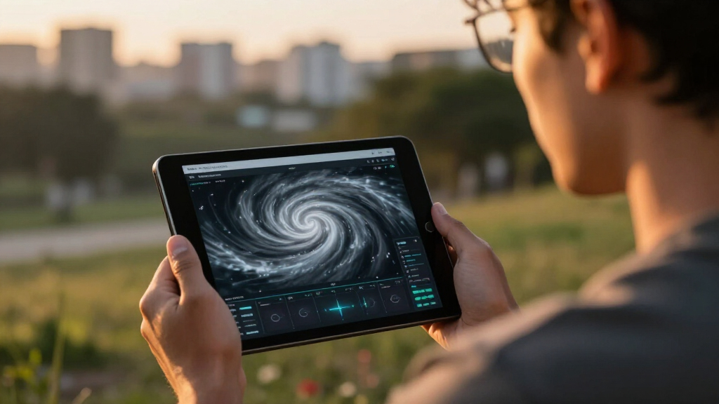
The Vortex Field Unit has developed a novel AI-driven visualization that renders complex supercell storm data entirely through procedural graphics, without relying on external media assets. This breakthrough highlights how disciplined, data-driven rendering can effectively portray dynamic weather phenomena, marking a significant step in digital storm visualization, as explored in the original analysis.
The visualization employs HTML, CSS, and JavaScript to generate layered, animated representations of storm features such as funnel clouds and radar hooks, similar to techniques discussed in the original analysis. It synchronizes multiple visual layers—simulating cloud rotation, rain curtains, and reflectivity—based solely on a normalized scroll value, which acts as a master control. This method allows the storm’s evolution to unfold in harmony, reaching key stages at specific scroll points, without static images or external requests.
The interface uses a restrained color palette—deep greens, slate tones, amber accents—that evokes a stormy atmosphere while maintaining clarity. Typography combines a condensed, display font for headlines with monospaced fonts for telemetry, ensuring legibility. Inline SVGs and Canvas elements depict the intercept map, pressure traces, and route lines, all generated dynamically and hosted entirely on-site. The entire system is built from scratch, with no external frameworks or image assets, emphasizing data accuracy and visual discipline.
How AI Can Render Signature Storm Data Without Visual Assets
Vortex Field Unit’s approach turns supercell structure, movement, and telemetry into synchronized code-driven graphics—without photographs, video, frameworks, or remotely hosted visual media.
A storm assembled as coordinated data layers
Instead of treating the storm as a finished picture, the system treats it as a collection of controllable visual fields. Each layer responds to the same timeline, allowing the scene to evolve as one coherent event.
Cloud rotation
Layered gradients, masks, shapes, and transforms suggest a rotating supercell structure without relying on photographic cloud textures.
Rain curtains
Repeated procedural elements vary in density, position, and movement to communicate shifting precipitation around the storm core.
Reflectivity hook
Generated paths and color fields depict the curved radar structure associated with rotating supercells and potential tornadic development.
Intercept map
Inline SVG geometry produces routes, field positions, and spatial references entirely within the page’s own code.
Pressure traces
Canvas and vector elements translate changing measurements into compact charts that share the storm’s synchronized progression.
Scroll timing
A normalized scroll value becomes the master clock, bringing specific features into view at deliberately chosen moments.
One input drives the entire storm sequence
The system maps a viewer’s position to a shared value between zero and one. Every visual layer reads that same signal, keeping motion, telemetry, and narrative events aligned.
Scroll input
The viewer moves through the page.
Normalize
Position becomes a value from 0 to 1.
Map stages
Thresholds define key storm moments.
Update layers
Cloud, rain, radar, and data respond.
Reveal event
The storm unfolds as one visual system.
🧭 Viewer position → ⚙️ normalized control → 🌀 storm rotation → 🌧️ precipitation field → 📡 radar and telemetry
Procedural graphics change what the page can control
Traditional imagery offers immediate realism, but code-driven rendering provides direct control over timing, state, and adaptation. The tradeoff is a greater need for scientific validation.
| Capability | Static imagery | Video assets | Procedural rendering |
|---|---|---|---|
| Runs without external visual media | ✗ | ✗ | ✓ |
| Supports state-by-state interaction | ✗ | ~ | ✓ |
| Can synchronize multiple data layers | ~ | ~ | ✓ |
| Can adapt to changing input | ✗ | ✗ | ✓ |
| Provides photographic realism by default | ✓ | ✓ | ~ |
| Confirmed live-data integration | ✗ | ✗ | ~ |
Strong concept, incomplete validation
The project demonstrates a compelling visualization method. It does not yet establish that the generated storm forms precisely match observed meteorological data or can scale to operational forecasting.
Capability maturity
Qualitative assessment based on the described implementation, not an independent scientific benchmark.
What must be resolved next
Broader adoption depends on connecting the visual system to trustworthy measurements, testing its accuracy, and proving that it remains clear across more weather types and use cases.
Does the rendering accurately reflect real storm data?
The relationship between the procedural forms and verified meteorological measurements has not been fully documented.
Can the system consume live weather feeds?
Real-time integration remains a future possibility rather than a confirmed production capability.
How much of the visual generation is AI-driven?
The precise division between AI-assisted creation, authored logic, and runtime procedural rendering is not yet clear.
Can the method scale beyond supercells?
Additional testing is needed for hurricanes, floods, winter storms, and other complex atmospheric events.
Advancement in Data-Driven Weather Visualization
This development matters because it demonstrates that detailed, realistic storm simulations can be produced entirely through procedural graphics, reducing reliance on static images or external media. It opens new avenues for real-time weather visualization, educational tools, and research, where dynamic data can be represented more flexibly and interactively. The approach also underscores the potential for AI and web technologies to create immersive scientific storytelling that is both precise and engaging.
weather data visualization software
As an affiliate, we earn on qualifying purchases.
As an affiliate, we earn on qualifying purchases.
Innovative Use of Procedural Graphics in Storm Data Rendering
Traditional weather visualizations often depend on static images, video assets, or external media to depict storm phenomena. Recent efforts by AI and web developers aim to shift toward dynamic, code-based representations that can adapt in real time. The Vortex Field Unit’s project follows this trend, building on advances in procedural graphics, web animation, and data synchronization. The site is part of a broader initiative to explore how disciplined, code-driven visualization can improve understanding and communication of complex weather events.
“This approach proves that detailed storm features can be simulated purely through synchronized layers of procedural graphics, without external images.”
— an anonymous researcher
storm simulation visualization tools
As an affiliate, we earn on qualifying purchases.
As an affiliate, we earn on qualifying purchases.
What Aspects of the Visualization Are Still Unconfirmed
It is not yet clear how accurately the procedural graphics reflect real storm data or whether the visualization can adapt to live data feeds. The extent of AI involvement in generating the visual layers remains unspecified, and the scalability of this approach for broader meteorological applications is still under exploration.
procedural graphics software for weather
As an affiliate, we earn on qualifying purchases.
As an affiliate, we earn on qualifying purchases.
Future Developments and Potential Expansions
Further testing and validation are expected to determine how well this visualization method can be integrated with live weather data streams. Developers may also explore expanding the system to depict other weather phenomena or to enhance interactivity, offering real-time, data-driven storm simulations in various contexts. Continued critique and refinement will shape its adoption in scientific and educational settings.
As an affiliate, we earn on qualifying purchases.
Key Questions
How does this AI visualization differ from traditional storm imagery?
It uses procedural graphics generated via code, synchronized through scroll interaction, instead of static images or external media assets, allowing dynamic, real-time simulation of storm features.
Can this method be used with live weather data?
It is currently unclear if the system can integrate live data feeds; further development is needed to adapt it for real-time meteorological use.
What are the advantages of procedural graphics in weather visualization?
Procedural graphics reduce reliance on static assets, enable dynamic updates, and allow precise control over visual features, enhancing clarity and interactivity.
Is this visualization accessible for educational purposes?
Yes, its web-based, code-driven design makes it suitable for educational tools, provided it is further refined for broader usability and data accuracy.
What remains to be developed before this can be widely adopted?
Integration with live data feeds, validation of visual accuracy, and scalability for different storm types are key steps before broader deployment.
Source: ThorstenMeyerAI.com
Columbus Day / Indigenous Peoples' Day Picks
long weekend sales
As an affiliate, we earn on qualifying purchases.