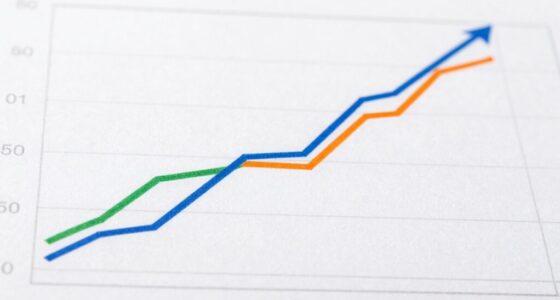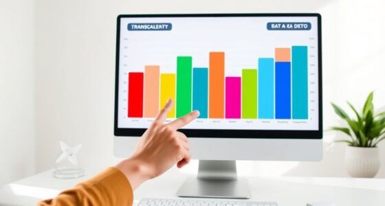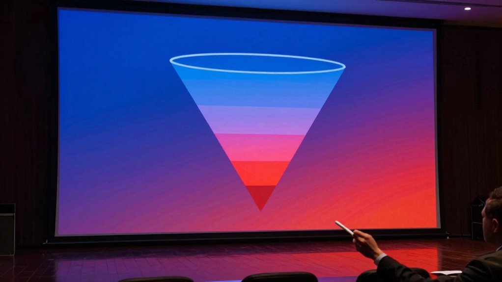
Funnel charts help you visualize sales stages, spot bottlenecks, and identify where potential customers drop off, guiding your optimization efforts. However, they can mislead if you ignore the context or assume a purely linear process. Wide top or narrow middle sections might not tell the full story, and external factors can impact results. To uncover deeper insights and avoid pitfalls, keep exploring the details behind the chart data.
Listen free for 30 days with Audible
Thousands of audiobooks and originals — cancel anytime.
As an affiliate, we earn on qualifying purchases.
Key Takeaways
- Funnel charts effectively visualize process stages and identify bottlenecks but can oversimplify complex, non-linear sales paths.
- They are helpful when combined with additional data and analysis but may mislead if used in isolation.
- Wide top or narrow middle sections can be misinterpreted without context, risking incorrect assumptions about performance.
- Proper interpretation requires understanding external factors and potential drop-off reasons beyond the visual data.
- Use funnel charts as starting points for deeper analysis rather than sole decision-making tools.
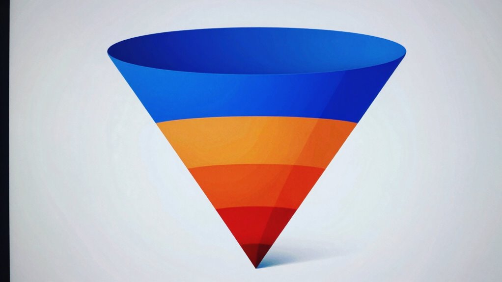
Have you ever wondered how to visualize the stages of a process or sales funnel clearly and effectively? Funnel charts are a popular tool for doing just that. They help you see how prospects move through different phases, from initial awareness to final conversion. When used correctly, funnel charts can give you a clear picture of your sales process, identify bottlenecks, and inform your marketing analysis. They’re especially useful in highlighting where potential customers drop off and can guide you in optimizing each stage for better results.
However, it’s important to remember that funnel charts are not foolproof. They can be misleading if you interpret them without context or ignore their limitations. A funnel chart simplifies a complex process into a straightforward visual, but that simplicity can hide important nuances. For example, a wide top might suggest strong awareness, but it doesn’t tell you why prospects are dropping off later in the process. Similarly, a narrow middle could indicate a problem in engagement or qualification, but without additional data, it’s hard to know for sure.
One of the key pitfalls is that funnel charts often assume a linear process, which isn’t always the case. Many sales processes involve multiple paths, loops, or iterations, which a basic funnel chart can’t capture. This can lead you to think your process is more straightforward than it really is, causing you to overlook opportunities for improvement or misallocate resources. Additionally, funnel charts tend to focus on quantity rather than quality. While they show how many prospects move from one stage to the next, they don’t provide insights into the value or readiness of those leads. As a result, you might mistakenly prioritize increasing volume over nurturing high-quality leads. Recognizing that exponential growth can occur in certain segments of your sales process can help you better interpret your data and focus on strategies that drive sustainable success.
To maximize the benefits of funnel charts, you need to combine them with thorough marketing analysis and other data sources. Use them as a visual aid to identify where prospects drop off, but don’t rely solely on the chart for decision-making. Dive deeper into your data to understand why certain stages underperform, and consider external factors that might influence your sales process. Integrating additional data sources and understanding their role can help you develop a more comprehensive strategy. When you do this, funnel charts become not just a visualization tool, but a starting point for actionable insights. But be cautious—always question what the chart shows and what it might be hiding. Understanding the content formats and how they relate to your process can help you develop a more comprehensive strategy. Incorporating U.S. tax law updates and understanding their impact on your business can also influence how you interpret and leverage your data. When used thoughtfully, funnel charts can be a powerful part of your strategy, but they shouldn’t be the only tool in your kit.
sales funnel visualization tools
As an affiliate, we earn on qualifying purchases.
As an affiliate, we earn on qualifying purchases.
Frequently Asked Questions
How Do Funnel Charts Compare to Other Visualization Tools?
You find funnel charts useful for visualizing the customer journey and tracking conversion analysis across different stages. Compared to other tools, they clearly show drop-offs and bottlenecks, helping you identify areas for improvement. However, they can be misleading if stages aren’t correctly defined or if data isn’t normalized. While great for straightforward processes, for complex data, other visualizations like heat maps or flow diagrams might provide more insights.
What Are Common Mistakes When Interpreting Funnel Charts?
Ever wonder if you’re reading funnel charts correctly? Common mistakes include falling for interpretation biases, like assuming the largest segment is always the most critical, or oversimplifying data by ignoring context. You might misjudge the flow or overlook subtle trends, leading to flawed conclusions. To avoid this, question your assumptions and consider additional data points. Remember, funnel charts are a tool—use them thoughtfully to uncover the full story behind the numbers.
Can Funnel Charts Be Used for Non-Sales Data?
Yes, you can use funnel charts for non-sales data. They’re great for visualizing stages in processes like recruitment, project management, or customer onboarding. For example, you might track how many applicants move through each hiring phase or how tasks progress through project phases. These alternative uses help identify bottlenecks and inefficiencies, making funnel charts a versatile tool beyond just sales analysis.
How Can I Improve the Accuracy of Funnel Chart Data?
Imagine your funnel chart is a fragile sandcastle—every grain counts. You improve its accuracy through diligent data validation, double-checking sources, and standardizing inputs. Keep a close eye on the margin of error, understanding its influence on your insights. By tightening data quality and acknowledging potential inaccuracies, you make certain your funnel reflects reality more than a funhouse mirror, guiding smarter decisions rather than whimsical guesses.
Are There Software Tools Specifically for Creating Funnel Charts?
Yes, you can find software options specifically for creating funnel charts. Tools like Tableau, Power BI, and Google Data Studio offer robust customization features, allowing you to tailor your funnel charts to fit your needs. These platforms enable you to adjust colors, labels, and data segments easily, helping you create clear, insightful visualizations that effectively communicate your data story. Choose one based on your budget and complexity requirements for the best results.
As an affiliate, we earn on qualifying purchases.
Conclusion
Funnel charts are powerful tools when used correctly, helping you visualize processes and identify bottlenecks. However, they can mislead if you ignore their limitations. For instance, did you know that a study found 60% of users misinterpret funnel data, often overestimating conversion rates? Keep a critical eye and supplement funnel charts with other metrics to get a clearer picture. When used thoughtfully, they can truly transform your understanding of your sales or marketing processes.
As an affiliate, we earn on qualifying purchases.
As an affiliate, we earn on qualifying purchases.
Flea & tick season Picks
flea and tick prevention
As an affiliate, we earn on qualifying purchases.