
To guarantee your data visuals are ethical, focus on representing data honestly and avoiding misleading shortcuts like cherry-picking or manipulating scales. Be transparent by clearly sharing sources, methods, and limitations to build trust. Respect privacy by anonymizing sensitive information and choosing appropriate visualization techniques. Recognize potential biases and disclose any assumptions so your audience can critically assess your work. Keep these principles in mind, and you’ll deepen your understanding of responsible data visualization.
Key Takeaways
- Use honest scales and avoid cherry-picking data to prevent misleading representations.
- Clearly disclose data sources, methodology, and limitations for transparency.
- Handle sensitive data responsibly by anonymizing and aggregating to protect privacy.
- Acknowledge potential biases and limitations to promote critical assessment.
- Tailor visuals to audience needs and context to avoid confusion and uphold integrity.

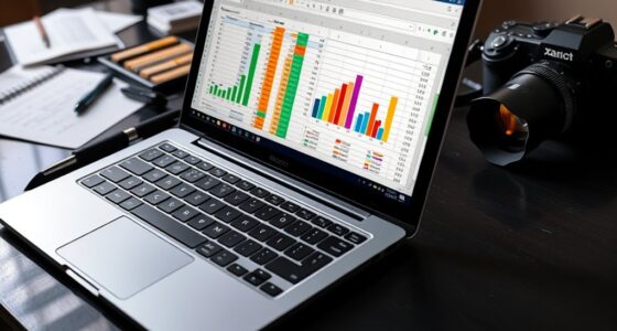
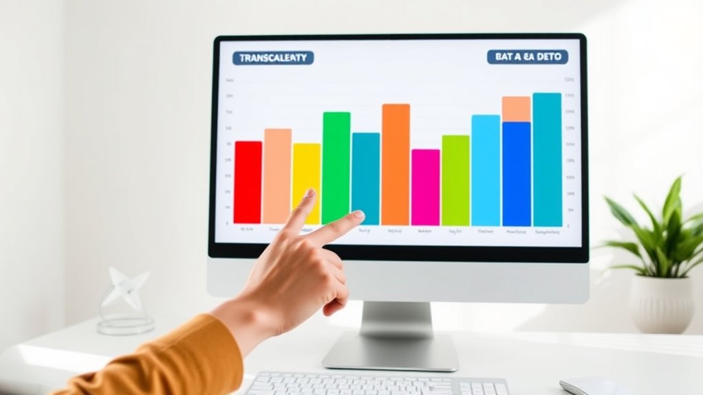
Data visualization plays a essential role in how we interpret information, but with great power comes great responsibility. When you create visual representations of data, you’re shaping perceptions and influencing decisions. That’s why it’s imperative to avoid misleading representations that can distort reality. For example, manipulating the scale of a graph or cherry-picking data points can give a false impression of trends or relationships. You need to make sure that your visuals accurately reflect the underlying data without exaggerating or downplaying important details. Misleading visuals can lead to misinformed decisions, eroding trust and damaging credibility. Transparency about data sources, methodology, and limitations is fundamental to maintain integrity. Clear labels, consistent scales, and honest portrayals help your audience understand the true story behind the visuals. Incorporating diverse design options can also help communicate data more effectively to different audiences. Privacy concerns are another essential aspect to think about in ethical data visualization. When handling sensitive data, it’s tempting to include detailed visuals that reveal personal or confidential information. However, exposing identifiable details can compromise privacy and violate ethical standards. You should anonymize data whenever possible and avoid displaying information that could be traced back to individuals. Respect for privacy not only protects individuals but also safeguards your reputation and complies with legal regulations. Striking a balance between informative visuals and privacy preservation is important. For instance, aggregating data into broader categories or using heat maps instead of individual identifiers can provide insights without risking privacy breaches. Additionally, it’s your duty to be aware of potential biases in your data and how they might influence your visualizations. Biases can sneak in through the data collection process, filtering choices, or even your own subjective interpretations. Recognizing these biases helps you create more balanced and fair visuals. You should also disclose any limitations or assumptions behind your visualizations, so viewers can critically assess the information. This openness fosters trust and encourages informed decision-making. Finally, always think about the context in which your visualization will be viewed. Different audiences require different levels of detail and framing. By being transparent about your methods, respectful of privacy, and vigilant against misleading representations, you make sure your visualizations serve as ethical tools for understanding data rather than sources of confusion or harm. In doing so, you uphold the integrity of your work and contribute to a more honest and responsible data culture.
Frequently Asked Questions
How Can I Identify Hidden Biases in Data Visualizations?
You can identify hidden biases in data visualizations by closely analyzing for statistical distortions that may skew interpretation. Look for manipulated scales, cherry-picked data, or misleading visuals that influence perception manipulation. Question the source and context of data, and compare with other visualizations. Being critical helps you spot subtle biases, ensuring you don’t fall prey to misrepresentations that could distort understanding or reinforce stereotypes.
What Are Common Ethical Pitfalls in Chart Design?
You might fall into common ethical pitfalls in chart design by choosing color choices that mislead or obscure data, like overly vibrant hues or inconsistent palettes. Also, neglecting to disclose your data source can undermine transparency and trust. Be mindful of these issues, verify your color choices accurately represent data, and always cite your sources to maintain integrity and avoid unintentional bias in your visualizations.
How Do Cultural Differences Impact Visualization Interpretation?
You should recognize that cultural perceptions profoundly influence how viewers interpret visualizations. Interpretive differences can lead to varied understandings of data depending on cultural backgrounds, symbols, or color meanings. To communicate effectively, you need to take these differences into account when designing charts, ensuring your visualization is inclusive and clear across diverse audiences. This approach helps prevent misinterpretation and promotes transparency, making your data accessible and ethically sound for everyone.
Can Algorithms Themselves Introduce Bias in Automated Visualizations?
Think of algorithms as mirrors reflecting their creators’ biases. Yes, algorithms can introduce bias in automated visualizations, especially through algorithm bias, skewing interpretation. Transparency challenges arise when it’s unclear how data is processed or decisions are made. For example, if an algorithm emphasizes certain data points over others, it can mislead viewers. Recognizing these issues helps you critically evaluate visualizations and advocate for clearer, fairer data practices.
What Role Does User Feedback Play in Ethical Visualization?
You play a vital role in ethical visualization through your feedback. Your engagement helps creators identify biases and improve transparency. By participating in feedback loops, you guarantee visualizations accurately reflect data and user concerns. Your input guides adjustments, making visuals more honest and fair. Active user feedback promotes accountability, helping prevent unintentional bias and fostering trust in the data presented. Your voice truly shapes ethical and transparent visualizations.
Conclusion
Remember, your data is like a mirror—reflecting reality but also shaping perceptions. By choosing honesty over distortion, you hold the torch that guides others through the fog of bias. Transparency is your compass, steering viewers toward truth. When you visualize ethically, you’re planting seeds of trust that grow into clarity and understanding. Stay vigilant, and let your charts be the lighthouse that illuminates genuine insight in a sea of noise.