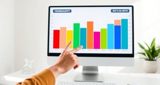

Dumbbell charts are an effective way for you to compare two related data points quickly and clearly. They visually connect two values with a simple line, making discrepancies or similarities stand out instantly. This minimalistic design reduces your cognitive load and helps interpret data at a glance. Whether tracking progress or analyzing categories, they simplify your analysis and sharpen your insights. Want to discover how to create and customize them effectively? Keep exploring to unveil their full potential.

Get business pricing on monitors, keyboards and dev gear
- Business-only prices and quantity discounts
- Tax-exempt purchasing
- Multiple users, one account, clear invoices
Key Takeaways
- Dumbbell charts visually emphasize the difference or similarity between two related data points, making comparisons clearer.
- They simplify data interpretation by focusing solely on two values, reducing cognitive load.
- Suitable for tracking changes over time or between categories with quick, intuitive insights.
- Customizable with colors and annotations to highlight specific disparities or trends effectively.
- Ideal for reports and dashboards, enhancing data storytelling through straightforward visual comparison.

Dumbbell charts are a simple yet effective way to visualize the comparison between two related data points. They provide a clear visual representation that makes it easy to see differences or similarities at a glance. When you’re working with data visualization, choosing the right comparison technique is vital to communicate your message effectively. Dumbbell charts excel in this area because they combine simplicity with clarity, offering an intuitive way to compare two sets of values side by side.
Imagine you’re analyzing sales figures for two different months or comparing the performance of two products. Instead of presenting this information in a cluttered table or a complex graph, a dumbbell chart places two points on a horizontal axis, connected by a line resembling a dumbbell. This connection immediately draws your eye to the distance between the two points, making it obvious whether one value is higher, lower, or roughly the same as the other. Because the chart emphasizes the difference rather than the individual values alone, it’s an excellent choice for highlighting disparities or shifts over time.
Dumbbell charts highlight differences over time by connecting two points, making disparities clear and easy to interpret at a glance.
In terms of data visualization, dumbbell charts stand out because they effectively simplify comparison techniques. They eliminate extraneous details, focusing solely on the two data points and their relationship. This approach reduces cognitive load, allowing viewers to grasp the key message quickly. Whether you’re analyzing survey responses, financial metrics, or operational data, dumbbell charts help you communicate the core insight without overwhelming your audience with unnecessary complexity. Additionally, they can be used to highlight trends over time or between categories, further enhancing their utility in various contexts.
Furthermore, dumbbell charts are versatile. You can adapt them to various contexts, such as tracking progress between two periods or comparing categories within a dataset. Their minimalist design makes them suitable for reports, dashboards, or presentations where clarity is paramount. Plus, they can be easily customized with colors or annotations to highlight specific insights, making your comparison even more impactful. When selecting a visualization tool, considering the Vetted conversion kits can help ensure compatibility and performance.
Using dumbbell charts isn’t just about aesthetics; it’s about enhancing understanding. They allow you to visually demonstrate differences, similarities, or changes, making your data storytelling more compelling. When you want your audience to quickly grasp the extent of a variation or to see how two values relate, this chart type is often the best choice. It streamlines the comparison process, ensuring your message is both accessible and persuasive. In short, if you’re looking for an efficient comparison technique that improves data visualization and clarity, dumbbell charts should be at the top of your toolkit.
Additionally, dumbbell charts are particularly effective because they can clearly represent visual comparison in a straightforward manner, making complex data easier to interpret.
As an affiliate, we earn on qualifying purchases.
Frequently Asked Questions
How Do Dumbbell Charts Compare to Bar Charts?
You’ll find dumbbell charts more effective than bar charts when comparing two related values because they highlight differences clearly with color contrast and visual emphasis. Dumbbell charts use distinct colors for each data point and include data labeling, making it easier to see variations at a glance. Unlike bar charts, they focus on the relationship between two values, providing a cleaner, more direct comparison for your analysis.
Can Dumbbell Charts Display More Than Two Values?
While dumbbell charts are primarily designed for comparing two values, you can get creative with alternative visualizations for multi-variable comparisons. They don’t naturally support displaying more than two values simultaneously, but you could layer multiple dumbbell charts or consider other options like radar or spider charts. These alternatives help you visualize complex, multi-variable data, offering a more all-encompassing view when comparing several values at once.
What Are Common Mistakes When Creating Dumbbell Charts?
You might make mistakes like neglecting proper color contrast, which can make differences hard to see, or skipping clear data labeling, leading to confusion. Guarantee your chart uses distinct, contrasting colors for each value to improve readability. Also, label each data point clearly so viewers grasp the comparison instantly. Avoid cluttering the chart, and double-check that the visual elements accurately represent your data, making your dumbbell chart effective.
Are Dumbbell Charts Suitable for Small Data Sets?
Yes, dumbbell charts work well for small datasets because they keep the chart simple and clear. With fewer data points, the visual impact is more apparent, making it easier to compare two values side by side. Larger datasets can make the chart complex and harder to interpret, so stick to small datasets for an effective and straightforward comparison. This way, your audience can quickly grasp the differences.
How Do I Interpret Overlapping Dumbbell Chart Lines?
When lines overlap in a dumbbell chart, it can hinder visual clarity and make data interpretation tricky. You should look closely at the position of the endpoints, as overlapping lines may indicate similar values. To maintain data accuracy, consider adding labels or adjusting spacing to differentiate values clearly. This way, you guarantee your audience easily understands the comparison without confusion, keeping your chart both precise and easy to interpret.
data comparison visualization tools
As an affiliate, we earn on qualifying purchases.
As an affiliate, we earn on qualifying purchases.
Conclusion
Think of dumbbell charts as your trusty bridge between two islands, allowing you to see the distance clearly and understand the journey’s challenge. Just like a well-constructed bridge reveals the gap and guides your path, these charts illuminate differences at a glance, making comparisons effortless. Embrace this visual tool, and you’ll navigate data with confidence, turning complex numbers into a simple, compelling story—one that invites you to cross over and uncover insights with ease.
chart creation tools for dashboards
As an affiliate, we earn on qualifying purchases.
As an affiliate, we earn on qualifying purchases.
As an affiliate, we earn on qualifying purchases.
Fall Picks
fall essentials
As an affiliate, we earn on qualifying purchases.