Cheap displays amplify common data visualization mistakes by distorting colors and blurring details. When you use pie charts or complex graphics, it can confuse your audience and obscure key insights. Poor contrast and blending elements weaken your message, making it harder for viewers to engage. Interactivity suffers too, causing frustration and disengagement. To guarantee your data’s story shines through, consider how display quality affects your visuals. There’s more to explore about improving your data presentation effectively.
Key Takeaways
- Low-quality displays distort colors, leading to misinterpretation of data trends and emotional cues.
- Pie charts lose clarity on cheap screens, making it hard to distinguish data segments.
- Poor resolution blurs details in visualizations, compromising effective storytelling and audience understanding.
- Interactive elements may lag or fail, reducing engagement and the ability to explore data deeply.
- Incompatible software and hardware can hinder visualization quality, resulting in viewer disinterest and frustration.

When you immerse yourself in data visualization, it’s easy to overlook common pitfalls that can skew your message. Cheap displays often exacerbate these mistakes, making it vital to recognize how they compromise your visuals. You might select vibrant color choices to enhance engagement, but if the display can’t render those colors accurately, your data loses its impact. The right hues can convey emotions or highlight trends, but poor-quality screens distort them, leading to misinterpretation. Additionally, screen resolution limitations can blur fine details, making it harder for viewers to interpret complex data accurately. Chart types play an important role in conveying your message effectively. You could choose a pie chart to illustrate proportions, but on a subpar display, the clarity of those slices diminishes. When the audience struggles to distinguish between segments, you risk losing their understanding of the data. Instead, consider utilizing bar charts or line graphs, which are generally easier to read, especially on less capable displays. The goal is to guarantee that your audience can grasp the insights without confusion. Audience understanding is paramount in data visualization. If your visuals don’t resonate with your viewers, the effort you put into data clarity is wasted. Cheap displays can obscure fine details that might be instrumental in telling your story. Remember, design principles like hierarchy and contrast matter. When elements blend together due to poor display quality, your message becomes muddled. Clear labeling and thoughtful design guarantee that your audience can follow along, regardless of the display’s limitations. Interactive elements can enhance engagement, but they also come with challenges. Cheap displays may not support the fluidity and responsiveness you need for a seamless experience. If your audience can’t interact with the data as intended, the storytelling techniques you employ fall flat. You want your viewers to dive deeper into the information, but when the technology holds them back, you lose that connection. Lastly, software limitations can hinder your visualization efforts. Even the best tools can’t compensate for a display that can’t handle complex graphics or animations. If your audience can’t see the finer details or if the visuals lag, they’ll quickly lose interest. Always verify that your software and hardware work in tandem to create a compelling experience.
high resolution computer monitor for data visualization
As an affiliate, we earn on qualifying purchases.
As an affiliate, we earn on qualifying purchases.
Frequently Asked Questions
How Can I Improve My Data Visualization Skills?
To improve your data visualization skills, focus on data storytelling; it helps convey your message effectively. Start by understanding your audience and the story you want to tell with your data. Prioritize visualization ethics by ensuring accuracy and avoiding misleading representations. Experiment with different tools and techniques to find what works best for you, and seek feedback from peers to refine your approach. Practice consistently, and you’ll see significant improvement!
What Tools Are Best for Creating Effective Visualizations?
Creating effective visualizations is like painting a picture; the right tools bring your ideas to life. You should consider tools like Tableau, Power BI, and Google Data Studio. These platforms offer various chart types and adhere to design principles that enhance clarity. They help you choose the best visuals for your data, ensuring your message shines through. Experiment with these tools to refine your skills and create compelling visual narratives.
Are There Best Practices for Color Selection in Charts?
Yes, there are best practices for color selection in charts. You should prioritize color contrast to guarantee clarity and accessibility. Consider color blindness by using color palettes that everyone can distinguish. Aim for color harmony to create a visually appealing design, and think about the emotional response different colors evoke. By following these guidelines, you’ll enhance your visualizations and make them more effective for your audience.
How Do Cultural Differences Affect Data Interpretation?
Cultural differences shape how you interpret data like a painter’s brush colors a canvas. Your cultural context influences the visual symbols you see and understand. For instance, a color that symbolizes luck in one culture might represent danger in another. When you’re digesting data, these symbols can lead to misinterpretations or insights. So, it’s essential to reflect on your audience’s background to guarantee your message resonates effectively and accurately.
What Role Does Audience Engagement Play in Data Visualization?
Audience engagement plays a significant role in data visualization. You need to take into account audience preferences and incorporate interactive elements to spark interest. Use storytelling techniques to create a narrative that resonates, enhancing emotional impact. Visual clarity is essential; it guarantees your message isn’t lost. Establish feedback loops to gauge understanding and adjust your approach. By focusing on these aspects, you’ll create a more compelling and effective data visualization that truly connects with your audience.
color accurate display for presentations
As an affiliate, we earn on qualifying purchases.
As an affiliate, we earn on qualifying purchases.
Conclusion
To summarize, cheap displays can amplify data visualization mistakes, making it harder for viewers to grasp essential insights. For instance, imagine a marketing team presenting sales data on a low-resolution screen. The blurry charts distort trends, leading to misinterpretations and misguided strategies. By investing in quality displays, you guarantee that your visualizations communicate effectively, enabling informed decision-making and clearer understanding among stakeholders. Don’t let poor visuals undermine the power of your data!
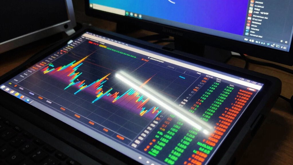
interactive touchscreen display for data analysis
As an affiliate, we earn on qualifying purchases.
As an affiliate, we earn on qualifying purchases.
professional data visualization monitor
As an affiliate, we earn on qualifying purchases.
As an affiliate, we earn on qualifying purchases.