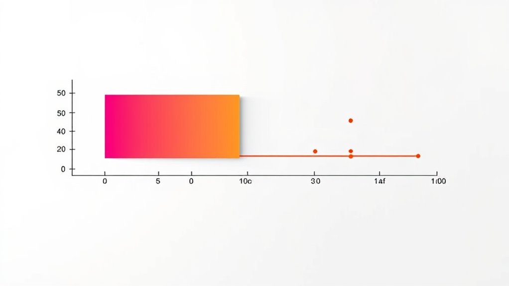

A box plot visually summarizes your data’s distribution, showing key parts like the median, interquartile range (IQR), and overall spread. The box represents the middle 50% of your data, while the lines (whiskers) extend to the minimum and maximum within 1.5 times the IQR. Outliers appear as dots beyond the whiskers. By understanding these components, you can quickly analyze your data’s spread, symmetry, and unusual points. Keep exploring to learn how each feature reveals specific data insights.
Key Takeaways
- A box plot visualizes data distribution using a box for the interquartile range, a median line, whiskers, and outliers.
- The box shows the middle 50% of data, with its length indicating variability and spread.
- Whiskers extend to the smallest and largest data points within 1.5 times the IQR, highlighting the overall range.
- Outliers are plotted beyond the whiskers as individual points, indicating unusually high or low values.
- By examining the median, box, whiskers, and outliers, you can interpret data symmetry, skewness, and spread quickly.
Understanding the Basic Components of a Box Plot

To understand a box plot, it’s essential to recognize its main components. The box itself shows the interquartile range (IQR), spanning from Q1 to Q3, highlighting the middle 50% of your data. Juice cleansing can influence data variability in health studies, making the understanding of distribution important. The length of the box reflects the data’s variability, which is essential for understanding data distribution and identifying data spread. Inside the box, a line marks the median, dividing the data into two halves. Whiskers extend from the box to the minimum and maximum values within 1.5 times the IQR, illustrating data spread outside the central range. Outliers are plotted beyond the whiskers as individual points, indicating unusually high or low values. The position of the median line indicates the data’s center. Understanding these components helps you grasp the distribution, spread, and potential outliers in your dataset.
How to Interpret the Five-Number Summary

Understanding the five-number summary allows you to interpret a dataset’s distribution quickly and effectively. The minimum and maximum values reveal the data’s range, showing the lowest and highest points. The median divides the data into two equal halves, indicating the central tendency. Accurate color representation is essential for visual clarity, especially when analyzing detailed data visualizations. Q1 and Q3 mark the 25th and 75th percentiles, helping you see where most data points cluster. The interquartile range (IQR), calculated as Q3 minus Q1, shows the spread of the middle 50%. If data points fall outside 1.5 times the IQR from Q1 or Q3, they’re potential outliers. This method is based on statistical principles that provide a comprehensive overview of data distribution. By examining these five key numbers, you get a clear picture of the data’s center, spread, and symmetry, enabling better understanding and comparison of datasets.
Analyzing Data Spread and Variability With the IQR and Whiskers

Analyzing data spread and variability with the IQR and whiskers helps you understand how data points are distributed around the center. The IQR, representing the middle 50% of data, shows where most values cluster and indicates variability. A larger IQR means more spread within the central data, while a smaller IQR suggests tighter grouping. Incorporating special events and themed breakfasts can also help illustrate how data variability impacts community engagement metrics. Whiskers extend from the box to the smallest and largest data points within 1.5 times the IQR from Q1 and Q3, revealing expected variation outside the middle range. Longer whiskers imply greater overall spread, whereas unequal lengths can indicate skewness or asymmetry. Recognizing outliers is important as they can significantly influence the interpretation of data spread and variability.
Detecting Outliers and Skewness in a Box Plot

Detecting outliers and skewness in a box plot sharpens your view of the data’s distribution. Outliers are points outside the whiskers that signal unusually high or low values, identified using the IQR rule—any data more than 1.5 IQRs from Q1 or Q3. These outliers can skew analysis and should be noted. Additionally, understanding the characteristics of different water parks can help contextualize the data patterns you observe. Recognizing the distribution shape is crucial for interpreting data accurately. Skewness is visible when the median isn’t centered; if it’s closer to Q1, the data is right-skewed, and if nearer to Q3, left-skewed. Symmetry appears when the median is in the middle, with balanced whiskers.
Practical Applications and Benefits of Using Box Plots

Box plots offer a practical way to compare multiple groups quickly, making it easy to see differences in their distributions at a glance. You can assess central tendencies, such as medians, and understand variability through the spread of the boxes and whiskers. Additionally, they can reveal outliers that may affect the analysis or interpretation of the data. This makes box plots valuable in experiments, business performance analysis, and educational assessments, where comparing groups is essential. They condense large datasets into simple five-number summaries, highlighting the range, interquartile range, and potential outliers. By visually displaying data shape and spread, box plots help identify skewness and symmetry. Understanding the appropriate tip size is crucial for optimal results and accurate data representation. They serve as efficient tools for initial data exploration, guiding further analysis, and improving communication with stakeholders.
Frequently Asked Questions
How Do I Create a Box Plot From Raw Data?
You start by organizing your raw data, sorting it for clarity.
Calculate key values: minimum, maximum, median, Q1, and Q3.
Find the interquartile range (IQR) to identify outliers.
Use software like Excel, Tableau, or online tools to input these values, then create a stacked chart.
Convert it into a box plot by removing extra series, adding whiskers, and customizing colors and labels for clear visualization.
What Software Tools Can Generate Box Plots?
Imagine you’re a chef selecting tools for your kitchen; choosing the right one makes all the difference. Similarly, software like Displayr, BoxPlotR, and Excel can generate box plots. You can customize colors, orientations, and data input methods.
Whether web-based or desktop, these tools help you visualize data’s story clearly. Pick the right software to craft precise, professional box plots that reveal your data’s hidden insights.
Can Box Plots Be Used for Categorical Data?
You might wonder if box plots can be used for categorical data. They aren’t designed to display categorical data directly but are great for comparing a continuous variable across different categories.
You group your data by categories, then create side-by-side box plots. This visual helps you see differences in medians, spreads, and outliers across categories, making it easier to analyze relationships between categorical and continuous variables.
How Does Sample Size Affect Box Plot Accuracy?
Picture your data as a story, and sample size as its audience. When your sample size grows, your box plot becomes a clearer narrator, revealing true distribution and reducing misleading outliers.
Larger samples boost accuracy, making it easier to trust medians and detect skewness. Conversely, small samples can hide variability, like a quiet voice, leading to misinterpretations.
What Are Common Mistakes When Interpreting Box Plots?
When interpreting box plots, you often make mistakes like confusing the box’s area with data frequency, or misreading whiskers as non-data points.
You might also mix up the median with the mean or overlook outliers beyond the whiskers.
Additionally, misunderstanding the interquartile range as the overall spread, or failing to recognize skewed distributions, can lead to incorrect conclusions.
Always double-check what each element truly represents.
Conclusion
So, now that you know how to read a box plot, you’re practically a data wizard—except when it comes to spotting outliers or skewness, which still might surprise you. But hey, who needs perfect insights when you can confidently stare at those mysterious boxes and whiskers? Keep practicing, and maybe someday you’ll impress everyone with your newfound ability to interpret data—and avoid embarrassing misreads. Or, you know, just keep pretending you understand.