
Power BI offers powerful tools to help you understand how your visuals perform and engage users. You can track metrics like click-through rates, time spent, and filter usage, all while maintaining user privacy through data anonymization and access controls. Customizing visuals can boost engagement, and ongoing analysis allows you to refine your reports continually. Keep exploring these features, and you’ll uncover how to optimize your visuals effectively while respecting privacy standards.
Key Takeaways
- Power BI provides built-in tools to track visual engagement metrics like clicks, filters, and time spent for performance analysis.
- Ensuring data privacy and user anonymity is crucial when collecting interaction statistics in Power BI reports.
- Customizing visuals with suitable colors, layouts, and types enhances user engagement and helps interpret interaction data effectively.
- Monitoring visual interaction data supports continuous improvement by identifying which visuals attract more attention and how users interact.
- Combining performance insights with privacy best practices enables data-driven enhancements while maintaining user trust.

Have you ever wondered how to measure the effectiveness of your Power BI visuals? Understanding the impact of your visuals is key to making informed decisions and improving your reports. One of the first steps is to analyze the underlying statistics that reveal how users interact with your visuals. Power BI offers built-in tools and features that help you track engagement, but it’s essential to balance this with a strong focus on data privacy. You want to gather meaningful insights without compromising sensitive information. When collecting data on how users interact with your visuals, ensure you adhere to data privacy standards by anonymizing user data and controlling access. This way, you can confidently evaluate your visuals’ performance while respecting privacy regulations.
Measuring Power BI visual effectiveness involves analyzing interaction data while ensuring data privacy and user anonymity.
Visual customization plays a crucial role in how users perceive and engage with your Power BI reports. By tailoring visuals to your audience’s needs, you can increase their effectiveness. Customization options include adjusting colors, fonts, and layouts to improve clarity and appeal. Moreover, you can experiment with different visual types—like bar charts, pie charts, or scatter plots—to see which ones resonate best. Tracking how users respond to these modifications provides valuable insights into their preferences and behaviors. For example, if a particular chart type garners more interactions or quicker data comprehension, you’ve identified a successful customization. This ongoing process helps you refine your visuals, making them more intuitive and impactful. Additionally, understanding visual engagement can help you create more effective reports tailored to your audience’s preferences.
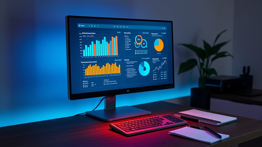
Power BI’s analytics capabilities allow you to gather detailed statistics on your visuals’ performance. You can monitor metrics like click-through rates, filter usage, and time spent on each visual. These insights reveal what captures your audience’s attention and what might need improvement. Using this data, you can optimize your visuals for better engagement by making them more interactive or easier to interpret. Remember, however, that tracking these metrics should be done responsibly. Protect user data by implementing privacy controls, and be transparent about what data you collect. This approach builds trust with your users and ensures compliance with data privacy standards.
In essence, measuring the effectiveness of your Power BI visuals involves analyzing interaction data, customizing visuals to suit your audience, and respecting data privacy. By leveraging Power BI’s built-in tools and maintaining a focus on privacy, you can create reports that are not only visually appealing but also highly effective in conveying insights. Continuous evaluation and refinement based on statistical feedback will elevate your reporting skills and help your organization make smarter, data-driven decisions.
Frequently Asked Questions
How Do I Customize Visual Statistics in Power BI?
To customize visual statistics in Power BI, you start by selecting your visual and exploring the formatting pane. You can adjust colors, labels, and data labels to enhance visual customization. Adding or removing statistical insights like trends or averages helps highlight key data points. Use the analytics pane to insert reference lines or trend lines, making your visuals more insightful and tailored to your reporting needs.
Can Visual Statistics Be Exported or Shared Externally?
You can export or share visual statistics externally, but you need to ensure data privacy when doing so. Power BI allows you to export visuals in formats like PDF or PowerPoint, making it easy to share insights securely. However, always review your organization’s data privacy policies before exporting to consider sensitive information stays protected. Using proper export formats helps maintain data integrity and privacy while sharing your visual statistics externally.
What Are Common Errors When Interpreting Power BI Visual Stats?
When interpreting Power BI visual stats, you often face common errors like visual misinterpretation and data distortion. You might draw incorrect conclusions if you overlook scale differences or misread axes. Always double-check the visual’s context, labels, and data source. Be cautious about cherry-picking data or overgeneralizing trends, as these mistakes can lead to faulty insights and skewed decision-making. Accurate interpretation requires careful analysis and understanding of the visual’s limitations.
How Do Visual Statistics Impact Report Performance?
Ironically, focusing on visual statistics can boost report performance—if you prioritize visual accuracy and use them wisely. They help you quickly identify data issues, enabling performance optimization. But overloading reports with complex visuals may slow down load times and strain system resources. So, your goal is to balance insightful visuals with streamlined performance, ensuring your report remains both accurate and efficient without sacrificing speed or clarity.
Are There Advanced Techniques for Analyzing Visual Statistics?
You can enhance your analysis of visual statistics by exploring advanced techniques like machine learning and predictive analytics. These methods allow you to identify patterns, forecast trends, and gain deeper insights beyond basic metrics. By integrating machine learning algorithms, you automate anomaly detection and segmentation. Predictive analytics helps you anticipate future performance, making your reports more dynamic and insightful. Leveraging these techniques empowers you to make smarter, data-driven decisions efficiently.
Conclusion
By understanding Power BI visual statistics, you unleash powerful insights effortlessly. Did you know that dashboards with visualized data can increase decision-making speed by up to 60%? This highlights how mastering these tools can transform raw data into actionable intelligence quickly. Keep exploring, and you’ll find that the more you harness visual statistics, the more confident you’ll become in making informed, impactful business decisions.