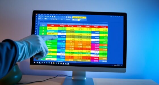
To get creative with data visualization in Excel using limited tools, you can combine multiple chart types like bars and lines, or add secondary axes for different scales. Customize colors, fonts, and labels to highlight key points and improve clarity. Use intuitive formatting options to enhance visuals without complex skills. By integrating these techniques, you’ll craft clearer, more compelling charts. Keep exploring, and you’ll discover even more ways to make your data stand out.
Key Takeaways
- Combine basic chart types like bar and line to create more informative visualizations despite limited tools.
- Use secondary axes to display data series with different scales for clearer comparison.
- Apply custom colors and labels to highlight key data points and improve visual clarity.
- Leverage right-click menus and the Format tab for quick, effective formatting adjustments.
- Focus on simplicity and contrast to enhance readability without overwhelming viewers.

Excel is a powerful tool for transforming raw data into clear, compelling visuals that reveal insights at a glance. When you want to elevate your data visualization game, exploring advanced chart techniques can make a significant difference. These techniques go beyond basic bar and pie charts, allowing you to craft more nuanced and informative visuals. For example, you might combine multiple chart types into a single graph to compare different data aspects simultaneously or use secondary axes to highlight different data series with distinct scales. These advanced chart techniques help you tell a richer story with your data, making it easier for your audience to grasp complex information quickly.
Leverage advanced chart techniques in Excel to tell richer data stories effortlessly.
Custom formatting plays an essential role in making your charts stand out and align with your presentation style. By customizing colors, fonts, and data labels, you can draw attention to key points or trends, making your visuals more effective. For instance, you can assign specific colors to highlight positive versus negative changes, or use custom data labels to display additional context directly on the chart. This level of customization ensures your visuals aren’t just accurate but also visually engaging, helping your audience focus on the most relevant insights.
You don’t need a graphic design background to implement these techniques. Excel offers intuitive tools for custom formatting, allowing you to modify chart elements easily. You can access formatting options through right-click menus or the Format tab, where you can change fill colors, border styles, and font settings. When applying custom formatting, keep in mind the importance of consistency and clarity. Use a color palette that’s easy on the eyes and maintains contrast for readability. Don’t overdo it—subtle adjustments often create the most professional results. The goal is to enhance readability and focus without overwhelming viewers with too many colors or styles.
Integrating advanced chart techniques with thoughtful custom formatting allows you to craft visuals tailored to your specific needs. For example, you might create a combo chart that uses a line graph to show trends over time alongside a bar chart for categorical comparisons, all styled with custom colors to differentiate the series. This approach makes your data more accessible and visually appealing, even when working within the limitations of Excel’s built-in tools. Remember, the key is to experiment and refine until your visuals clearly communicate your insights while maintaining an attractive, professional look. Mastering these techniques empowers you to turn simple data into compelling stories that captivate your audience and drive informed decisions. Additionally, understanding advanced chart techniques can help you better communicate complex data in a clear and concise manner.
Frequently Asked Questions
Can I Create Interactive Dashboards in Excel Without Add-Ins?
Yes, you can create interactive dashboards in Excel without add-ins. You achieve dashboard interactivity by using data filtering options like slicers and pivot tables, which allow users to dynamically explore data. These tools enable you to build engaging dashboards that respond to user selections, making data analysis more intuitive. With some creative setup, you can deliver a powerful, interactive experience without relying on external add-ins.
How Do I Optimize Excel Charts for Large Datasets?
Think of it as “less is more.” To optimize Excel charts for large datasets, focus on data compression and segmentation. Use filters, pivot tables, or summary tables to reduce data volume. Limit chart elements like labels and gridlines to enhance performance. Consider creating multiple smaller charts instead of one massive one. This way, your visuals stay responsive and clear, making insights easier to grasp despite the dataset’s size.
Are There Any Keyboard Shortcuts for Faster Chart Creation?
Yes, you can boost chart efficiency in Excel using keyboard shortcuts. Press F11 to quickly insert a chart based on your selected data, saving time over menu navigation. Use Ctrl + D to duplicate charts or Ctrl + C and Ctrl + V to copy and paste. Mastering these shortcuts helps you create and modify charts faster, making your data visualization process more streamlined and less reliant on mouse clicks.
How Can I Make My Excel Visuals Accessible to Color-Blind Users?
Your Excel visuals can be a game-changer for color-blind users if you prioritize color accessibility and visual differentiation. Use high-contrast color palettes, avoid relying solely on color to convey info, and incorporate patterns or textures in charts. Add descriptive labels, legends, and consider tools like color blindness simulators to test your visuals. These steps make your data understandable for everyone, turning good visuals into truly inclusive ones.
What Are the Best Practices for Embedding Visuals in Reports?
When embedding visuals in reports, you should prioritize strategic chart placement to guide your readers’ focus effectively. Maintain visual consistency by using uniform colors, fonts, and styles, which helps your audience understand and interpret data easily. Guarantee charts are clear and appropriately sized, avoiding clutter. Incorporate descriptive titles and labels for context. These practices make your visuals more professional, accessible, and impactful within your overall report.
Conclusion
Think of Excel as a humble artist’s palette, where even limited colors can create a vivid masterpiece. With your creativity and resourcefulness, you can transform simple data into compelling visual stories. Remember, it’s not about having the fanciest tools, but about how you wield them. Like a craftsman shaping raw clay into art, your ingenuity turns basic features into powerful insights, proving that even with limited tools, you can craft visuals that truly resonate.


