Violin plots and box plots both help you understand data distributions but focus on different aspects. Box plots give a quick summary of median, quartiles, and outliers, making comparisons simple. Violin plots, however, show the full distribution shape, including density, skewness, or bimodality, offering more detailed insights. If you want to see how data points are concentrated or have a complex shape, violin plots are best. Continue exploring to discover which visualization fits your needs.
Key Takeaways
- Violin plots display distribution shape and density, while box plots summarize median, quartiles, and outliers.
- Violin plots reveal data concentration areas and distribution nuances, unlike box plots which highlight statistical summaries.
- Box plots are simpler and better for quick comparisons and outlier detection; violin plots provide detailed distribution insights.
- Use violin plots when understanding distribution shape, skewness, or multimodality is important; choose box plots for straightforward statistical overviews.
- Both visualizations serve different purposes; selecting depends on whether detailed distribution or concise summary is needed.
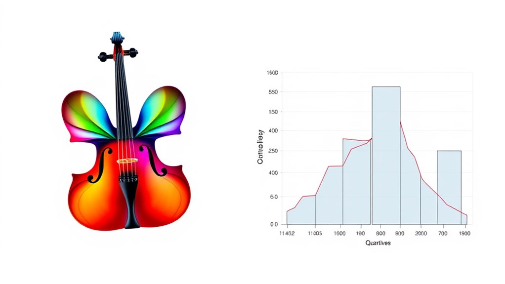
When it comes to visualizing data distributions, both violin plots and box plots offer valuable insights, but they serve different purposes. If you want to understand the distribution shape and data density, a violin plot provides a more *extensive* picture. It combines elements of a box plot with a mirrored density plot, allowing you to see where data points are concentrated and how they spread across the range. The wider sections of the violin indicate higher data density, meaning more data points cluster there, while narrower sections suggest fewer data points. This visualization helps you quickly grasp the underlying distribution shape, whether it’s symmetric, skewed, or bimodal, revealing nuances that a simple box plot might miss.
In contrast, box plots focus on summarizing the data through key statistics such as the median, quartiles, and potential outliers. They give you a clear overview of the data’s central tendency and variability without delving into the details of distribution shape or density. With a box plot, you can easily identify the interquartile range, the presence of outliers, and how data points are spread around the median. However, box plots don’t show the distribution shape explicitly, so they might overlook features like multiple peaks or uneven data density. If your goal is to compare groups based on these summary statistics, box plots are straightforward and effective.
While violin plots excel at illustrating the overall distribution, they can sometimes be more complex to interpret, especially if you’re new to density plots. They demand a bit more attention to detail to understand the distribution shape and where data density peaks. On the other hand, box plots are simple, making them ideal for quick comparisons and identifying outliers. If you’re analyzing data that benefits from understanding the distribution’s intricacies—such as whether data are skewed or have multiple modes—a violin plot is your best choice. Conversely, if your focus is on comparing medians, quartiles, and outliers across different groups, box plots are usually sufficient.
Ultimately, choosing between violin and box plots depends on what you need to learn from your data. For a detailed view of distribution shape and data density, violin plots are invaluable. For a clean, statistical summary, box plots do the job well. Both tools have their strengths, and understanding their differences helps you select the right visualization for your analysis. Recognizing the data distribution is essential for choosing the most appropriate visualization method.

Fiddle & Song, Bk 1: A Sequenced Guide to American Fiddling (Violin), Book & Online Audio/Software
As an affiliate, we earn on qualifying purchases.
As an affiliate, we earn on qualifying purchases.
Frequently Asked Questions
How Do Violin Plots Perform With Small Sample Sizes?
You’ll find that violin plots can be less effective with small sample sizes because they rely on density estimation, which needs enough data to accurately represent distribution. With small dataset visualization, the sample size effects make the violin plot’s shape less reliable, potentially misleading your interpretation. In such cases, box plots might be a better choice, as they provide clear summaries without requiring large amounts of data for accurate visualization.
Can Violin Plots Replace Box Plots in All Data Scenarios?
You can’t rely on violin plots to replace box plots in all data scenarios because they offer different insights. While violin plots excel in data interpretation and visualization accuracy by showing distribution shapes, box plots provide clear summaries of quartiles and outliers. In small sample sizes or when simplicity matters, box plots are more effective. Use each tool where it best enhances your understanding, rather than trying to substitute one for the other entirely.
Are Violin Plots Suitable for Categorical Data Visualization?
Like trying to fit a square peg into a round hole, violin plots aren’t ideal for categorical data. They focus on distribution, which isn’t relevant for categories. You’ll find better results with bar charts or pie charts, as they clearly show categorical limitations. For visualizations that highlight differences across categories, these alternatives provide more clarity and are easier for your audience to interpret.
What Software Tools Support Creating Violin and Box Plots?
You can create violin and box plots using various software tools, including interactive options and open source choices. For interactive tools, try Plotly or Tableau, which let you explore your data dynamically. Open source options like R (ggplot2, ggpubr) and Python (Seaborn, Matplotlib) are also excellent for customizing and generating these plots. These tools help you visualize data distributions effectively, whether for presentations or detailed analysis.
How Do Violin Plots Handle Outliers Compared to Box Plots?
You’ll find that violin plots handle outliers differently than box plots by emphasizing data distribution more clearly. They don’t explicitly mark outliers but show the full range of data, making outlier detection easier through the shape and density of the plot. Box plots, however, use whiskers and points to highlight outliers explicitly, giving you a straightforward way to spot anomalies while summarizing data distribution efficiently.
box plot graph maker
As an affiliate, we earn on qualifying purchases.
As an affiliate, we earn on qualifying purchases.
Conclusion
Imagine gazing at a data landscape—violin plots spread out like graceful bows, revealing intricate patterns and subtle nuances, while box plots stand firm like a sturdy fence, highlighting core distributions. Both are powerful tools, but your choice depends on the story you want to tell. Whether you prefer the detailed elegance of violins or the straightforward clarity of boxes, understanding their visuals helps you see your data in a new, mesmerizing light.

Good Charts Workbook: Tips, Tools, and Exercises for Making Better Data Visualizations
As an affiliate, we earn on qualifying purchases.
As an affiliate, we earn on qualifying purchases.

Graph Algorithms: Practical Examples in Apache Spark and Neo4j
As an affiliate, we earn on qualifying purchases.
As an affiliate, we earn on qualifying purchases.