

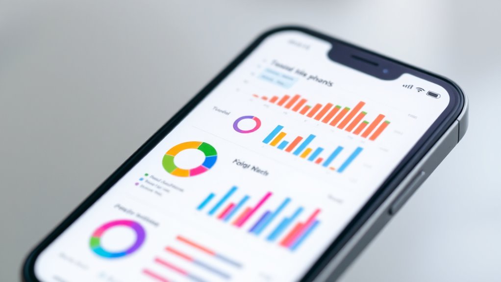
To create mobile-friendly data visualizations, focus on simplicity, responsiveness, and touch-friendly design. Use minimalistic charts with bold colors, clear labels, and large touch targets to prevent accidental taps. Optimize layouts to adapt smoothly across different screen sizes and orientations, leveraging gestures like zoom and swipe for interaction. Prioritize quick load times by optimizing images and data complexity. To master these strategies and improve your mobile visualizations, keep exploring the key principles behind effective mobile data design.
Key Takeaways
- Utilize responsive layouts with flexible grids and scalable graphics to adapt to various small screen sizes and orientations.
- Incorporate intuitive touch gestures like taps, swipes, and pinches for seamless data exploration.
- Simplify visuals by minimizing clutter, using bold colors, clear labels, and prioritizing essential information.
- Optimize performance by reducing data complexity, compressing images, and ensuring fast load times across devices.
- Design with accessibility in mind, including large touch targets and readable fonts to enhance user engagement.
In today’s mobile-driven world, data visualizations must be optimized for small screens to be effective. When designing for mobile, you need to consider how users will interact with your visuals, especially since screens are limited in space. Touchscreen gestures become your primary tools for navigation, so it’s essential to create visualizations that respond well to taps, swipes, pinches, and drags. These gestures allow users to explore data more intuitively, making complex information easier to digest on a compact device. For instance, zooming into a specific chart segment with a pinch gesture or scrolling through a timeline with a swipe can enhance user engagement and comprehension.
Alongside touchscreen gestures, responsive layouts are vital for delivering a seamless experience. Responsive design ensures that your data visualizations adapt fluidly to various screen sizes and orientations. Instead of static graphics that become cluttered or unreadable on smaller devices, your visualizations should reflow and resize depending on the device in use. This means using flexible grids, scalable vector graphics (SVG), and adaptable font sizes. When you prioritize responsive layouts, your visuals remain clear, accessible, and functional whether viewed on a smartphone, tablet, or other small-screen device.
Additionally, effective mobile visualizations leverage simplicity. Keep your charts and graphs minimalistic—avoid unnecessary details that clutter the screen. Use bold colors, clear labels, and large touch targets to make interactions effortless. Since screen space is limited, prioritize the most relevant data and consider layered or drill-down approaches. Users should be able to tap on a summarized view to reveal more detailed information without overwhelming the initial display. This technique keeps things clean while still providing depth when needed.
Designing for small screens also means you need to think about performance. Large, complex visualizations can slow down load times and frustrate users. Optimize your images and scripts to guarantee fast rendering. Use touch-friendly features like larger buttons and spacing to prevent accidental taps. Test your visualizations across multiple devices to validate they perform well and remain user-friendly. Additionally, minimizing data complexity through data simplification can significantly improve loading times and user experience on mobile devices.
Ultimately, crafting mobile-friendly data visualizations involves a blend of responsive layouts, gesture-based interactions, and minimalistic design. By keeping these elements in mind, you’ll create visuals that are not only visually appealing but also highly functional on small screens. Your goal should be to make data exploration natural and effortless, empowering users to uncover insights no matter what device they’re using.

Learning Responsive Data Visualization
As an affiliate, we earn on qualifying purchases.
As an affiliate, we earn on qualifying purchases.
Frequently Asked Questions
How Do Touch Interactions Impact Visualization Design?
Touch interactions substantially impact visualization design by requiring gesture controls that are intuitive and easy to use. You need to guarantee screen responsiveness so users can smoothly zoom, pan, or tap without frustration. By optimizing gesture controls and making your visualizations responsive, you enhance user engagement and accessibility on small screens, ensuring that interactions feel natural and efficient. This approach improves overall usability and helps users interpret data more effectively.
What Tools Are Best for Creating Mobile-Optimized Visuals?
You should use tools like Tableau Mobile, Power BI, and Datawrapper to create mobile-optimized visuals. These platforms support touch gestures, making interactions smooth, and adapt to different screen resolutions for clarity. They allow you to design responsive visualizations that look great on small screens. By choosing these tools, you guarantee your data visuals are accessible, engaging, and easy to explore on any mobile device.
How Can I Ensure Data Accuracy on Small Screens?
To guarantee data accuracy on small screens, you should prioritize data validation to catch errors early and maintain integrity. Use scaling techniques like normalization or aggregation to simplify complex data, making it easier to interpret without losing meaning. Regularly cross-check your visualizations against original data sources, and test on different devices to confirm that the scaled visuals remain accurate and clear, ensuring your audience gets reliable insights.
What Are Common Pitfalls in Mobile Visualization Design?
Imagine trying to read a tiny map in a crowded city—frustrating, right? That’s what common pitfalls in mobile visualization design feel like. You often overlook responsive layouts, causing charts to break or become unreadable. Poor font readability also hampers understanding. To avoid this, prioritize responsive layouts that adapt smoothly to small screens and use large, clear fonts, ensuring your data remains accessible and user-friendly.
How Does User Context Influence Visualization Choices?
Your user context shapes how you choose visualizations by highlighting what’s most relevant. If your audience prefers quick insights, opt for simple charts like bar or line graphs. Personalization plays a role by tailoring data displays to individual needs, making information more accessible. Consider factors like device type, location, and activity to make sure your visualizations are intuitive, engaging, and actionable, ultimately enhancing user experience on small screens.

Dragon Touch 10.1 inch Digital Calendar & Chore Chart – Interactive Touchscreen Smart Family Planner,Digital Picture Frame for Mom, Women, Christmas & Weddings
【All-In-One Smart Family Calendar】: Dragon Touch digital frame effortlessly organizes and tracks every family schedule with the crystal-clear…
As an affiliate, we earn on qualifying purchases.
As an affiliate, we earn on qualifying purchases.
Conclusion
You might think small screens limit your design options, but they challenge you to prioritize clarity over complexity. While the data becomes more condensed, your creativity must expand—finding elegant ways to highlight key insights without overwhelming. In this balance between simplicity and detail, you craft visualizations that are both accessible and compelling. Ultimately, designing for small screens isn’t a restriction; it’s an opportunity to refine your message and sharpen your storytelling skills.
mobile data visualization kit
As an affiliate, we earn on qualifying purchases.
As an affiliate, we earn on qualifying purchases.
Dragon Touch 10.1 inch Digital Calendar & Chore Chart – Interactive Touchscreen Smart Family Planner,Digital Picture Frame for Mom, Women, Christmas & Weddings
【All-In-One Smart Family Calendar】: Dragon Touch digital frame effortlessly organizes and tracks every family schedule with the crystal-clear…
As an affiliate, we earn on qualifying purchases.
As an affiliate, we earn on qualifying purchases.