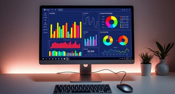
To visualize big data effectively, you should simplify complex information into clear, manageable charts that highlight key insights without overwhelming your audience. Use a combination of visualization types, like bar charts, heat maps, and scatter plots, to uncover relationships, trends, and outliers. Incorporate filters and interactivity to control data density and reveal layered details as needed. Continuing this approach can help you transform vast amounts of data into meaningful, actionable stories.
Key Takeaways
- Use multiple visualization types to represent complex relationships and identify patterns effectively.
- Incorporate interactive features like filters and tooltips to reduce visual clutter and focus on relevant data.
- Balance data density by simplifying charts to highlight key insights without overwhelming viewers.
- Break down large datasets into manageable segments or summaries to improve clarity and comprehension.
- Employ layered visualizations that allow users to drill down into details, maintaining an overview of the big picture.

In today’s data-driven world, visualizing big data has become essential for uncovering insights and making informed decisions. When dealing with vast amounts of information, the key challenge isn’t just collecting data but making sense of it quickly and effectively. This is where understanding data density and leveraging interactive dashboards become critical. Data density refers to how much information is packed into a visualization. High data density can provide a comprehensive overview, but it risks overwhelming you if not presented thoughtfully. The goal is to strike a balance—display enough detail to inform without creating clutter that hinders understanding. Interactive dashboards excel at this, allowing you to drill down into specific data subsets or zoom out for a broader perspective. They offer a dynamic experience, enabling you to customize views, filter data on the fly, and explore relationships between variables with ease.
When working with big data, static charts often fall short because they can’t adapt to your evolving questions or reveal hidden patterns. Interactive dashboards, on the other hand, make complex data approachable by providing layers of information that you can access as needed. For example, you might start with a high-level overview of sales performance across regions, then click into a specific area to analyze customer behavior or seasonal trends. This flexibility keeps you engaged and allows for rapid hypothesis testing, so you spend less time deciphering raw numbers and more time deriving actionable insights. Additionally, understanding data extraction techniques is crucial for efficiently gathering relevant information from large datasets to feed into your visualizations.
Another advantage of these dashboards is their ability to handle data density effectively. They often integrate multiple visualization types—bar charts, heat maps, scatter plots—within a single interface. This integration helps you see relationships and correlations that might be lost in traditional, isolated charts. You can contrast metrics side by side, identify outliers, or track changes over time without switching tools or losing context. The key is to design dashboards that balance detail with clarity. Using filters, tooltips, and customizable views, you control the level of data density, ensuring that your visualizations are both informative and digestible.
Ultimately, mastering big data visualization involves more than just choosing the right charts; it’s about creating a narrative that guides your understanding. Interactive dashboards serve as powerful storytelling tools, transforming raw data into clear, actionable insights. By managing data density thoughtfully and leveraging interactivity, you turn overwhelming datasets into manageable, insightful visuals. This approach empowers you to make smarter decisions swiftly, keeping your organization agile in a competitive landscape.
Frequently Asked Questions
How Can I Ensure My Charts Are Accessible to All Users?
To guarantee your charts are accessible, focus on high color contrast so all users can distinguish data clearly. Make sure your charts are compatible with screen readers by adding descriptive alt text and labels. Use clear, simple language and avoid relying solely on color to convey information. Test your charts with accessibility tools to identify any issues, ensuring everyone, regardless of their abilities, can interpret your data effectively.
What Are the Best Tools for Real-Time Big Data Visualization?
You should consider using cloud-based solutions like Tableau, Power BI, or Grafana for real-time big data visualization. These tools offer interactive dashboards that enable you to monitor live data streams effortlessly. They integrate seamlessly with various data sources, providing scalable, flexible, and accessible options. By choosing these platforms, you guarantee your visualizations stay up-to-date and user-friendly, helping you make quick, informed decisions without complexity.
How Do I Handle Missing or Incomplete Data in Visualizations?
Imagine your data as a puzzle with missing pieces. You handle incomplete data by using data imputation to fill gaps and data validation to make sure accuracy. This way, your visualizations become clear and trustworthy. Always verify your data before presenting it, and use imputation techniques to estimate missing values. With these steps, you turn fragmented data into a complete picture, making your charts both reliable and insightful.
What Are Common Pitfalls When Simplifying Complex Data Charts?
When simplifying complex data charts, you should watch out for chart distortion and data oversimplification. You might unintentionally mislead viewers by omitting important details or exaggerating trends. Avoid cluttered visuals that confuse your audience, and guarantee your simplification maintains data integrity. Focus on clarity without sacrificing accuracy, and always cross-check that your chart accurately reflects the underlying data to prevent misinterpretation.
How Can I Validate the Accuracy of My Visualized Data?
To validate your visualized data, double-check your data sources, cross-reference with original datasets, and perform accuracy verification through statistical methods. You should also review your charts for consistency, clarity, and logical flow. By systematically validating your data, verifying accuracy, and cross-referencing sources, you guarantee your visualizations truly represent the underlying information, reducing errors and increasing trustworthiness. Accuracy verification and data validation are essential steps for reliable visualization.
Conclusion
By simplifying complex data into clear, engaging charts, you make big data more accessible and insightful. Did you know that visualizations can increase data comprehension by up to 400%? This means you can make smarter decisions faster, turning overwhelming information into actionable insights. So, next time you face complex datasets, remember that a well-designed chart isn’t just pretty—it’s your secret weapon for clarity and success. Embrace simplicity and reveal the true power of your data.


