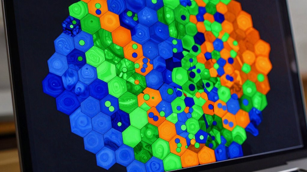

If you’re working with dense datasets, hexbin plots are a smarter alternative to traditional scatterplots. Instead of overlapping points, they group data into hexagonal bins, making patterns and high-density areas easy to spot. With customizable sizes and color scales, you can highlight trends and outliers effectively. This approach reduces clutter and clarifies complex data. Keep exploring, and you’ll discover how to optimize your visualizations for better insights.
Key Takeaways
- Hexbin plots aggregate data into hexagonal bins, reducing clutter and making dense datasets easier to interpret.
- They visualize data density by color-coding bins, highlighting hotspots and sparse regions effectively.
- Customizable bin size and color scales allow tailored analysis, balancing detail and trend visibility.
- Hexbin plots handle large datasets efficiently by summarizing point distributions into manageable visual units.
- They reveal underlying patterns masked in traditional scatterplots, simplifying complex data visualization.
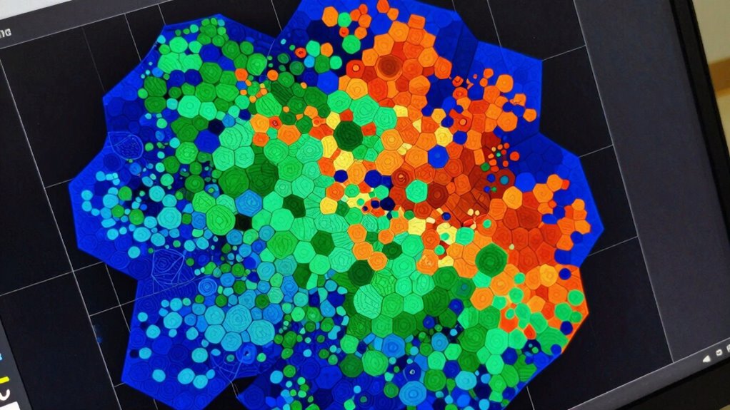
Have you ever struggled to interpret dense scatter plots with overlapping points? When your data becomes too crowded, traditional scatterplots can turn into a confusing jumble, making it hard to identify meaningful patterns. That’s where hexbin plots come in, offering a smarter way to visualize dense data. Instead of plotting each individual point, hexbin plots aggregate data into hexagonal bins, providing a clear overview of density variations across the plot. This method simplifies complex data, allowing you to see where points cluster without getting lost in overplotting. Effective color scaling plays a vital role in making hexbin plots more understandable. By assigning different colors to different bin densities, you immediately grasp areas of high and low concentration. For example, warmer colors like reds and oranges can indicate regions with a high number of points, while cooler colors like blues reveal sparser zones. This visual cue helps you quickly identify hotspots or outliers, making your analysis more intuitive. Adjusting the color scale can further refine your view, highlighting specific ranges of data density that matter most to your investigation. Data aggregation is the backbone of hexbin plotting. Instead of plotting each data point individually, each hexagon represents the combined data within its boundaries. When you generate a hexbin plot, your software calculates how many points fall into each hexagon, transforming a potentially overwhelming scatter into a manageable, digestible map. This aggregation smooths out noise, revealing underlying trends that might be hidden in a traditional scatterplot. It also allows you to handle massive datasets efficiently, since plotting thousands of points individually would be computationally expensive and visually cluttered. Using hexbin plots effectively involves balancing the size of the hexagons and the color scale. Larger hexagons can smooth out fine details, emphasizing broader trends, while smaller ones reveal more local variations. Similarly, fine-tuning the color scale enhances contrast and makes density differences more apparent. By customizing these parameters, you tailor your visualization to suit your specific needs—whether you’re exploring general patterns or zooming into particular regions of interest.
As an affiliate, we earn on qualifying purchases.
Frequently Asked Questions
How Do I Choose the Optimal Bin Size for My Data?
To choose the most suitable bin size, start by considering your data density—if it’s very dense, larger bins help reduce clutter; for sparser data, smaller bins reveal more detail. Experiment with different bin sizes and visually assess which one best balances clarity and detail. Use tools like cross-validation or rule-of-thumb methods to refine your choice, ensuring your hexbin plot accurately represents your data’s distribution without oversimplifying or overcomplicating.
Can Hexbin Plots Be Used With Categorical Variables?
Think of hexbin plots as a canvas designed for continuous data; they aren’t ideal for categorical variables. You need to use categorical encoding or variable transformation to visualize categorical data effectively. While hexbin plots excel at showing density, for categories, consider bar plots or mosaic plots. Using the right visualization methods guarantees your data tells its story clearly, without getting lost in the wrong type of plot.
What Are the Limitations of Hexbin Plots?
You should be aware that hexbin plots have limitations, especially as an alternative visualization for detailed data. They aggregate data into hexagonal bins, which can obscure individual point details and nuances. This makes it less suitable if you need precise data insights. Also, they work best with dense data, but sparse datasets might not benefit much. So, consider your data density and the level of detail you need before choosing hexbin plots.
How Do I Customize Color Schemes in Hexbin Plots?
Ever notice how color can make your hexbin plots pop? You can customize color schemes by selecting different color palettes or tweaking color gradients. In tools like Matplotlib, use functions like `colormap` to apply your preferred palette, such as ‘viridis’ or ‘plasma.’ This way, you control the visual impact, making your data easier to interpret and more visually appealing, all while aligning with your aesthetic preferences.
Are Hexbin Plots Suitable for Real-Time Data Visualization?
Yes, hexbin plots are suitable for live updating data visualization, especially when combined with dynamic binning. You can implement real-time updates by revitalizing the plot at intervals and adjusting the binning dynamically as new data comes in. This approach allows you to efficiently visualize dense data streams, making hexbin plots a powerful tool for monitoring trends and patterns in live data without clutter.
As an affiliate, we earn on qualifying purchases.
Conclusion
Don’t let dense data overwhelm your visualizations. Hexbin plots provide a smarter way to see patterns without the clutter of traditional scatterplots. Some might say they sacrifice detail, but in reality, they reveal insights you’d miss otherwise. When you need clarity in crowded datasets, hexbin plots are your go-to. Give them a try—you’ll find your data telling a clearer story, making your analysis more effective and your insights sharper.
density plot visualization software
As an affiliate, we earn on qualifying purchases.
As an affiliate, we earn on qualifying purchases.
As an affiliate, we earn on qualifying purchases.