

Slope charts are a simple yet powerful way to compare data points between two categories or time periods. They clearly show trends, changes, and outliers with just a few lines. You can easily spot growth, decline, or stagnation at a glance. To make your charts effective, focus on clear labels, contrasting colors, and a neat layout. Keep exploring to discover tips that will help you create impactful slope charts effortlessly.
Key Takeaways
- Slope charts compare two data points or categories, highlighting changes visually with connecting lines.
- Use clear labels, contrasting colors, and precise plotting for easy interpretation.
- They simplify trend analysis by emphasizing the direction and magnitude of change.
- Ideal for side-by-side comparisons across periods or categories in a straightforward format.
- Keep the design uncluttered to effectively communicate insights and detect outliers.
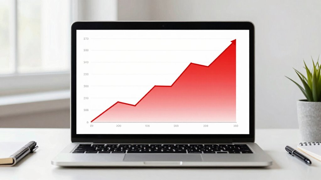
If you’ve ever struggled to compare data points over time or across categories, slope charts can be a powerful tool to simplify that process. They excel at presenting changes visually, making it easier to grasp trends at a glance. When you’re working with data visualization, the goal is to communicate insights clearly and efficiently. Slope charts do just that by highlighting the direction and magnitude of change between two points, whether they’re different time periods or categories. This makes them especially useful for trend analysis because they allow you to see patterns without drowning in numbers.
Unlike bar or line charts, slope charts focus on the relationship between two data points, which helps you quickly identify growth or decline. Imagine you’re comparing sales figures from two years; a slope chart will draw a line from the sales number in year one to the number in year two. If the line slopes upward, you know sales increased; if it slopes downward, sales decreased. The simplicity of this visual makes it easy to compare multiple categories side by side, giving you a clear overview of how each is performing over time or against each other.
Creating an effective slope chart isn’t complicated, but paying attention to details enhances clarity. Make sure the axes are clearly labeled, and the data points are accurately plotted. Keep the number of categories manageable so the chart doesn’t become cluttered. Using contrasting colors can further help distinguish categories or highlight significant changes. When you design your slope chart thoughtfully, it becomes a powerful tool for trend analysis—helping you identify which areas are improving, stagnating, or declining, all at a glance. Additionally, understanding the visualization fundamentals involved in chart design ensures your slope chart communicates your message effectively.
Another advantage of slope charts is their ability to reveal outliers or unexpected shifts in data. If one category suddenly jumps or dips dramatically, it stands out in the visual, prompting further investigation. This makes slope charts not just about visual appeal but also about uncovering insights quickly. They’re especially valuable when you need to communicate complex data to stakeholders who may not be familiar with detailed statistics but can understand simple visual cues. As with any chart type, effective design principles play a crucial role in maximizing their clarity and impact. Incorporating knowledge of dog breeds and their traits can also inspire ways to categorize and color-code data for better visual storytelling.
As an affiliate, we earn on qualifying purchases.
Frequently Asked Questions
What Are the Best Tools for Creating Slope Charts?
You can create slope charts using tools like Excel, Google Sheets, or Tableau, which excel in data visualization and offer customizable options for chart aesthetics. Excel and Google Sheets are accessible and user-friendly for basic slope charts, while Tableau provides advanced features and more polished visuals. These tools help you clearly illustrate trends over time, ensuring your slope charts are both informative and visually appealing.
How Can I Customize Colors in Slope Charts?
You can easily customize colors in slope charts by selecting from various color palettes that suit your data and style. Use consistent colors for related data points to maintain design consistency, helping viewers quickly grasp the story. Many tools allow you to manually adjust colors or apply preset palettes. By aligning your colors with your overall design scheme, you guarantee your slope chart looks professional and communicates your insights clearly.
Are Slope Charts Suitable for Large Datasets?
Slope charts can be suitable for large datasets if you focus on data scaling and visual clarity. By carefully scaling your data, you guarantee the chart remains readable without clutter. Use clear labels and limit the number of lines to avoid confusion. Proper data scaling helps highlight trends, making it easier to interpret large datasets visually. Keep the design simple, and slope charts will effectively communicate your insights even with many data points.
How Do I Interpret Complex Slope Charts?
Did you know that slope charts can reveal that over 75% of companies experienced growth or decline in revenue over five years? When interpreting complex slope charts, focus on trend analysis and data comparison. Look at the slopes’ directions and steepness, which indicate growth or decline rates. Pay attention to overlapping lines and color coding for nuanced insights, helping you understand shifts and patterns across multiple data points effectively.
Can Slope Charts Be Used in Presentations Effectively?
Yes, slope charts can be very effective in presentations. They enhance data clarity by visually illustrating changes over time or between categories, making trends easy to grasp quickly. Their visual impact captures your audience’s attention, helping communicate complex information simply and clearly. Use them strategically to highlight key insights, ensuring your message resonates and your data storytelling remains engaging and compelling.
data visualization tools for slope charts
As an affiliate, we earn on qualifying purchases.
As an affiliate, we earn on qualifying purchases.
Conclusion
Now that you know how to create slope charts, you can confidently visualize changes over time or comparisons between data points. If you worry they might be confusing, remember that clear labels and consistent scales make them easy to interpret. Don’t shy away from using slope charts—they’re a straightforward way to turn complex data into a visual story that everyone can understand. With practice, you’ll find them an invaluable tool for clear, impactful communication.
As an affiliate, we earn on qualifying purchases.
As an affiliate, we earn on qualifying purchases.