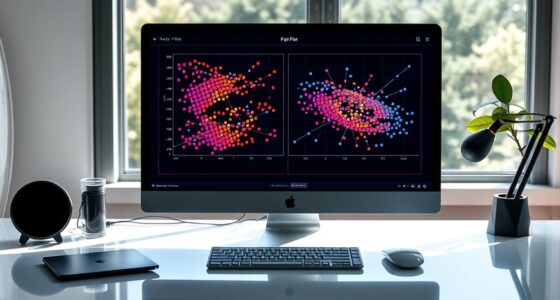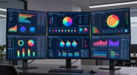
The best screen layout for comparing two datasets is a side-by-side arrangement. This setup helps you view both datasets simultaneously, making it easier to spot trends and anomalies quickly. Using larger screens or multi-monitor setups enhances this experience, while color coding and highlighting key points can clarify differences. A clean, organized layout reduces distractions and improves your analysis. If you’re curious about effective visual techniques and further tips, there’s more to explore on this topic.
Key Takeaways
- Utilize a side-by-side layout to facilitate simultaneous viewing and enhance data comparison efficiency.
- Choose a larger display or multi-monitor setup for detailed analysis and improved visual clarity.
- Implement color coding and contrasting visuals to differentiate datasets while maintaining cohesion.
- Maintain a clean and organized layout to reduce clutter and emphasize key data points.
- Highlight significant trends and anomalies to aid quick recognition and insightful analysis.

When you need to compare datasets effectively, choosing the right screen layout can make all the difference. You want to guarantee that your data is easy to analyze and interpret, so opting for a layout designed for side-by-side comparisons is essential. This method allows you to see both datasets simultaneously, making it easier to spot trends, anomalies, or correlations. You’ll find that this approach not only saves time but also enhances your overall understanding of the information at hand.
One of the key benefits of side-by-side comparisons is the visual alignment it offers. When data sets are aligned next to each other, you can quickly identify differences or similarities without having to switch between screens or tabs. Imagine having two tables or charts displayed next to each other, with matching data points lined up. This visual organization reduces cognitive load, helping you process the information more efficiently. Your eyes naturally flow from one dataset to the other, making it easier to draw meaningful insights.
One of the key advantages of side-by-side comparisons is their ability to enhance visual alignment, making insights easier to uncover.
To maximize the effectiveness of your screen layout, consider the size and resolution of your display. A larger screen can provide ample space for detailed comparisons, while a smaller screen may require you to adjust the size of your datasets. If you’re working with multiple datasets, utilizing a multi-monitor setup can also be beneficial. This way, you can dedicate one screen to each dataset, enhancing your ability to make visual connections. Knowing how to leverage your display setup optimizes visual clarity and improves your workflow. Additionally, incorporating responsible use and privacy considerations ensures that sensitive data remains protected during analysis.
Don’t forget about color coding or highlighting key data points. When both datasets are visually distinct yet aligned, it becomes much easier to recognize where they intersect or diverge. You can use contrasting colors to differentiate the datasets while maintaining an overall cohesive look. This tactic not only aids in visual alignment but also makes your comparisons pop, drawing your attention to significant areas.
Lastly, guarantee that your layout maintains clarity. Avoid cluttering your screen with unnecessary information or visual elements that may confuse the viewer. Keep it simple and focused. A clean layout will let you concentrate on the data itself, allowing for more insightful analysis. Incorporating visual organization principles can further improve clarity and effectiveness. By choosing the right screen layout with side-by-side comparisons and effective visual alignment, you’ll transform your dataset comparison process, making it intuitive and straightforward.

HUANUO FlowLift™ Dual Monitor Stand, Fully Adjustable Gaming Monitor Desk Mount for 13–32″ Computer Screens, Full Motion VESA 75×75/100×100 with C-Clamp & Grommet Base, Each Arm Holds 4.4 to 19.8 lbs
Compatible with Wide Screens – To ensure compatibility with the dual monitor mount, your each monitor must meet…
As an affiliate, we earn on qualifying purchases.
As an affiliate, we earn on qualifying purchases.
Frequently Asked Questions
What Software Tools Are Best for Dataset Comparison?
For dataset comparison, tools like Tableau, Excel, and Python libraries such as Pandas are great choices. They offer data merging capabilities and support version control, which helps you track changes. You can easily conduct comparative analysis by integrating these tools with others, like SQL databases or R for deeper insights. Just guarantee you choose one that fits your workflow and makes it easy to visualize differences between datasets effectively.
How Can I Visualize Differences Effectively?
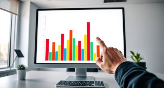
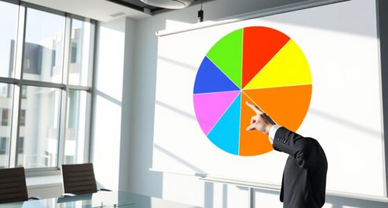
Imagine two rivers flowing side by side, each with its own unique colors and currents. To visualize differences effectively, use visualization techniques like bar charts or heat maps to highlight key comparison metrics. These tools let you see patterns and discrepancies clearly, just as the sunlight reveals each river’s distinct hues. With the right approach, you’ll navigate through the data, uncovering insights that might otherwise remain hidden beneath the surface.
Are There Shortcuts for Dataset Comparison?
Yes, there are shortcuts for dataset comparison! You can streamline your process by using data merging techniques to combine datasets quickly. Automated comparison tools can also save you time, allowing you to identify differences without manual effort. Software like Excel, Python libraries, or specialized data analysis tools often have built-in functions for these tasks. By leveraging these shortcuts, you’ll enhance your efficiency and accuracy when analyzing and visualizing differences.
What Are Common Mistakes in Dataset Comparisons?
You might think comparing datasets is as easy as pie, but common mistakes can sink your efforts! Ignoring data integrity can lead to disastrous conclusions. Focusing on statistical significance without considering context relevance distorts your findings. Visual clutter makes it tough to spot trends, while user bias can skew your interpretation. Finally, overlooking sample size may render your analysis meaningless, leaving you lost in a sea of numbers instead of gaining insights.
How Do I Handle Large Datasets Efficiently?
To handle large datasets efficiently, start by applying data preprocessing techniques like normalization and filtering to reduce noise and improve quality. This helps streamline your analysis. Next, use efficient storage solutions such as databases or cloud services that can scale with your data needs. These approaches not only speed up processing but also make it easier to access and manage your datasets, ensuring you can focus on deriving insights rather than getting bogged down in data handling.

ELECROW 10.1 Inch Touchscreen Monitor, 1280×800 IPS LCD HD Display with Stand, Portable Capacitive Touch Screen for Raspberry Pi 3/3B+/4B/5, Jetson Nano, Banana Pi, PC, Windows, Beaglebone
10.1 Inch IPS Touchscreen Monitor: ELECROW 10.1 inch portable monitor features a high-resolution 1280×800 IPS display, delivering crisp…
As an affiliate, we earn on qualifying purchases.
As an affiliate, we earn on qualifying purchases.
Conclusion
To conclude, choosing the right screen layout can make all the difference when comparing datasets. Notably, studies show that layouts allowing side-by-side comparisons can boost comprehension by up to 30%. So, whether you opt for split screens or overlapping visuals, remember that clarity is key. By implementing these strategies, you’ll not only enhance your analysis but also make the process more enjoyable. Happy comparing!

DGK Color Tools Digital Kolor Pro 16:9 Large Color Calibration and Video Chip Chart, 2-Pack
SUPERIOR ACCURACY – Ensures precise color calibration with professional-grade chips, delivering consistent and reliable results for video production.
As an affiliate, we earn on qualifying purchases.
As an affiliate, we earn on qualifying purchases.

Funhill Laptop Screen Extender 14 inch Laptop Monitor Extender 1080P IPS, Triple Portable Monitor for Laptops 13-17.3" with Display/HDMI Port, Plug-Play Portable Screen for Windows/Chrome/Android
Boost 300% Efficiency- Funhill laptop screen extender can instantly expand your laptop to triple screens – view spreadsheets,…
As an affiliate, we earn on qualifying purchases.
As an affiliate, we earn on qualifying purchases.