
To enhance your ggplot2 visualizations, focus on customizing colors with palettes like RColorBrewer or viridis for better contrast and accessibility. Layer multiple geoms to create complex, informative graphics and adjust themes to match presentation needs. Experiment with axes, labels, and annotations to improve clarity. Mastering these techniques will help you craft visually appealing, professional plots that clearly communicate your data insights—stay tuned for more tips to take your visualizations further.
Key Takeaways
- Leverage ggplot2 layers to build complex visualizations with multiple geoms and customized aesthetics.
- Utilize advanced color palettes like viridis and RColorBrewer for improved contrast and accessibility.
- Customize plot themes and elements using theme() and element_text() for presentation-ready graphics.
- Combine multiple plots or annotations to create comprehensive, informative visual stories.
- Incorporate data transformations and faceting to reveal detailed patterns and insights.
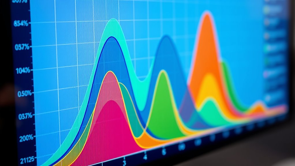
Visualization in R can substantially enhance how you understand and communicate data insights, especially when you leverage the power of ggplot2. One of the key strengths of ggplot2 is its flexibility in plot customization, which allows you to tailor visualizations to fit your specific needs. A critical aspect of this customization involves selecting appropriate color palettes. Colors can direct attention, convey meaning, and improve the overall aesthetic of your plots. By choosing the right color schemes, you make your visualizations more intuitive and accessible, especially for audiences with color vision deficiencies. ggplot2 offers various built-in color palettes, such as RColorBrewer and viridis, which are designed for clarity and contrast. You can easily incorporate these into your plots using functions like scale_fill_brewer) or scale_color_viridis), giving your charts a polished, professional appearance.
Plot customization extends beyond just colors; it encompasses adjusting axes, labels, themes, and other visual elements. With ggplot2, you can modify almost every aspect of your plot to match your presentation style or publication standards. For example, you might tweak font sizes, change grid lines, or add custom annotations, all with simple functions like theme) and element_text). These options empower you to create clean, informative visuals that communicate your message effectively. When customizing plots, it’s important to keep consistency in mind—using a cohesive color palette and style helps your audience easily interpret your data.
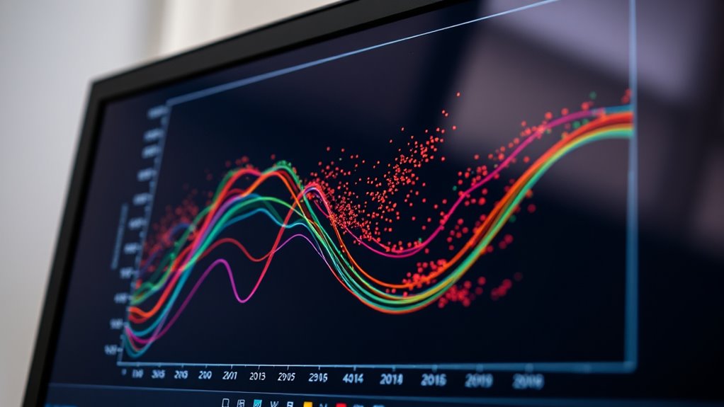
Another powerful feature of ggplot2 is layering. You can add multiple geometric objects (geoms) to a single plot, such as points, lines, and bars, to produce complex visualizations. Each layer can be customized independently, giving you control over the appearance and behavior of each element. For instance, you might overlay a scatter plot with a trend line, applying different color schemes to distinguish data groups clearly. Combining plot customization with well-chosen color palettes results in visualizations that are not only aesthetically appealing but also highly informative.
Mijello MWP-2020 20 Wells Water Color Color Wheel Palette
Mijello MWP-2020 Water Color Wheel Palette
As an affiliate, we earn on qualifying purchases.
As an affiliate, we earn on qualifying purchases.
Frequently Asked Questions
How Can I Customize Themes in Ggplot2?
To customize themes in ggplot2, you create a custom theme*** by modifying theme elements like axis titles, text, and backgrounds. Use the theme() function to override default settings, such as theme(axis.title = element_text(color = “blue”, size = 14)) or theme(panel.background = element_rect(fill = “lightgray”)). This approach lets you tailor your plot’s appearance, making your visualizations more aligned with your style or presentation needs.
What Are the Best Practices for Handling Large Datasets?
When handling large datasets in ggplot2, you should prioritize data sampling to reduce the dataset size, making visualization faster and more manageable. Additionally, optimize memory by converting data to more efficient formats like data.table or using functions like dplyr for streamlined data manipulation. These practices help prevent memory overload and improve plotting performance, ensuring your visualizations remain clear and responsive even with massive datasets.
How Do I Add Interactive Elements to Ggplot2 Plots?
To add interactive elements to ggplot2 plots, you can convert your static visualizations into interactive dashboards using packages like plotly or ggiraph. These tools let you incorporate tooltip customization, enabling you to display detailed info on hover. Simply pass your ggplot2 object to these functions, customize your tooltips, and then embed the resulting interactive plot into your dashboard. This approach enhances user engagement and data exploration.
Can Ggplot2 Be Integrated With Other R Visualization Libraries?
You can seamlessly integrate ggplot2 with other R visualization libraries, creating a rich tapestry of graphics. Think of it as combining vibrant colors on a canvas; libraries like plotly, gridExtra, and patchwork enhance ggplot2’s static plots with interactivity and layout flexibility. This library compatibility allows you to craft dynamic, multi-layered visualizations, making your data stories more engaging and insightful, all while maintaining the power of ggplot2’s elegant syntax.
How to Create Animated Visualizations With Ggplot2?
You can create animated plots with ggplot2 by combining it with the gganimate package. This allows you to add animation layers to your static visualizations, making them more dynamic. To generate GIFs, simply export the animation using functions like animate) and save it with anim_save(). This process enables you to craft engaging animated visualizations and share them easily as GIF files.
advanced ggplot2 plotting tools
As an affiliate, we earn on qualifying purchases.
As an affiliate, we earn on qualifying purchases.
Conclusion
With these ggplot2 tips, you hold the brush to paint your data’s story vividly. Think of each plot as a window to your insights, framing your narrative with color, shape, and style. As you master these techniques, you become the artist of your data landscape, transforming raw numbers into compelling visuals. Let your creativity flow through every chart, turning abstract data into a masterpiece that speaks volumes without uttering a word.
ggplot2 theme customization kit
As an affiliate, we earn on qualifying purchases.
As an affiliate, we earn on qualifying purchases.
ggplot2 layered geoms package
As an affiliate, we earn on qualifying purchases.
As an affiliate, we earn on qualifying purchases.