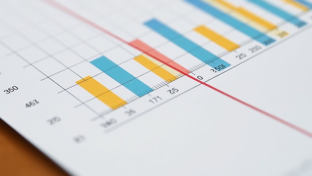

To understand graph components like axes, scales, and labels, recognize that axes provide primary reference points, with the x-axis usually showing independent variables and the y-axis displaying dependent ones. Scales determine how data points are spaced and interpreted, whether linear or logarithmic. Labels add clarity by explaining what each part of the graph represents. Paying attention to these elements helps you accurately interpret data and communicate insights effectively—exploring each further reveals how they work together.

Get business pricing on monitors, keyboards and dev gear
- Business-only prices and quantity discounts
- Tax-exempt purchasing
- Multiple users, one account, clear invoices
Key Takeaways
- Axes provide reference points, with the x-axis typically representing independent variables and the y-axis showing dependent variables.
- Scales determine how data points are spaced and interpreted, with options like linear or logarithmic scales.
- Proper labels clarify what each axis measures and provide context, aiding accurate data understanding.
- Well-designed axes and scales help reveal patterns, outliers, and relationships within the data.
- Labels such as titles and annotations enhance clarity and support effective communication of the graph’s message.

Graphs are fundamental structures in computer science and mathematics, representing relationships between objects. When you look at a graph, you’re essentially observing a visual tool that helps you interpret data more intuitively. To maximize its usefulness, understanding the components of a graph—such as axes, scales, and labels—is vital. These elements are the backbone of effective graph design, guiding your data interpretation and guaranteeing your audience can grasp the information correctly. Clear axes, appropriate scales, and descriptive labels work together to make complex data accessible and meaningful.
Understanding axes, scales, and labels is key to creating clear, effective graphs that communicate data accurately.
The axes in a graph serve as the primary reference points, defining the dimensions along which data points are plotted. The x-axis typically presents the independent variable, while the y-axis shows the dependent variable. When you’re designing a graph, carefully selecting the axes helps clarify what relationships you’re illustrating. Misaligned or poorly labeled axes can confuse viewers, making it harder to interpret data accurately. For example, if you’re plotting sales over time, the horizontal axis should represent the timeline, while the vertical axis displays sales figures. Proper axis design guarantees your graph communicates the intended message clearly.
Scales are equally important because they determine how data points are spaced and interpreted. Choosing an appropriate scale affects the readability and accuracy of your graph. If the scale jumps too large or too small, it can distort the data, leading viewers to misinterpret the trends or differences. When you’re working on data interpretation, consider whether a linear or logarithmic scale best suits your data’s nature. Consistent, well-chosen scales allow viewers to see patterns, outliers, and relationships effortlessly. For instance, when plotting large ranges of data, a logarithmic scale can compress the data, making it easier to identify proportional differences.
Labels provide context and clarity, guiding viewers through the information presented. They include titles, axis labels, and data point annotations. When you label your graphs effectively, you help your audience understand exactly what they’re looking at without guesswork. Clear labels eliminate ambiguity, especially when dealing with multiple variables or complex datasets. The title should succinctly describe the graph’s purpose, while axis labels specify what each axis measures. Data labels or annotations can highlight significant points or trends, making your data interpretation more precise. Good graph design emphasizes these details, ensuring your visuals support accurate and quick understanding. Additionally, considering graph components such as grid lines and legends can further improve clarity and comprehension.
Frequently Asked Questions
How Do I Choose the Right Scale for My Graph?
To choose the right scale for your graph, consider your data range and how best to represent it clearly. Focus on axis considerations like starting points, intervals, and whether to use consistent or varying scales. You want your scale to highlight trends without exaggerating differences. Adjust it so your data fits well and is easy to interpret, ensuring your graph effectively communicates the information to your audience.
What Are Common Mistakes in Labeling Graph Axes?
Ever wonder why your graph confuses viewers? Misleading labels are a common mistake, like using vague or exaggerated descriptions. You should avoid inconsistent units, which can distort data interpretation. Always double-check that your labels clearly describe what’s being measured and use consistent units throughout. This way, your graph communicates accurately, avoiding misunderstandings and making your data trustworthy and easy to analyze.
How Can I Improve Graph Readability for Viewers?
To improve your graph’s readability, you should use clear color contrast between elements, making labels and data stand out. Guarantee axis orientation is logical, with time progressing left to right or top to bottom, so viewers easily follow the data. Keep labels concise and legible, and avoid clutter. These steps make your graph more accessible, helping viewers quickly grasp the information without confusion or eye strain.
When Should I Use a Logarithmic Scale?
You should use a logarithmic scale when data spans several orders of magnitude or exhibits exponential growth. Logarithmic advantages include compressing large ranges and revealing trends not visible on linear scales. This scale transformation makes it easier to compare relative changes and identify patterns in complex data. Use it when data points are multiplicative or when you want to highlight proportional differences, ensuring your viewers grasp the underlying relationships more clearly.
How Do I Interpret Overlapping Labels on a Graph?
When labels overlap on a graph, focus on improving legend clarity and label placement. You should move labels to avoid overlap, use shorter or rotated text, or add a legend if labels are too crowded. Clear labels help you interpret data accurately, so always guarantee they’re readable. Adjusting label positions or spacing makes your graph more understandable, letting you quickly grasp the key information without confusion.
Conclusion
Just like an artist carefully chooses their colors and brushstrokes, understanding axes, scales, and labels helps you interpret graphs with clarity. Think of each component as a guiding star in a night sky, leading you through data’s vast universe. When you grasp these elements, you open the story behind the numbers, turning abstract figures into vivid stories. So, embrace these tools, and let them illuminate your path to insightful understanding—making data your ally, not a mystery.
Halloween Picks
halloween
As an affiliate, we earn on qualifying purchases.