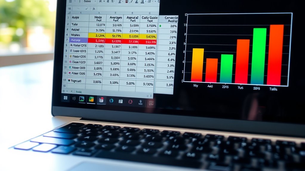
To use Excel for basic statistical analysis, organize your data in columns and utilize functions like AVERAGE, MEDIAN, MODE, and STDEV to summarize it. You can create charts such as bar graphs or line charts to visualize trends and add trendlines for further insights. Filtering and sorting help focus on specific data segments, while statistical summaries reveal patterns and variability. Keep exploring how combining these tools can deepen your understanding of your data.
Key Takeaways
- Use functions like AVERAGE, MEDIAN, MODE, and STDEV to calculate basic statistical measures.
- Apply filtering and sorting tools to focus on specific data subsets for targeted analysis.
- Create charts and graphs, such as histograms or box plots, to visualize data distribution.
- Add trendlines to charts to identify data trends and understand overall patterns.
- Summarize data with descriptive statistics to interpret central tendencies and variability easily.

Excel is a powerful tool that makes basic statistical analysis accessible and straightforward. Whether you’re working with sales data, survey responses, or any other dataset, Excel provides the features you need to uncover insights quickly. One of the key aspects of understanding your data is effective data visualization. By creating charts and graphs, you can transform raw numbers into visual stories that reveal patterns, outliers, and trends. For example, a simple line chart can help you spot trends over time, while bar graphs make comparisons across categories clear at a glance. Using Excel’s built-in chart tools, you can customize your visuals with labels, titles, and colors, making your analysis more engaging and easier to interpret. Additionally, understanding key statistical concepts helps you interpret your results more accurately. Trend analysis is another crucial component of basic statistical work in Excel. It involves examining data points over a period to identify consistent increases, decreases, or cycles. You can perform trend analysis by adding a trendline to your chart, which helps visualize the overall direction of your data. Excel allows you to fit different types of trendlines, such as linear, exponential, or polynomial, depending on what best describes your data. This not only helps you understand past behavior but also enables you to forecast future values, supporting decision-making processes. To do this effectively, you simply select your data series, insert a chart, and then add a trendline through the chart tools menu. You can also display the trendline’s equation and R-squared value, which give you insights into how well the trendline fits your data. Beyond visualization, Excel offers various functions for descriptive statistics, such as calculating averages, medians, modes, and standard deviations, which form the foundation of your analysis. These calculations help you summarize your data, spot variability, and understand distribution. Using functions like AVERAGE, MEDIAN, and STDEV, you can get quick numerical summaries that support your visual insights. Additionally, Excel’s filtering and sorting features allow you to focus on specific segments of your data, making it easier to perform targeted trend analysis or identify anomalies. Combining these tools, you can build a thorough understanding of your dataset without needing advanced statistical software. Overall, Excel’s blend of data visualization and trend analysis tools makes it a practical choice for anyone looking to perform basic statistical analysis efficiently and effectively.
Frequently Asked Questions
Can Excel Perform Advanced Statistical Tests Like ANOVA?
Yes, Excel can perform advanced statistical tests like ANOVA, but you might need to use the Data Analysis Toolpak add-in. Before running tests, you should do data cleaning to guarantee accuracy and calculate descriptive statistics to understand your data. While Excel handles basic analysis well, for more complex tests, consider dedicated statistical software. This approach helps you get reliable results and insights from your data.
How Do I Interpret P-Values in Excel Output?
Interpreting p-values might feel like deciphering an ancient code, but it’s simpler than you think! When you see a p-value in Excel output, if it’s below your significance level (usually 0.05), it means your results are statistically significant. This indicates strong evidence against the null hypothesis. So, focus on the p value significance, and you’ll quickly grasp whether your findings are worth celebrating or questioning.
Is There a Way to Visualize Statistical Data in Excel?
Yes, you can visualize statistical data in Excel easily. Use scatter plots to show relationships between two variables, which helps identify correlations or patterns. Data histograms are great for displaying data distribution, revealing skewness or modality. To create these visuals, select your data, go to the Insert tab, and choose the appropriate chart type. These tools help you interpret your data more intuitively and communicate findings effectively.
Can Excel Handle Large Datasets for Statistical Analysis?
Excel can handle large datasets, but it’s like trying to fit a skyscraper into a shoebox—your data storage and software limitations can slow you down. While Excel’s powerful, it struggles with massive datasets, risking crashes or slow performance. For truly extensive data, consider specialized tools like SQL or data analysis software. Excel’s best suited for moderate-sized data, where it can perform efficiently without hitting its limits.
How Do I Correct for Data Outliers in Excel?
To correct for outliers in Excel, start with outlier detection by creating a boxplot or calculating the interquartile range (IQR). Once identified, you can clean your data by removing or replacing outliers with the median or a nearby value. Use functions like AVERAGE and MEDIAN for reference. This data cleaning process guarantees your analysis reflects more accurate, representative insights, improving your overall data quality.
Conclusion
Now that you know how to use Excel for basic statistical analysis, you can confidently interpret your data. For example, if you’re tracking sales over six months, calculating the average and identifying trends helps you make better decisions. With these skills, you’ll turn raw numbers into insights, empowering you to analyze data efficiently. Keep practicing, and soon you’ll handle more complex analyses with ease—making Excel your go-to tool for data-driven success.


