
Violin plots combine box plots and density curves to give you a clear picture of data distribution. They show where data points are concentrated, reveal skewness, multimodal patterns, and outliers, making complex datasets easier to understand. You can compare groups visually and see distribution shapes that box plots alone miss. If you want to uncover the story behind your data’s shape and spread, exploring more will give you even deeper insights.
Key Takeaways
- Violin plots combine box plots and density plots to show data distribution, density, and multimodal patterns visually.
- They reveal data shape, concentration, skewness, and outliers more thoroughly than traditional box plots.
- The thickness of the violin indicates data density, helping identify where data points are most concentrated.
- Violin plots enable easy comparison of multiple groups by overlaying or juxtaposing distributions.
- They are essential for exploratory data analysis and clear communication of complex distribution characteristics.

Violin plots are a powerful visualization tool that combines the features of box plots and density plots to show the distribution of data more thoroughly. When you’re working with complex datasets, understanding the underlying patterns can be challenging. That’s where violin plots shine, as they give you a visual summary that helps you interpret data more intuitively. Instead of just relying on basic statistics, you get a detailed view of data spread, density, and potential multimodal distributions. This makes them invaluable for data interpretation, especially when you need to compare multiple groups or identify outliers. Using violin plots in your statistical visualization toolkit allows you to see not only the central tendency but also the shape and variability of your data, providing a richer context for analysis.
Violin plots reveal data distribution, density, and outliers for more intuitive analysis.
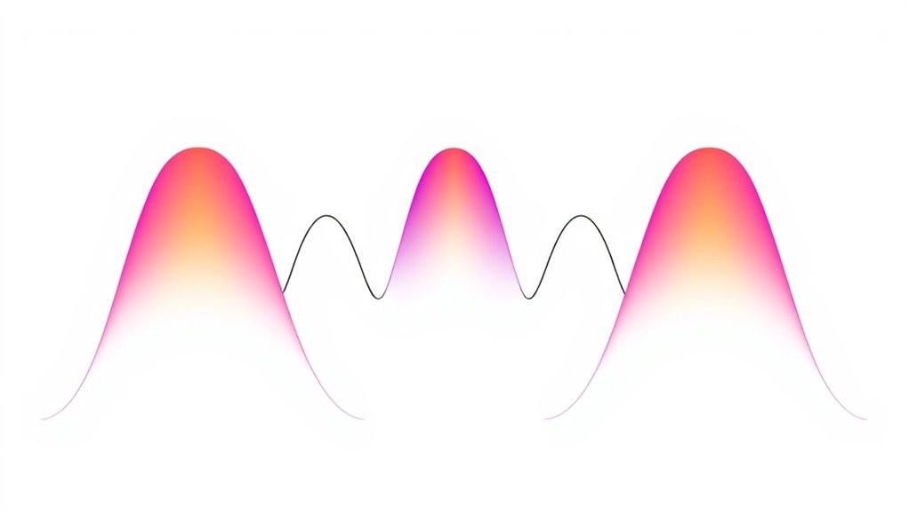
The key advantage of violin plots is their ability to represent the density distribution of data points. The shape of the violin indicates where data points are concentrated, giving you a visual cue about the frequency of values. Thick sections of the plot signify higher data density, while thinner areas show sparser data points. This feature helps you spot skewness, multimodality, or unusual patterns that might be missed with traditional box plots. When interpreting data, such visual cues are vital because they can reveal underlying structures or irregularities, guiding your next steps in analysis. As a form of statistical visualization, violin plots bridge the gap between raw data and summary statistics, offering a detailed snapshot that supports deeper insights. Recognizing the importance of visual data representation can enhance your ability to communicate complex information effectively.
Another aspect that makes violin plots particularly effective is their ability to display multiple data groups simultaneously. By overlaying or juxtaposing violins, you can quickly compare distributions across different categories, time points, or experimental conditions. This comparative view enhances your data interpretation by highlighting differences in data variability, central tendency, and distribution shape. It’s especially useful in exploratory data analysis, where you need to identify trends or anomalies before jumping into more complex modeling. The visual richness of violin plots enables you to communicate findings more clearly, making them an essential part of effective statistical visualization. Whether you’re presenting to colleagues or exploring data for research, understanding how to read violin plots can elevate your analytical skills.
In essence, violin plots serve as a versatile, informative tool that simplifies complex data interpretation. They provide a detailed, visual depiction of distribution that helps you grasp the nuances of your data quickly. As a form of statistical visualization, they combine the strengths of box plots and density plots, making them ideal for exploring data shape, spread, and outliers. By incorporating violin plots into your data analysis process, you gain a more complete understanding of your datasets, enabling smarter decisions and clearer communication of your findings.
Frequently Asked Questions
How Do Violin Plots Compare to Box Plots?
You might wonder how violin plots compare to box plots. Violin plots offer a detailed density visualization, showing the distribution shape alongside summary stats. Unlike box plots, which highlight median and quartiles, violin plots reveal the data’s full distribution, making it easier to compare underlying density and detect multimodal patterns. They provide a richer visualization for distribution comparison, giving you a deeper understanding of your data’s spread and density.
What Are the Limitations of Violin Plots?
When considering limitations of violin plots, you might find that they can complicate data interpretation because their visual aesthetics can be misleading if not carefully analyzed. They may obscure outliers or small sample sizes, making it harder to identify specific data points. Additionally, they require more space and can be less intuitive for some viewers compared to simpler charts like box plots, especially when presenting complex data.
Can Violin Plots Display Multiple Data Groups?
You can definitely use violin plots to display multiple data groups. They offer a powerful way to compare data distributions side by side, making it easier to identify differences and similarities. By overlaying or grouping violins, you get a clear comparative visualization of each dataset’s shape, spread, and density. This makes violin plots ideal for analyzing multiple data groups, helping you interpret complex data distributions efficiently.
What Software Tools Support Creating Violin Plots?
Imagine a toolbox filled with possibilities—you can craft your data story with various software tools. You’ll find options like R (ggplot2), Python (Seaborn, Matplotlib), and specialized programs like Origin and Tableau. These tools support creating violin plots with interactive customization and serve as excellent alternative visualizations. Explore them to enhance your data insights and tailor your visuals to match your presentation needs effortlessly.
How Do I Interpret the Density Curves in Violin Plots?
When interpreting density curves in violin plots, you focus on the distribution shape. The width of the curve at any point shows how common values are—wider parts indicate higher density, meaning more data points fall there. Thin areas mean fewer data points. Look for multiple peaks to identify modes, and note the overall spread to understand data variability. This helps you grasp the underlying distribution of your data.
Conclusion
Now that you’ve seen how violin plots reveal data distributions, don’t you wonder how many insights you’ve been missing with traditional charts? These versatile visuals combine the best of box plots and density curves, offering a richer story about your data. Once you understand their power, you’ll naturally want to incorporate them into your analysis toolkit. So, are you ready to access deeper understanding and make smarter decisions with violin plots?