

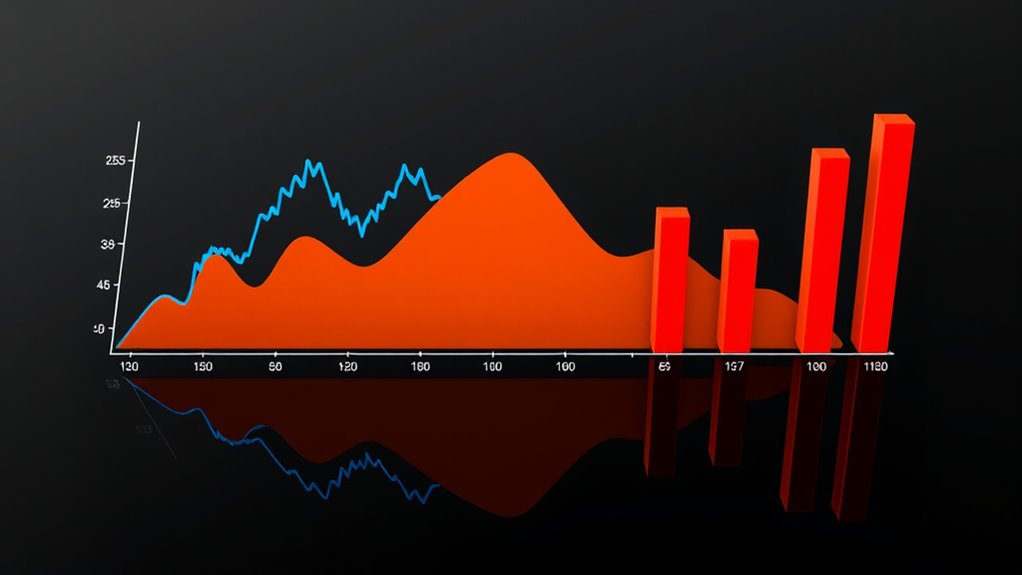
When choosing charts for time series data, you need to take into account your goals. Line charts are great for showing continuous trends and fluctuations clearly over time. Area charts build on this by emphasizing the volume and overall shape of data, making patterns more noticeable. Bar charts are better suited for comparing specific periods or categories, but they don’t display smooth trends as effectively. Keep exploring to find the best way to visualize your data clearly.
Key Takeaways
- Line charts are ideal for displaying continuous trends and fluctuations over time clearly.
- Area charts emphasize the magnitude and cumulative volume of data, highlighting overall shape.
- Bar charts are best for discrete, categorical comparisons or summarized time intervals.
- Normalization ensures that visual differences reflect true data trends, regardless of scale.
- Selecting the appropriate chart depends on whether you want to show detailed trends, volume, or categorical comparisons.
Have you ever wondered how to effectively visualize data that changes over time? When dealing with time series data, choosing the right chart type can make all the difference in understanding trends and patterns. Line, area, and bar charts each offer unique advantages, but knowing when and how to use them depends on your goals and the story you want to tell. To start, consider data normalization—scaling your data to a common range—to make different datasets comparable and reveal true trends without bias. This step is essential for accurate trend analysis, especially when your data varies widely in magnitude. Once normalized, your charts can better highlight subtle shifts and long-term patterns. Additionally, understanding the 16PF traits can help in selecting visualizations that best represent behavioral data over time, enhancing interpretability.
Line charts are often the go-to option for trend analysis because they excel at displaying continuous data over time. They provide a clear view of fluctuations, peaks, and valleys, allowing you to easily identify upward or downward trends. Because line charts connect data points with smooth lines, they help you see the overall direction of your data, making them ideal for tracking performance metrics or monitoring changes over intervals. They’re especially effective when you need to compare multiple datasets simultaneously, as overlapping lines can quickly reveal correlations or divergences.
Line charts clearly show continuous data trends over time, highlighting fluctuations and overall direction.
Area charts build on line charts by filling the space beneath the line, which emphasizes the magnitude of data over time. They’re excellent for illustrating the volume or cumulative effect of data, giving a sense of how different components contribute to the whole. For trend analysis, area charts can make it easier to grasp the proportion of various factors influencing your data, especially when combined with data normalization. However, they can become cluttered if you overlay too many series, so use them when you want to highlight the size of changes and the overall shape of your data.
Bar charts are typically less common for analyzing continuous time series data but can be powerful when comparing data points at specific intervals. They work well when the data is categorical or discrete, such as sales per quarter or annual revenue figures. Bar charts are straightforward and easy to interpret, making them suitable for presenting summarized data or when you want to emphasize differences between distinct periods. However, they’re less effective for showing smooth trends over time, which is where line and area charts excel.
Ultimately, selecting the right chart depends on your specific data and what you aim to reveal through trend analysis. Whether you prefer the clarity of line charts, the volume emphasis of area charts, or the simplicity of bar charts, understanding their strengths allows you to communicate your data story more effectively. Proper data normalization ensures your visualizations accurately reflect real trends, making your insights more reliable.
Amazon Product B0F1H325FN
As an affiliate, we earn on qualifying purchases.
Frequently Asked Questions
How Do I Choose the Best Chart Type for My Data?
You should choose a chart type based on how you want to visualize your data. If you want to show trends over time clearly, a line chart works best. For emphasizing the magnitude, an area chart adds visual impact, while bar charts are great for comparing discrete categories. Remember to perform data normalization if needed, and customize your chart to highlight key insights effectively.
Can These Charts Be Combined for Better Insights?
You can definitely combine these charts for layered visualizations that reveal more insights. Using chart combinations, like overlaying a line chart on an area or bar chart, helps you see trends and comparisons simultaneously. It’s a smart move—killing two birds with one stone—because layered visualizations make complex data easier to understand. Just make sure your layers are clear and not cluttered, so viewers can easily interpret the story your data tells.
What Are Common Mistakes When Creating Time Series Charts?
When creating time series charts, avoid common mistakes like inconsistent color schemes, which can confuse viewers, and improper axis scaling, making data look misleading. Guarantee your colors are distinct and intuitive, and set axis scales thoughtfully to accurately reflect data trends. Double-check that the time intervals are consistent and labels are clear. These steps help your charts communicate insights effectively and prevent misinterpretation.
How Do I Handle Missing Data Points in Charts?
When handling missing data points in your charts, you should use interpolation techniques for gap filling, which helps create a continuous data flow. You can opt for linear, polynomial, or spline interpolation depending on your data’s nature. This approach improves readability and accuracy, ensuring your chart accurately reflects trends without misleading gaps. Always choose the interpolation method that best preserves the data’s integrity and context.
Are There Interactive Chart Options for Real-Time Data?
Yes, you can use interactive chart options for real-time data. They allow you to see live data updates and dynamic changes instantly. Tools like dashboards, with features such as zoom, hover details, and filtering, make it easy to monitor live data effectively. These interactive options guarantee your charts stay current and engaging, giving you real-time insights without the need for constant manual refreshes.
Amazon Product B0BLT79X2G
As an affiliate, we earn on qualifying purchases.
Conclusion
Choosing the right chart type depends on what story you want to tell. Line charts excel at showing trends over time, while area charts highlight volume and magnitude. Bar charts work well for comparing categories. Remember, don’t put all your eggs in one basket—select the chart that best captures your data’s essence. When you pick wisely, you’ll have a clearer picture and make better decisions. After all, a picture is worth a thousand words.
Amazon Product B0DT1H7NDS
As an affiliate, we earn on qualifying purchases.
Amazon Product B0FHMS6993
As an affiliate, we earn on qualifying purchases.