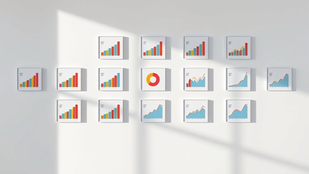

Small multiples are a visual technique where you display similar charts side-by-side to compare data easily. They help you spot patterns, differences, and trends quickly without switching between graphs or tables. By using consistent design elements like axes and scales, they make complex data clearer and more engaging. This simple approach boosts understanding and makes insights more accessible. Keep exploring, and you’ll discover how mastering small multiples can improve your data storytelling.
Key Takeaways
- Small multiples are a series of similar charts displayed side by side for easy comparison.
- Consistent axes, scales, and design elements across charts help viewers focus on data differences.
- They simplify complex data by breaking it into digestible visual segments, enhancing understanding.
- Small multiples increase engagement by allowing viewers to explore patterns and trends at their own pace.
- They are versatile tools suitable for various data types, making insights clearer and more impactful.
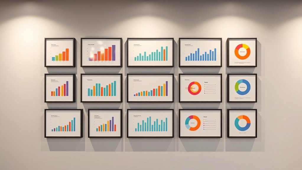
Have you ever wondered how to compare multiple data sets clearly and efficiently? Small multiples are your answer. They’re a powerful technique in data visualization that allows you to display several related charts side-by-side, making it easier to spot patterns, differences, and trends across different categories or over time. Instead of flipping through various graphs or sifting through dense tables, small multiples provide a compact, organized view that enhances your understanding instantly. When you use small multiples effectively, you’re not just presenting data—you’re telling a story that’s easy to follow. This approach keeps your audience engaged because they can see the comparisons at a glance, increasing user engagement and making your insights more accessible.
The core idea behind small multiples is to create a series of similar visualizations that share the same axes, scales, and design elements. This consistency allows viewers to focus on the differences and similarities between data sets without confusion. For instance, if you’re analyzing sales across different regions, small multiples let you display each region’s sales trend in a separate but visually aligned chart. Your audience can instantly compare these trends without switching between different graphs, reducing cognitive load and making your presentation more compelling. Additionally, using visual consistency helps viewers interpret the data more easily by maintaining uniform design elements across all charts. The simplicity of this method ensures that complex data becomes approachable, especially when your goal is to highlight contrasts or growth patterns over time.
One key advantage of small multiples is their ability to improve user engagement. When viewers see data presented in a clear, uniform format, they’re more likely to stay focused and absorb the information. It transforms a cluttered dashboard into an intuitive visual narrative. Instead of overwhelming your audience with a single, complicated chart, you break the data into smaller, digestible parts. This approach invites viewers to explore each segment at their own pace, encouraging deeper analysis. As a result, they feel more involved in the story your data tells, which boosts their overall engagement and understanding. Plus, small multiples are adaptable to various types of data—be it time series, categories, or geographic regions—making them versatile for many contexts.
Frequently Asked Questions
How Can I Create Small Multiples in Excel?
To create small multiples in Excel, start by preparing your data with clear categories. Insert a chart, then copy and paste it multiple times to display different segments. Use chart alignment options to arrange them neatly. Adjust color schemes for consistency across all charts, making comparisons easier. This method helps you visualize data trends side-by-side, enhancing clarity and insight, especially when you want to compare multiple variables within a single view.
What Are Best Practices for Designing Small Multiples?
Imagine you’re a Renaissance artist, meticulously crafting a masterpiece. When designing small multiples, prioritize color consistency to make comparisons easy and avoid confusion. Keep label clarity sharp—use legible fonts and clear titles for each chart. Arrange your visuals logically, like a gallery, so viewers can effortlessly interpret patterns. These best practices ensure your small multiples are both visually appealing and easy to understand, helping your data tell a compelling story.
Which Data Types Work Best With Small Multiples?
When choosing data types for small multiples, focus on continuous and categorical data that can be effectively compared across multiple views. Use consistent color schemes to distinguish categories clearly, and guarantee data normalization for accurate comparisons. Numeric data like sales figures or temperatures work well, while normalized data helps avoid misinterpretation. This approach keeps your small multiples clear, cohesive, and easy to analyze visually.
How Do Small Multiples Compare to Other Data Visualization Methods?
Imagine trying to read a novel with scattered pages. Small multiples offer a clear, comparative effectiveness by displaying similar data side-by-side, reducing visual complexity. Unlike pie charts or line graphs, they allow you to see patterns across categories instantly. You can quickly spot trends or outliers, making them ideal for comparative analysis. They’re more effective than complex, cluttered visuals because they simplify comparison without overwhelming your viewer.
Can Small Multiples Be Interactive or Dynamic?
You can definitely make small multiples interactive or dynamic. Using tools like interactive dashboards, you can add features such as filters, tooltips, and clickable elements that update the visuals in real-time. Dynamic updates allow you to explore data across different time periods or categories seamlessly, enhancing understanding. This interactive approach makes small multiples more engaging and insightful, helping you spot trends and patterns more effectively.
Conclusion
Now that you’ve learned how to create small multiples, you’re ready to make your data stories clearer and more engaging. Think of them as your modern-day scrolls—easy to compare, quick to interpret. Just don’t forget, even in this digital age, a bit of good old-fashioned patience and a dash of curiosity go a long way. So go ahead, wield your new skills like a data wizard and turn chaos into clarity—no time machine needed!