Screen resolution affects how you interpret charts because higher pixel density provides clearer visuals. When the details are sharp, you understand complex data faster and make better decisions. Low resolution can obscure crucial information, leading to missed insights or misinterpretations. Vibrant colors and precise lines not only enhance engagement but also improve your overall experience with data. If you want to uncover more about the impact of visuals on data analysis, keep exploring this topic.
Key Takeaways
- Higher screen resolution enhances clarity, making charts more interpretable and reducing the likelihood of misinterpretation.
- Sharp displays improve detail visibility, allowing quicker recognition of trends and insights in data.
- Visual clarity facilitates faster information processing, leading to more accurate decision-making and conclusions.
- Aesthetically pleasing charts on high-resolution screens enhance user engagement and enjoyment during data analysis.
- Improved pixel density supports a seamless reading experience, enabling focused interaction with the data’s meaning.
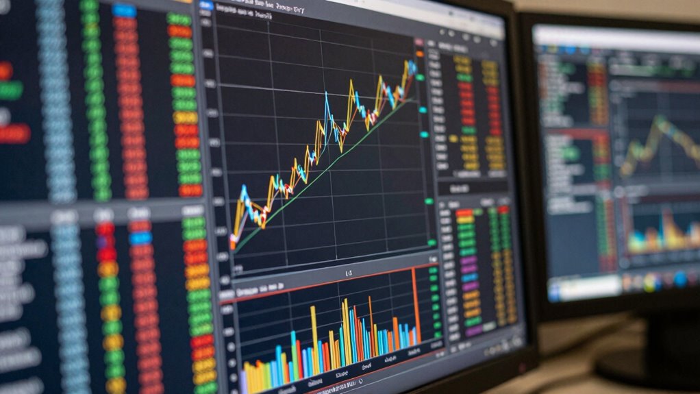
When it comes to screen resolution, you might be surprised by how much it impacts your reading experience. The clarity with which you see charts and graphs can make all the difference in how effectively you interpret data. Higher pixel density means more detail, allowing you to discern finer points and subtle differences in the data presented. If you’re trying to analyze a complex chart filled with intricate lines or various data points, a high-resolution screen will enhance your ability to read each element clearly.
Screen resolution significantly impacts your reading experience, enhancing clarity and detail in charts for better data interpretation.
Visual clarity is essential for understanding information quickly. If you’re squinting at a low-resolution chart, you’re likely to miss important insights that could affect your reading speed. When everything is sharp and well-defined, you can process information more efficiently. This means you won’t just read faster; you’ll also interpret data more accurately, leading to better decision-making. In contrast, a blurry display can lead to misinterpretations that might skew your understanding of the data.
Let’s not overlook chart aesthetics either. Well-designed charts can only shine when displayed on screens that do them justice. Vibrant colors, clear lines, and structured layouts all contribute to a better user experience. If you’re looking at a beautifully crafted pie chart, for instance, a high-resolution display allows you to appreciate the color gradients and the divisions more effectively. You’ll find yourself more engaged and less frustrated, which can transform data analysis into a pleasurable activity.
You may also notice that the effectiveness of your data interpretation greatly increases with higher screen resolutions. When you can clearly see the differences between trends or categories, the insights become more apparent. This clarity enables you to draw conclusions based on the data without second-guessing what you see. Additionally, pixel density plays a critical role in how sharp and detailed the displayed information appears, directly affecting your ability to analyze data accurately.
Moreover, a better screen enhances your overall experience. Whether you’re in the middle of a presentation or just reviewing your findings, the ease of reading impacts how you interact with the information. A seamless experience allows you to focus more on what the data means rather than how to decipher it.
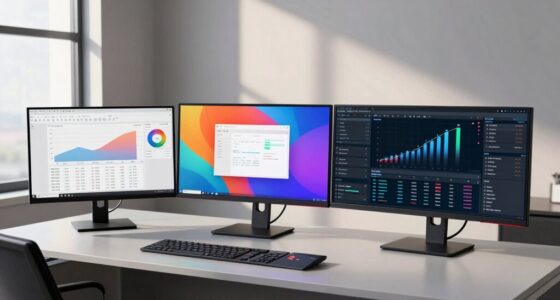
high resolution monitor for data analysis
As an affiliate, we earn on qualifying purchases.
As an affiliate, we earn on qualifying purchases.
Frequently Asked Questions
How Does Screen Resolution Affect Color Perception in Charts?
Screen resolution considerably affects your color perception in charts. Higher pixel density enhances color contrast, making shades more distinct and easier to differentiate. If you’re looking at a low-resolution screen, colors might blend together, obscuring important data. You might miss subtle variations that can impact analysis. Additionally, poor resolution can distort color accuracy, leading to misinterpretations. So, investing in a higher resolution display can greatly improve how you read and understand charts.
Can Different Devices Change the Way Charts Are Interpreted?
Yes, different devices can change how you interpret charts. The chart design might look great on one screen but could distort on another, affecting device compatibility. When you view data on a smartphone versus a tablet, the user experience varies, which can lead to misinterpretations. This inconsistency can compromise data accuracy, making it essential to guarantee your charts are optimized for various devices to maintain clarity and effectiveness in communication.
What Role Does Font Size Play in Chart Readability?
Think of font size as the spotlight on a stage; it highlights the important details of your chart. When you choose a larger font size, you enhance font clarity, making information easier to digest. A smaller font can feel like a whisper in a crowded room, making it harder to grasp key points. So, always consider how size impacts readability—your audience will appreciate the effort, and the message will shine through clearly.
Are There Optimal Screen Resolutions for Viewing Specific Chart Types?
Yes, there are ideal resolutions for viewing specific chart types. For instance, higher resolutions enhance chart clarity in detailed visualizations like heat maps or intricate graphs, making data points easier to distinguish. If you’re analyzing simpler charts, like bar graphs, a lower resolution can suffice without sacrificing readability. Always adjust your screen settings to match the chart complexity; this way, you’ll guarantee you get the most accurate interpretation from your data.
How Do Screen Reflections Impact Chart Visibility?
Screen reflections can transform your chart into a confusing kaleidoscope! When you’re battling screen glare, every viewing angle feels like a new adventure, but not the fun kind. You squint and twist, trying to decipher the data hidden behind those pesky reflections. Even the most straightforward chart becomes a puzzle, leaving you frustrated. To get a clear look, you might need to adjust your position or lower the brightness—anything for clarity!
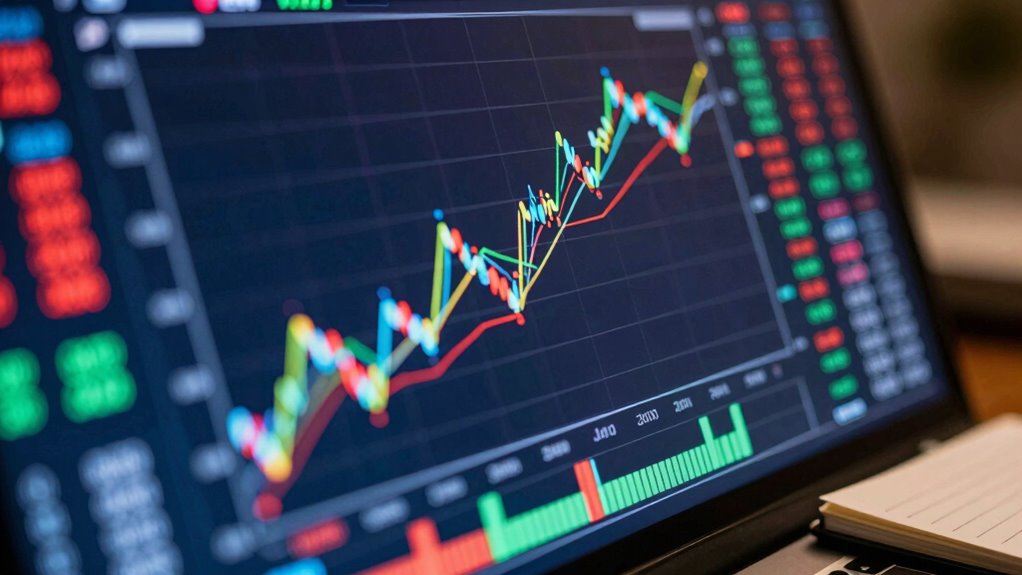
4K display for chart reading
As an affiliate, we earn on qualifying purchases.
As an affiliate, we earn on qualifying purchases.
Conclusion
In the world of charts, screen resolution is your lens, sharpening or blurring the details. A high resolution is like a crisp autumn morning, where every leaf’s color pops, while a low resolution is a foggy day, where patterns fade into obscurity. You need clarity to navigate the data landscape; without it, you might just wander lost in a maze of numbers. So, next time you glance at a chart, remember: clarity is key to revealing its secrets.
professional color calibrated monitor
As an affiliate, we earn on qualifying purchases.
As an affiliate, we earn on qualifying purchases.
high pixel density computer screen
As an affiliate, we earn on qualifying purchases.
As an affiliate, we earn on qualifying purchases.