
To quickly learn how to create ridge plots, start by organizing your data into categories or groups. Use popular tools like Seaborn in Python or ggplot2 in R to generate the visual, adjusting parameters such as bandwidth and spacing for clarity. Focus on customizing colors and smoothness to make the ridges easily distinguishable. With a bit of practice, you’ll be able to interpret distribution patterns effectively—stick around to explore detailed techniques and tips to master this powerful visualization.
Key Takeaways
- Begin with organized data grouped by categories or variables for clear visualization.
- Use plotting libraries like Seaborn (Python) or ggplot2 (R) to generate ridge plots efficiently.
- Customize key parameters such as bandwidth, spacing, and colors to enhance clarity and interpretability.
- Follow step-by-step tutorials or guides that include code snippets for quick implementation.
- Practice adjusting visual elements to understand distribution patterns and improve your ridge plot skills.

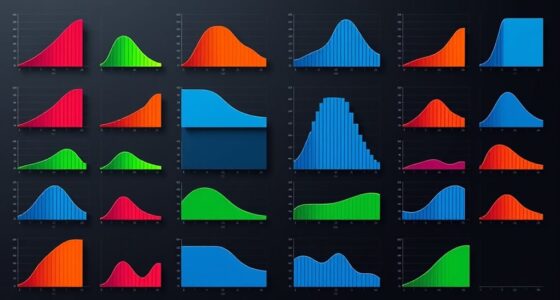
Ridge plots are an effective way to visualize the distribution of multiple variables or groups simultaneously, making it easier to compare patterns across datasets. If you’re involved in data visualization and want to uncover insights quickly, ridge plots can be a powerful addition to your toolkit. They allow you to overlay multiple density curves in a stacked format, providing a clear view of how different groups or variables compare regarding their distribution. This visual approach simplifies complex data, helping you spot trends, overlaps, and outliers at a glance. Whether you’re analyzing experimental results or survey data, ridge plots facilitate a more intuitive understanding of your dataset’s structure.
When working with statistical analysis, clarity is key. Ridge plots transform dense numerical information into an accessible visual form, enabling you to interpret data distributions without digging through raw numbers. They are especially useful when you’re comparing multiple categories or time points, as they visually emphasize differences or similarities between groups. To create a ridge plot, you typically start with your dataset—organized by categories or groups—and then select a plotting library or tool that supports these visualizations, like Python’s Seaborn or R’s ggplot2. These tools simplify the process, offering customizable options for colors, spacing, and smoothing parameters. As you build your plot, ensure your data is properly prepared; clean, well-structured data yields clearer and more meaningful visualizations.
The key to effective ridge plots lies in choosing the right parameters. Adjust the bandwidth for density estimation to balance detail and smoothness, and set appropriate spacing between the ridges so they don’t overlap excessively. You want each distribution to be distinguishable, but also to maintain a cohesive visual flow. When interpreting your ridge plot, pay attention to the shape and height of the ridges, which indicate the density and frequency of data points within certain ranges. Peaks highlight common values, while the spread shows variability. This insight supports your statistical analysis by revealing how different groups compare regarding their distribution patterns.
Top picks for "ridge plot fast"
Open Amazon search results for this keyword.
As an affiliate, we earn on qualifying purchases.
Frequently Asked Questions
Can Ridge Plots Be Used for Categorical Data Analysis?
You might wonder if ridge plots suit categorical data analysis. While they excel in visualizing distributions of continuous data, they’re not ideal for categorical visualization. Ridge plots help you see data categorization techniques by showing density variations, but for pure categories, bar charts or mosaic plots are more effective. So, use ridge plots when analyzing continuous variables, but stick to other methods for categorical data to get clearer insights.
What Are Common Pitfalls When Creating Ridge Plots?
Imagine you’re in a time machine, and creating ridge plots, a common pitfall is neglecting color gradients, which can obscure data differences. You also risk misrepresenting data with improper axis adjustments, making comparisons misleading. To avoid these pitfalls, guarantee your color gradients clearly distinguish distributions, and adjust axes thoughtfully. This way, your ridge plot remains clear, accurate, and visually compelling, helping viewers easily interpret the data trends.
How to Customize Color Schemes in Ridge Plots?
To customize color schemes in ridge plots, you should choose a suitable color palette that enhances your data’s story. Use functions like `scale_fill_manual()` or `scale_color_manual()` to specify your colors, ensuring aesthetic customization aligns with your visualization goals. Experiment with different palettes to find one that provides clear contrast and visual appeal, making your ridge plots more engaging and easier to interpret.
Are Ridge Plots Suitable for Large Datasets?
Imagine attempting a density comparison of thousands of data points—ridge plots make this task doable! They excel at distribution visualization, revealing subtle differences across large datasets. While they can become cluttered with excessive data, smart filtering and stacking help maintain clarity. So, yes, ridge plots are suitable for large datasets, providing a powerful way to visualize complex distributions without losing the big picture.
How Do Ridge Plots Compare to Violin Plots?
You might wonder how ridge plots compare to violin plots for density comparison and distribution visualization. Ridge plots display multiple distributions stacked vertically, making it easy to compare patterns across groups. Violin plots combine box plots with density curves, showing detailed distribution shape. While ridge plots excel at visualizing trends over categories, violin plots provide a deeper look into distribution shape, making each useful depending on your analysis focus.
Conclusion
Now that you’ve navigated the nuances of ridge plots, you’re ready to wow with your work. With a little practice, you’ll produce powerful, picturesque visualizations that pop and persuade. Remember, mastery makes your data dance, and detail deepens your discovery. So, stay steadfast, stay skilled, and let your visualizations speak volumes. Keep creating, keep enthralling—your data-driven journey just got a whole lot more dynamic and delightful!