
Real-time dashboards for IoT data streams let you monitor device performance instantly, helping you spot issues and make quick decisions. They use edge computing to process data locally, reducing latency and bandwidth use, so you get faster updates. With visual tools like gauges and heat maps, you can easily spot trends and anomalies. Proper hardware and smart integrations make these dashboards reliable and actionable, so you can optimize IoT operations—continue to explore to learn more about building these powerful tools.
Key Takeaways
- Enable instant insights and device monitoring through real-time data visualization techniques like gauges and heat maps.
- Use edge computing to process data locally, reducing latency and bandwidth for faster dashboard updates.
- Incorporate alert systems and interactive filters for quick issue detection and efficient data analysis.
- Design intuitive layouts that facilitate quick trend recognition and support proactive decision-making.
- Ensure hardware and system integration optimize performance and reliability in environments like manufacturing and smart cities.
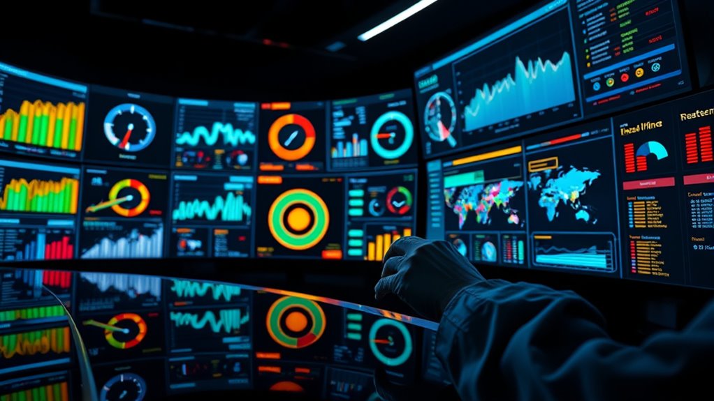
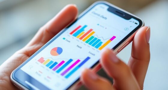
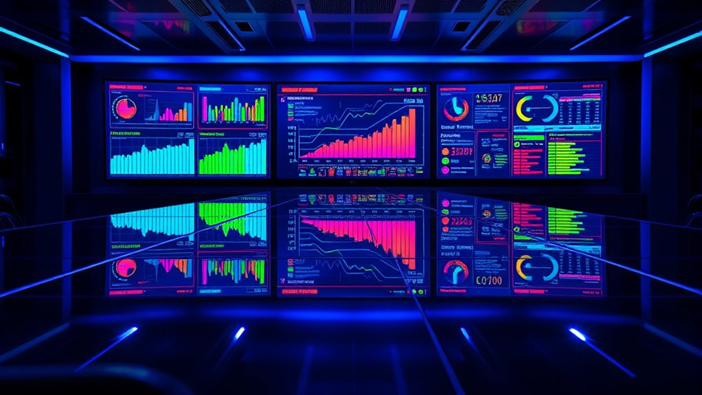
In today’s fast-paced world, real-time dashboards have become essential tools for managing IoT data streams effectively. These dashboards provide immediate insights, allowing you to monitor devices, detect anomalies, and make informed decisions without delay. To achieve this, leveraging edge computing is vital. By processing data locally at or near the source, edge computing reduces latency and minimizes bandwidth usage, guaranteeing your dashboard updates in real time. This setup allows you to handle vast amounts of IoT data efficiently, especially when dealing with numerous sensors or devices spread across different locations. When combined with smart data visualization techniques, edge computing empowers you to present complex data clearly and intuitively. Visual elements like gauges, heat maps, and dynamic charts translate raw data into actionable insights instantly, making it easier to spot trends or issues at a glance.
You’ll find that designing effective dashboards involves choosing the right data visualization techniques tailored to your specific needs. For example, real-time line graphs are ideal for tracking continuous metrics like temperature or humidity, while bar charts can compare categorical data, such as different machine statuses. Dashboards should also incorporate alert systems that trigger notifications when certain thresholds are exceeded, enabling quick responses to potential problems. The key is to balance detail and clarity—present enough information to inform decisions without overwhelming users. Using color coding and interactive filters enhances usability, allowing you to drill down into data or view summaries with ease. These techniques make your dashboard not just a display of data but a practical tool for proactive management. Additionally, selecting appropriate hardware and ensuring proper setup can significantly improve the performance and reliability of your IoT monitoring systems.
Furthermore, integrating edge computing with your data visualization techniques enhances overall efficiency. Since data is processed closer to the source, you experience faster updates and reduced network dependency. This setup is especially beneficial in environments where connectivity issues are common or where real-time responses are critical—like manufacturing plants, smart cities, or healthcare facilities. Your dashboards become more reliable and responsive, empowering you to act swiftly on incoming data. As IoT ecosystems grow more complex, the combination of edge computing and advanced visualization techniques ensures your dashboards remain a powerful, real-time control center. This synergy ultimately enhances your ability to oversee IoT operations seamlessly, making data-driven decisions more accurate and timely.
IoT real-time dashboard software
As an affiliate, we earn on qualifying purchases.
As an affiliate, we earn on qualifying purchases.
Frequently Asked Questions
How Do Real-Time Dashboards Improve Decision-Making Processes?
Real-time dashboards improve your decision-making by providing instant insights through effective visualization techniques, making complex data easy to interpret quickly. You can customize alerts to notify you of critical changes, enabling swift responses. This immediate access to relevant data helps you identify trends, troubleshoot issues early, and make informed choices on the spot, ultimately enhancing efficiency and reducing risks in your operations.
What Are Common Challenges in Implementing Iot Dashboards?
Did you know that 60% of IoT projects face challenges during implementation? When creating dashboards, you often struggle with sensor calibration and data normalization. These issues can lead to inaccurate insights and delayed decision-making. Ensuring proper calibration and consistent data normalization helps maintain data integrity. Overcoming these challenges requires careful planning, regular updates, and robust data processing to deliver reliable, real-time insights for your operations.
How Do Dashboards Handle Data Security and Privacy Concerns?
You handle data security and privacy on dashboards by implementing data encryption to protect sensitive information during transmission and storage. Access controls are vital, allowing you to restrict who can view or modify data based on roles. Regularly updating security protocols and monitoring access helps prevent breaches. These measures guarantee your IoT data remains secure and private, giving you peace of mind while managing real-time insights.
Can Dashboards Integrate Data From Multiple Iot Platforms?
Yes, dashboards can integrate data from multiple IoT platforms. You should focus on platform interoperability, ensuring different systems communicate effectively. Data normalization is vital, as it standardizes data formats from various sources, making integration seamless. By combining these approaches, your dashboard can display extensive insights from diverse IoT platforms, enabling you to monitor all your devices in one unified view and make informed decisions efficiently.
What Are the Best Practices for Designing User-Friendly Dashboards?
Think of designing a dashboard like creating a well-organized map. You should prioritize visual hierarchy to guide users effortlessly through data, highlighting critical info first. Use clear, consistent color schemes to differentiate data types and reduce confusion. Keep it simple—avoid clutter—and guarantee navigation is intuitive. By focusing on these best practices, you make your dashboard both visually appealing and easy to understand, empowering users to make quick, informed decisions.
edge computing IoT device monitor
As an affiliate, we earn on qualifying purchases.
As an affiliate, we earn on qualifying purchases.
Conclusion
Now, imagine watching your IoT data flow like a vibrant river, each stream illuminating your dashboard with real-time insights. You can instantly spot anomalies, optimize processes, and make confident decisions—all at a glance. These dashboards turn raw data into a living, breathing picture of your environment. With every flicker of information, you stay connected and in control, steering the future smoothly. Embrace this power, and let your data tell its story in vivid, real-time detail.
IoT heat map visualization tool
As an affiliate, we earn on qualifying purchases.
As an affiliate, we earn on qualifying purchases.
industrial IoT alert system
As an affiliate, we earn on qualifying purchases.
As an affiliate, we earn on qualifying purchases.