
To use pivot tables for statistical summaries, first ensure your data is clean, organized, and relevant. Insert a pivot table and choose where to place it. Drag fields into rows, columns, and values areas, then select the desired summary functions like sum, average, max, or count. You can customize calculations with formulas, filter and group data for specific insights, and enhance clarity using charts or conditional formatting. Exploring these steps will help you access powerful data insights.
Key Takeaways
- Drag relevant fields into “Values” and select summary functions like SUM, AVERAGE, MAX, or MIN for statistical insights.
- Use calculated fields and items to create custom metrics tailored to specific statistical analyses within the pivot table.
- Apply filters and grouping to focus on specific data subsets, enabling targeted statistical summaries.
- Incorporate external or additional data sources to enrich the analysis and provide more comprehensive statistical insights.
- Utilize conditional formatting and visual tools to highlight key statistical patterns, outliers, or variability in your data.
Selecting and Preparing Your Data for Statistical Analysis
Before performing statistical analysis, you need to carefully select and prepare your data. First, identify your data sources, such as databases or spreadsheets, and understand the types involved—whether quantitative or qualitative. Assess the volume of data to ensure it’s manageable and determine the formats, like CSV or JSON, to handle variety effectively. For example, if you’re working with data related to electric dirt bikes, understanding the specific models and features can help tailor your analysis. Next, evaluate data quality by checking for consistency, completeness, accuracy, and validity to ensure reliable results. Remove duplicate entries and address any redundancy. Once you’ve assessed quality, clean your data by handling missing values, normalizing, standardizing, and removing outliers. Proper organization—structuring datasets, defining relationships, and creating data tables—sets the foundation for meaningful analysis. Incorporating data organization techniques and best practices helps you produce accurate, valuable statistical summaries.
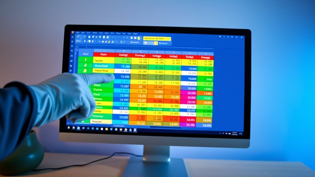
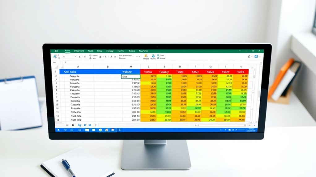
Creating a Pivot Table to Summarize Data Sets

Creating a pivot table is a powerful way to quickly organize and summarize large data sets. To start, select a cell within your data, then go to the “Insert” menu and choose “Pivot Table.” Once you’ve inserted the pivot table, consider the benefits of data analysis that come from visualizing complex information in a clear format. Decide where you’d like to place the new table—either on a new sheet or an existing one. Drag fields into the “Rows,” “Columns,” and “Values” areas to structure your data. For example, place product categories in rows and sales figures in values. Adjust the layout and choose the type of summary, such as SUM, COUNT, or AVERAGE, to analyze different aspects of your data. Understanding contrast ratio helps in choosing projectors that provide deeper blacks and brighter whites, which can enhance your viewing experience. This flexibility lets you uncover trends, compare categories, and generate meaningful insights efficiently.
Choosing and Applying Statistical Functions in Pivot Tables

Selecting the appropriate statistical functions in pivot tables is essential for deriving meaningful insights from your data. You can choose from functions like SUM, AVERAGE, MAX, MIN, COUNT, and more, depending on your analysis goals. For numerical data, summation helps total values, while averaging reveals central tendencies. Ranking sorts data from highest to lowest, and percent difference measures change over time. Standard deviation indicates data variability. To apply these functions, place your fields in the data area and select the desired summary type. You can easily switch functions to explore different perspectives, and pivot tables will adjust calculations automatically. Choosing the right function assures your analysis accurately reflects the data’s story, enabling you to make informed decisions quickly. Additionally, understanding how to identify bad lemon juice signs can help ensure the quality of ingredients used in your analyses, especially when incorporating real-world data. Being aware of antique integration in decor can also inspire creative ways to present your data visualizations, making your reports more engaging.
Customizing Calculations With Formulas and Options

Customizing calculations in pivot tables allows you to go beyond basic summaries and tailor your data analysis to specific needs. You can create calculated fields that apply custom formulas across the entire dataset, enabling complex calculations like profit margins or sales taxes. For example, understanding how to tailor your calculations can help in managing environmental considerations and ensuring sustainable data practices. To do this, go to the “Analyze” tab, select “Fields, Items, & Sets,” then choose “Calculated Field” and input your formula, referencing other fields as needed. For more granular control, calculated items let you apply unique formulas to individual items within a field, such as regional adjustments. Additionally, leveraging the Data Model with Power Pivot and DAX formulas enables advanced calculations like time intelligence or conditional logic. These options give you powerful tools to customize your data analysis and enhance your pivot table insights effectively.
Filtering and Grouping Data for Focused Insights

To gain targeted insights from your pivot table, filtering and grouping data are essential techniques that help you focus on specific subsets of information. You can filter data using slicers, which stay visible and show active filters, or apply manual filters with AutoFilter for precise selections. Implementing vertical storage solutions and creating designated zones can also help organize your data visually, making analysis more intuitive. Combining multiple filters per field enhances analysis, especially when filtering for top or bottom values, percentages, or sums. Advanced filters allow for refined data analysis through the Filters box, enabling condition-based filtering and search functions. Grouping data simplifies complex datasets—date fields into months or years, numerical ranges, or text categories—creating hierarchies that improve readability. Implementing precise filtering techniques such as combining multiple criteria or using advanced options enables you to analyze specific data slices efficiently, making your statistical summaries more relevant and insightful.
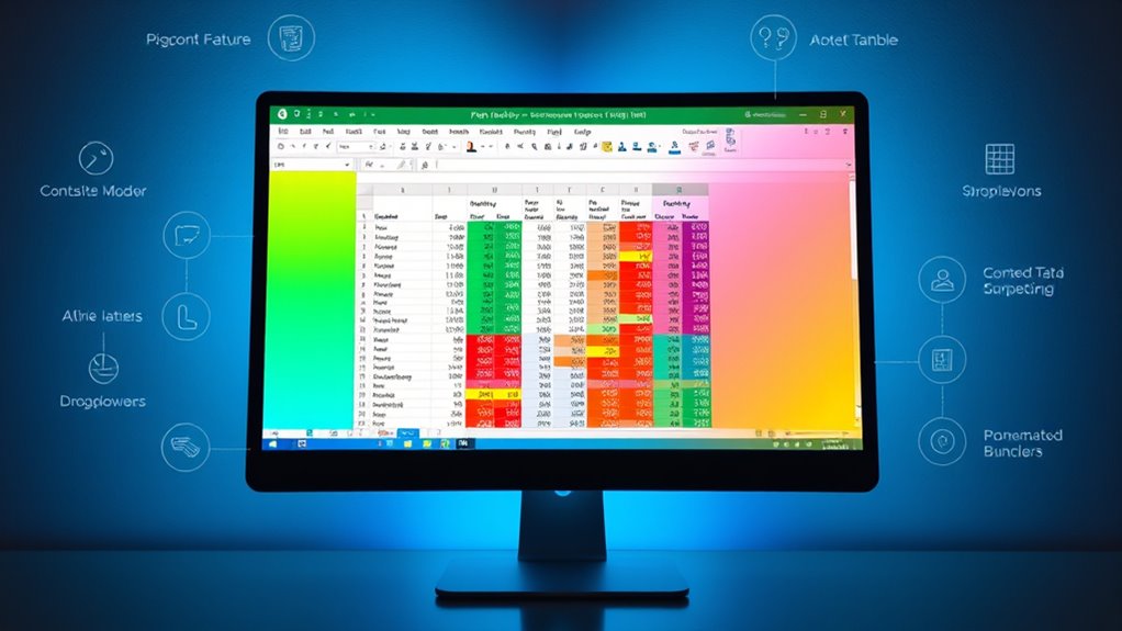
Visualizing Statistical Summaries With Charts and Conditional Formatting

Visualizing statistical summaries with charts and conditional formatting transforms raw data into clear, impactful insights. PivotCharts enhance your analysis by visually representing data, making trends and patterns easier to spot. You can choose from various chart types—bar, line, or pie—to best illustrate your data’s story. To create a Pivot Chart, select your PivotTable, then click “Insert” and pick a chart type. Conditional formatting adds another layer of clarity by highlighting critical values or outliers directly within PivotTables. Custom rules let you emphasize specific ranges or conditions, making anomalies stand out. For example, understanding how to interpret data visually can significantly improve your ability to identify meaningful patterns. Additionally, being aware of privacy policies and cookie preferences helps you manage your data security while analyzing sensitive information. Together, charts and conditional formatting improve data interpretation, helping you quickly identify key insights, compare categories, and make informed decisions without getting lost in numbers.
Enhancing Analysis With Advanced Features and Data Validation
Enhancing your analysis with advanced pivot table features unravels deeper insights and makes data exploration more efficient. Use double-clicking to drill down into specific data points, revealing detailed trends. Manage fields easily with drag-and-drop, organizing data into rows, columns, or values for clearer visualization. Incorporate essential oils for respiratory health into your analysis to understand their application in health-related datasets. Take advantage of grouping and custom calculations to summarize complex datasets effectively. Integrate conditional formatting within pivot tables to highlight outliers or key patterns instantly. Regularly refresh your pivot tables to ensure your insights reflect the latest data. Combining data validation lists with pivot tables to control user input, maintain source data consistency, and prevent errors. Handling multiple selections and automating list updates streamline analysis, making your statistical summaries more reliable and insightful. Additionally, understanding juice cleansing benefits can provide valuable context when analyzing health-related datasets, enhancing your overall insights.
Frequently Asked Questions
How Can I Handle Missing or Inconsistent Data in Pivot Tables?
Handling missing or inconsistent data in pivot tables is vital for accurate analysis. You should verify your data source to guarantee all relevant data is included, and refresh your pivot table regularly.
Use the “Show items with no data” option to display missing items, and perform data validation to prevent errors.
Adjust field settings to include missing data, and check filters that might exclude important information.
What Are the Best Practices for Designing Clear, Effective Pivot Table Layouts?
Did you know a well-designed pivot table can boost data clarity by up to 50%?
To create clear, effective layouts, keep it minimal—use only essential fields, organize them logically, and employ visual hierarchy with headers and colors.
Transpose fields for better readability, merge cells for alignment, and avoid clutter by limiting columns and rows.
Consistent styles and clear labels help your audience grasp insights quickly.
Can Pivot Tables Automatically Update With Real-Time Data Feeds?
You can set up pivot tables to automatically update with real-time data feeds by connecting them directly to live data sources like databases or APIs. Using tools like scheduled refreshes or live connections guarantees your data stays current.
Just make sure your network is reliable, your data sources are optimized, and your system can handle the load. This way, your pivot tables always reflect the most recent information without manual updates.
How Do I Troubleshoot Common Errors in Pivot Table Calculations?
When troubleshooting pivot table calculation errors, start by checking your source data for completeness and proper formatting.
Confirm formulas are correct and field references match exactly.
Watch out for division by zero errors by adding error handling like IFERROR.
Refresh your pivot table regularly to update calculations, and verify the data model loads properly.
Simplify complex formulas and test calculated fields to catch issues early.
What Security Measures Protect Sensitive Data in Pivot Table Reports?
You can protect sensitive data in pivot table reports by locking the worksheet and disabling editing features through Excel’s protection options. Use VBA scripts for advanced security, like automating sheet protection and preventing drill-downs.
Also, remove or mask confidential info from the source data before creating pivot tables. Additionally, restrict access with passwords, role-based permissions, and by exporting static reports, ensuring only authorized users can view or modify the data.
Conclusion
Now that you know how to create and customize pivot tables, you might think it’s too complicated. But with a little practice, it becomes a quick way to analyze your data efficiently. Don’t let the initial learning curve hold you back—once you get the hang of it, you’ll confidently generate insightful statistical summaries that save you time and improve your decision-making. So go ahead, start experimenting with your data today!