
Personalized visualizations let you customize charts and dashboards to match your unique preferences and goals. By adjusting colors, layouts, and interactivity, you can make data more accessible and relevant. This tailored approach helps highlight the most important insights for you, making analysis faster and more intuitive. With adaptive features, your visuals evolve as your needs change. Keep exploring to discover how these techniques can transform your data experience even further.
Key Takeaways
- Customize visualizations with user-defined color schemes and layouts for better relevance and readability.
- Enable interactive dashboards that allow real-time filtering and drill-down to tailored insights.
- Adapt visual features dynamically based on user preferences to enhance engagement and comprehension.
- Highlight key data points or regions to focus user attention on their specific interests.
- Use personalized visualizations to improve decision-making by aligning data presentation with user goals.
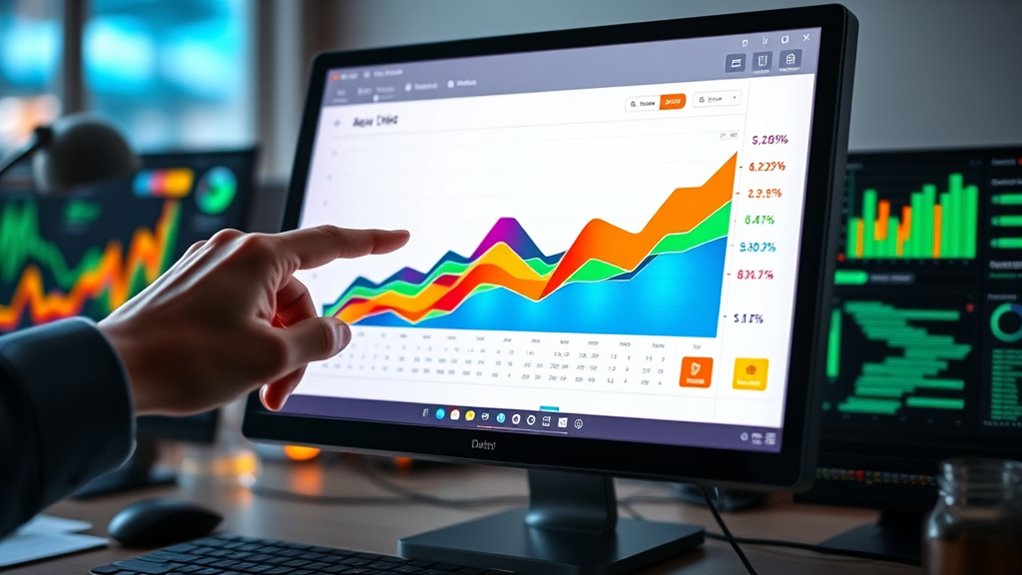
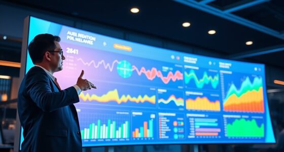
Have you ever wondered how data can be transformed into insights tailored specifically for you? The answer lies in personalized visualizations, which adapt to your preferences and needs to make data more accessible and meaningful. When you use interactive dashboards, you’re empowered to customize how information is presented, allowing you to focus on what matters most. These dashboards enable you to manipulate views, drill down into details, and filter data in real-time, giving you a dynamic experience that evolves with your questions. This interactivity makes complex data less overwhelming and more approachable, turning raw numbers into actionable insights that are directly relevant to your goals.
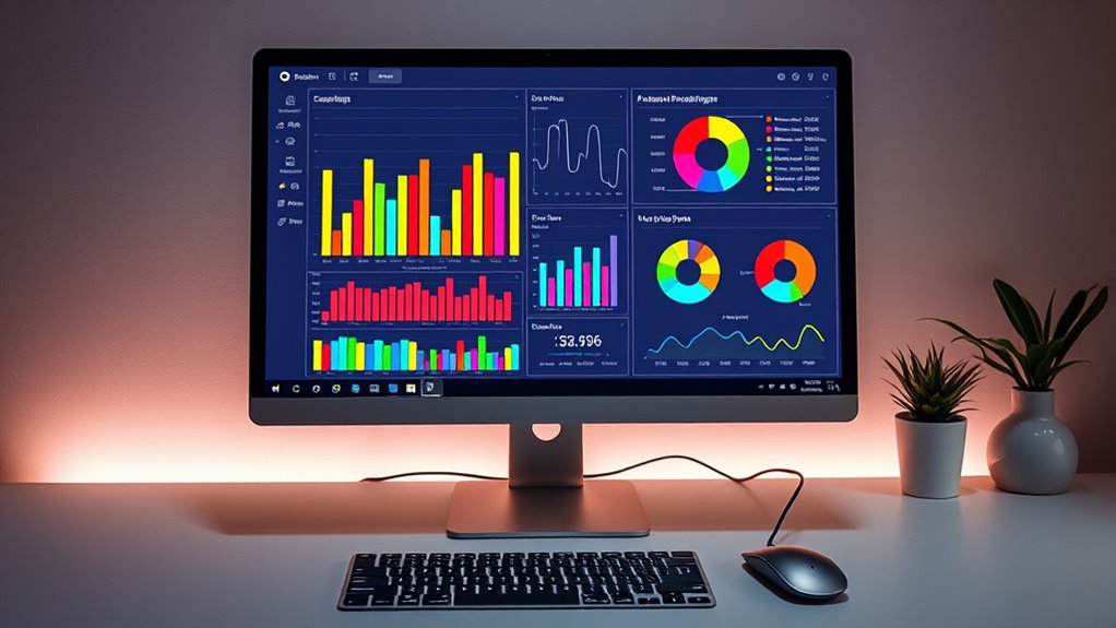
One of the key features that enhance personalization is the use of adaptive color schemes. Instead of static, one-size-fits-all colors, adaptive schemes adjust hues based on your preferences or the context of the data. For example, if you’re analyzing sales data, the colors can shift to highlight regions or products that need attention, drawing your focus precisely where it’s needed. You might prefer softer tones or high-contrast palettes for easier readability, and adaptive color schemes can accommodate these preferences seamlessly. This tailored approach helps prevent visual fatigue and makes it easier to interpret data at a glance, especially when dealing with large datasets or complex visualizations.
The beauty of combining interactive dashboards with adaptive color schemes is that it puts you in control. You can set your preferred color themes, choose which metrics to display, and customize layouts to suit your workflow. As your needs change, these visualizations adapt accordingly, providing fresh perspectives without the need for extensive reconfiguration. This level of personalization ensures you’re not stuck with generic charts that don’t reflect your priorities. Instead, you get a tailored view that highlights the most relevant insights, saving you time and reducing confusion.
Personalized visualizations also foster a deeper understanding because they align with your cognitive preferences. When you see data in a way that feels intuitive—through colors you find comfortable and interfaces that respond to your commands—you’re more likely to engage with the information actively. This engagement leads to better decision-making, as the visualizations become tools that genuinely support your objectives. Additionally, understanding how arcade machines operate can provide context for creating more engaging visual content, as they rely on specialized hardware and performance mechanisms similar to complex data systems. By leveraging interactive dashboards and adaptive color schemes, you transform static data into a personalized experience, turning raw information into a powerful resource tailored specifically for you.
Frequently Asked Questions
How Can User Feedback Improve Visualization Customization?
You can improve visualization customization by actively listening to user feedback, which enhances user engagement. Incorporate their suggestions through feedback loops, allowing users to see their input reflected in future visualizations. This iterative process helps you identify preferences, optimize chart features, and create more personalized experiences. As a result, users feel valued and more satisfied, leading to increased engagement and better-tailored visualizations that meet their needs.
What Tools Enable Real-Time Personalization of Charts?
You can use tools like interactive dashboards and platforms with adaptive color schemes for real-time chart personalization. These tools let you instantly adjust data views and visual styles based on your preferences, making analysis more intuitive. While some may worry about complexity, user-friendly interfaces guarantee you personalize effortlessly. This immediate customization helps you focus on insights, enhancing decision-making without delay.
How Do Cultural Differences Influence Visualization Preferences?
Cultural differences greatly influence your visualization preferences through cultural aesthetics and visual symbolism. You may favor colors, shapes, and symbols that resonate with your cultural background, making data more relatable and understandable. For instance, certain colors symbolize luck or danger in specific cultures, affecting your chart choices. Recognizing these cultural nuances helps you create more effective, engaging visualizations that connect deeply with diverse audiences.
Can Personalization Reduce Data Misinterpretation?
Like a knight wielding a sword in a digital age, personalization can cut through cognitive biases, enhancing perception accuracy. By tailoring visualizations to your preferences, you reduce misinterpretation risks, ensuring data is clearer and more meaningful. Custom charts address diverse cognitive styles, helping you interpret information correctly. However, beware—over-personalization might reinforce biases. So, thoughtfully designed visualizations empower you to make better, quicker decisions, minimizing misunderstanding.
What Privacy Concerns Arise With Personalized Data Visualizations?
You might worry about data privacy when using personalized data visualizations, as they often require collecting and analyzing your personal data. This raises concerns about how securely your information is stored and whether it’s shared without your consent. Always guarantee you give informed user consent before sharing your data, and look for platforms that prioritize data privacy to protect your personal information from misuse or unauthorized access.
Conclusion
By tailoring visualizations to your preferences, you enhance understanding and engagement. Studies show that personalized charts increase data retention by 30%, making insights stick longer. Imagine customizing your dashboard so that your most relevant data appears in colors and formats you prefer—it’s like speaking your data’s language. Embrace personalized visualizations to make complex information clear and memorable, transforming raw data into visuals that truly resonate with you.