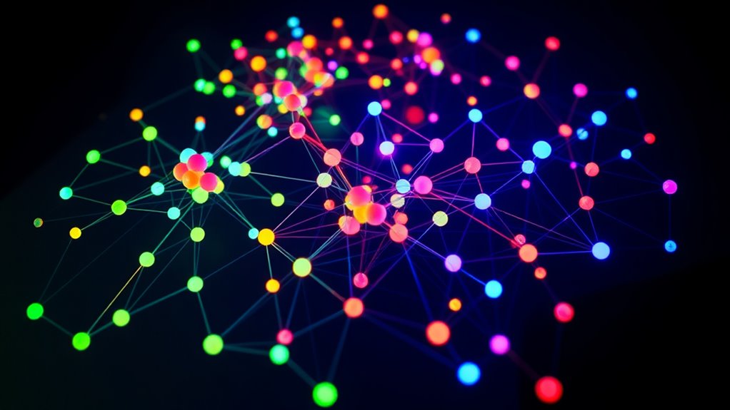
Network graphs visually represent interconnected systems by showing nodes (points) and edges (connections) that illustrate relationships. They help you understand complex data patterns, identify important nodes, and visualize how elements interact within systems like social networks or transportation. Using different layouts and visualization techniques, you can make sense of these connections more clearly. Keep exploring to uncover how algorithms and visual tools work together to reveal insights from network graphs.
Key Takeaways
- Network graphs visually represent relationships between entities using nodes (points) and edges (connections).
- Nodes symbolize elements like people, locations, or devices, while edges show their interactions or relationships.
- Graph algorithms help analyze network structure, identify influential nodes, and find shortest paths or clusters.
- Visualization techniques enhance understanding by adjusting visual features such as size, color, and layout based on data.
- Combining analysis algorithms with visualization makes complex systems more understandable and supports better decision-making.

Network graphs are powerful tools for visualizing relationships and connections within complex systems. They help you see how different elements are interconnected, revealing patterns and insights that might be difficult to grasp through raw data alone. Whether you’re analyzing social networks, transportation routes, or communication systems, understanding the structure of these networks is vital. To do this effectively, you’ll rely on a combination of graph algorithms and visualization techniques. These tools enable you to interpret the data more intuitively and identify important nodes, clusters, or pathways that drive the overall system.
Network graphs reveal hidden patterns and connections in complex systems.
At the core of working with network graphs are graph algorithms, which are systematic procedures designed to analyze the structure and properties of the network. For example, algorithms like Dijkstra’s help you find the shortest path between nodes, which is useful for optimizing routes or identifying key points of connection. Centrality measures, such as degree or betweenness centrality, reveal which nodes are most influential or serve as essential connectors within the network. You might also use community detection algorithms to identify clusters or groups of nodes that are tightly interconnected, giving you insight into substructures or functional units within the system. These algorithms allow you to quantify relationships, prioritize nodes, and understand the flow of information or resources.
Visualization techniques play a pivotal role in translating these algorithms’ outputs into meaningful visual representations. They help you make sense of complex relationships by displaying nodes and edges in ways that highlight key features. For instance, adjusting the size or color of nodes based on centrality measures makes important nodes stand out immediately. Using different edge thicknesses or styles can illustrate the strength or type of connection between nodes. Layout algorithms, like force-directed or circular layouts, arrange the graph to minimize overlaps and clutter, making the structure clearer. Interactive visualizations, which allow you to zoom, filter, or hover over elements, further enhance your understanding by providing detailed information on demand. Incorporating graph visualization tools can significantly improve your ability to analyze and interpret network data effectively.
Combining graph algorithms with visualization techniques empowers you to analyze network graphs thoroughly. You can identify influential nodes, detect clusters, and uncover pathways that are critical for the system’s function. These insights support decision-making, whether you’re designing efficient transportation routes, understanding social influence, or improving network security. Ultimately, mastering these tools allows you to turn raw data into actionable knowledge, making complex systems more understandable and manageable. Essentially, effective use of graph algorithms and visualization techniques transforms abstract nodes and edges into a clear, insightful map of interconnected relationships.
Frequently Asked Questions
How Can I Visualize Large-Scale Network Graphs Effectively?
To visualize large-scale network graphs effectively, you should use interactive layouts that let you zoom, pan, and explore data dynamically. Simplify your data by focusing on key nodes and edges, reducing clutter. Tools like Gephi or Cytoscape help manage complexity, enabling you to see meaningful patterns. These approaches make it easier to interpret vast networks and uncover insights without getting overwhelmed by the volume of information.
What Software Tools Are Best for Creating Network Graphs?
You should explore software options like Gephi, Cytoscape, and Graphviz, which are popular visualization tools for creating network graphs. These tools offer user-friendly interfaces and powerful features to handle large-scale networks efficiently. Gephi is great for interactive exploration, Cytoscape excels in biological data, and Graphviz provides simple, customizable visualizations. Try them out to find which one best suits your project’s needs and helps you visualize complex networks effectively.
How Do I Interpret Weighted Edges in a Network Graph?
You interpret weighted edges by examining their edge weights, which indicate the strength or importance of the connection. Higher weights suggest stronger relationships, while lower weights imply weaker ones. Use interpretative strategies like comparing edge weights across the graph to identify key connections or clusters. Remember, visual cues such as thicker lines or darker colors often represent higher weights, helping you quickly grasp the network’s most significant links.
Can Network Graphs Be Used for Predictive Analytics?
Think of network graphs as detectives connecting clues. They can indeed be used for predictive analytics by leveraging machine learning to analyze data correlation. Just like a detective predicts where the next clue might be, these graphs help forecast trends and behaviors based on existing connections. By examining node relationships and edge weights, you can uncover patterns that assist in making informed predictions about future outcomes.
How Do I Handle Missing Data in Network Graphs?
When handling missing data in network graphs, you should use data imputation to estimate missing values, helping to fill in missing links or nodes. This approach preserves the network’s structure and improves analysis accuracy. You can also consider adding inferred links based on existing patterns or relationships, but be cautious to avoid introducing bias. Regularly validate your imputations to ensure the network remains representative of the real data.
Conclusion
Understanding network graphs helps you see the big picture clearly, connecting the dots between nodes and edges. You now know how these visual tools reveal relationships and patterns that might otherwise go unnoticed. Think of it as peeling back layers of an onion—you uncover more with each look. With this knowledge, you’ll be better equipped to navigate complex systems and turn chaos into clarity, proving that sometimes, a picture really is worth a thousand words.


