
To create a histogram in Excel, first organize your data in a single column and decide on bin ranges that group your data points. For Excel 2016 and later, select your data, go to the Insert tab, and choose the Histogram chart. If you’re using an earlier version, install the Analysis ToolPak add-in and use the Data Analysis tool to generate the histogram. Continue exploring to learn step-by-step instructions and tips for customizing your chart.
Key Takeaways
- Select your numerical dataset and insert a histogram chart via the Insert tab’s Chart options in Excel 2016+.
- For earlier versions, enable the Analysis ToolPak add-in and use the Data Analysis > Histogram feature.
- Define bin ranges either automatically or manually to categorize data intervals effectively.
- Customize the histogram by adjusting bin widths, colors, titles, and axis labels for clarity and presentation.
- Enhance visuals with data labels, gridlines, and formatting options to better analyze data distribution patterns.
Understanding the Purpose and Benefits of Histograms in Excel
Histograms in Excel serve as powerful tools for visualizing numerical data, allowing you to quickly grasp patterns and distributions within your dataset. They help you understand the frequency of data points within specific ranges, making it easier to spot trends and outliers. Research companies thoroughly before investing to ensure your data analysis supports sound financial decisions. Unlike bar charts, histograms focus on continuous data, highlighting how values are spread across different intervals. They’re particularly useful for uncovering hidden patterns, analyzing data symmetry, and identifying skewness or gaps. Additionally, histograms can reveal data skewness and provide insights into data variability, supporting better decision-making and trend analysis. By visualizing data distribution, histograms support better decision-making and trend analysis. They simplify complex information into clear visuals, making it easier to interpret data at a glance.
Preparing Your Data and Bin Values for Histogram Creation
To create an effective histogram in Excel, you need to properly organize your data and define bin values that determine how the data is grouped. Place all data points in a single column, ensuring each entry occupies its own cell. Keep the data consistent, avoiding text in number cells, and eliminate empty cells to prevent errors. Using popular juice brands as an example, understanding the distribution of product preferences can help you analyze consumer choices effectively. Additionally, understanding data distribution can improve your ability to select appropriate bin sizes for clearer visualization. When preparing bins, decide whether to use automatic options or set specific values manually for more control. Bin size should reflect your data’s scale and distribution, with roughly equal widths for clarity. You can adjust bin sizes later by formatting the axis or data series. Selecting appropriate bin sizes balances detail and readability, helping you reveal meaningful patterns without cluttering the histogram.
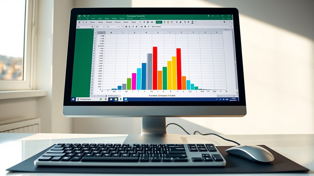
Creating a Histogram Using Excel 2016 and Later Versions
In Excel 2016 and later versions, creating a histogram involves selecting your organized data range and using the built-in chart tools. First, highlight the cells containing your data, ensuring only numeric values are included.
To create a histogram in Excel 2016+, select your data and use the built-in chart tools for quick visualization.
Then, navigate to the Insert tab on the ribbon. In the Charts group, click the Statistical Chart icon or dropdown menu, and select “Histogram” from the options. Excel will automatically generate the histogram, using default bins or custom intervals if you’ve specified them.
You can adjust bin sizes by right-clicking the horizontal axis and choosing “Format Axis.” From there, modify bin width, boundaries, or overflow and underflow limits to better visualize your data distribution.
Add titles, change colors, and customize labels for clarity and visual appeal.
Installing and Using the Analysis ToolPak for Earlier Excel Versions

If you’re using an earlier version of Excel, you’ll need to install the Analysis ToolPak add-in to access advanced data analysis features like histograms. The ToolPak is an add-in program included with Excel but isn’t enabled by default. To install it, go to File > Options > Add-Ins**, select Manage Excel Add-ins, then click Go. Check the Analysis ToolPak box and click OK. If it’s not listed, use Browse to locate and install it manually. Common issues include Error 1706**, which occurs if installation files are missing, or network problems. Ensure your installation media or network connection is active. Once installed, you’ll find data analysis under the **Data** tab, allowing you to create histograms and perform other advanced analyses. Additionally, knowing the potential pitfalls of adopting new payment technologies can help ensure your data security and compliance when analyzing payment transaction data. It is also helpful to understand Breast cancer symptoms to recognize early signs that may require medical attention.
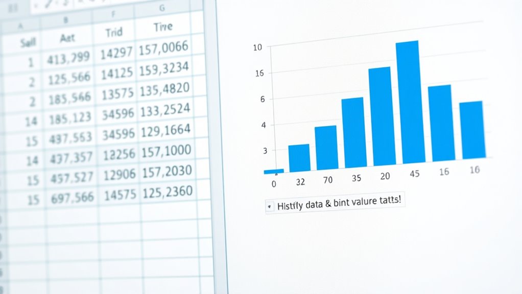
Step-By-Step Guide to Building a Histogram With Data Analysis Toolpak

Once you’ve installed and enabled the Analysis ToolPak add-in, creating a histogram becomes a straightforward process.
First, organize your raw data in a single column without empty cells to guarantee accuracy.
Create a separate column for bin upper limits, choosing ranges based on data analysis or equal intervals.
Make sure bins cover the entire data range to avoid missing points.
Next, go to the ‘Data’ tab, click ‘Data Analysis,’ select ‘Histogram,’ and click ‘OK.’
Specify your input data and bin range, then choose your output location.
Check the ‘Chart Output’ box to generate a histogram chart with the frequency table.
Confirm your settings with ‘OK,’ review your histogram, and delete unnecessary elements for a cleaner look.
Additionally, understanding how to interpret the performance upgrades can help in optimizing your vehicle’s handling and responsiveness.
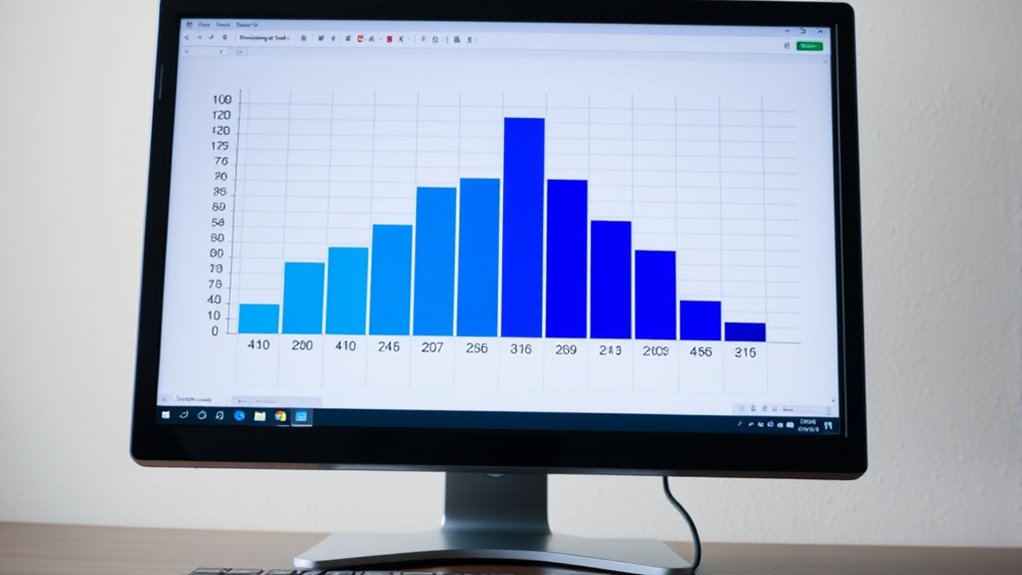
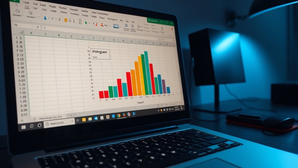
Customizing Your Histogram for Clearer Data Visualization

Customizing your histogram enhances its clarity and makes your data easier to interpret. You can change the chart’s background and bar colors to improve contrast and visibility. Adding a clear, descriptive title helps viewers understand the histogram’s purpose, while removing the legend can declutter the chart if it’s unnecessary. Adjust the font size and style of axis labels for better readability, and toggle gridlines on or off to aid in data point tracking. You also have control over bin settings—using automatic options or setting custom bin widths—to focus on specific data ranges. Highlighting key data points, choosing different chart styles, or adding data labels and annotations further enhance insight. These customizations guarantee your histogram communicates your data effectively and efficiently. Additionally, understanding the sound healing science can help you create visualizations that better address your audience’s needs.
Frequently Asked Questions
Can I Create a Histogram Without Using Bin Values?
Yes, you can create a histogram without manually defining bin values. Excel’s built-in histogram chart automatically determines bin ranges based on your data, so you don’t need to specify them.
Simply select your data, insert a histogram chart, and Excel will optimize the bin width and number of bins for you.
You can also adjust these settings afterward to better suit your analysis, making the process quick and easy.
How Do I Interpret the Data From a Histogram?
Interpreting a histogram helps you understand your data better, revealing patterns, trends, and potential issues. Look for symmetry to identify normality, peaks to find common values, skewness to detect bias, and tails to spot outliers.
Recognize multiple peaks for subgroups, assess spread for variability, and note outliers for anomalies. By analyzing these visual cues, you gain insights, make informed decisions, and reveal the story your data tells.
Is There a Way to Update the Histogram Automatically?
You want to know if you can update your histogram automatically. Yes, you can with dynamic methods like formulas, PivotTables, or using the latest Excel features.
When you set up your histogram with functions like FREQUENCY or COUNTIFS, it updates as your data changes.
PivotTables also refresh automatically when you add new data.
Just make certain you’re using the latest Excel version, and your histogram will stay current without manual adjustments.
Can I Customize the Color Scheme of My Histogram?
Did you know that customizing your histogram’s colors can make data insights clearer? You can easily change the color scheme by selecting the bars, right-clicking, and choosing “Format Data Series.”
From there, pick a solid fill or enter custom hex codes. Vary colors by point for more visual interest, or create a custom palette to keep your design consistent across projects.
This helps your data stand out and look professional.
What Are Common Errors When Creating a Histogram in Excel?
When creating a histogram, you might encounter common errors like using non-numeric data, which causes errors. You could also choose inappropriate bin sizes—either too few or too many—making your chart hard to interpret.
Inadequate data quality, misaligned data, or missing values can distort results. Additionally, failing to customize labels, colors, or axes can make your histogram less clear and harder to analyze effectively.
Conclusion
Now that you’ve mastered creating histograms in Excel, you can effortlessly visualize your data like a seasoned data analyst—no need for a crystal ball. Whether you’re using the latest version or relying on the classic Analysis ToolPak, these steps make it simple. Remember, even Leonardo da Vinci would be impressed by your ability to turn raw data into clear, insightful visuals. Happy charting!