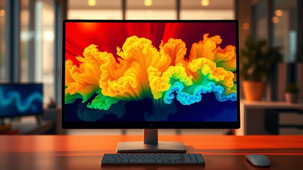
Heatmaps are simple visual tools that use colors to show where visitors click, scroll, or hover on your website. They help you see which areas attract the most attention and which are ignored. This makes understanding how users interact much easier than analyzing raw data. By using heatmaps, you can identify issues and make smarter design choices. Keep exploring to discover how these insights can help improve your site even further.
Key Takeaways
- Heatmaps are visual tools that use colors to show where visitors click, scroll, or hover on a website.
- They help website owners see which areas attract attention and which are ignored.
- Heatmaps provide quick insights to improve website design and user experience.
- They track user behavior over time, showing if changes increase engagement.
- Overall, heatmaps turn complex visitor actions into simple, actionable visual data.

Heatmaps are visual tools that help you understand data by highlighting patterns and areas of interest through color. When you look at a heatmap, you see where visitors click, scroll, or hover on your website, giving you instant insight into how users interact with your pages. This visual representation makes it easier to identify which parts of your site attract the most attention and which areas might be ignored. By analyzing these patterns, you can make smarter decisions to improve user engagement and optimize your website’s layout and content.
As a website owner or marketer, you know that user engagement is vital for success. Heatmaps give you a direct window into your visitors’ behavior, showing you where they spend most of their time and what catches their eye. For example, if a key call-to-action button remains untouched, a heatmap might reveal that it’s hard to see or poorly placed. With this information, you can tweak your design—moving buttons, changing colors, or adjusting placement—to encourage more interaction. Essentially, heatmaps serve as a real-time feedback tool, helping you fine-tune your website to meet your users’ needs and expectations.
Website optimization becomes much more straightforward with heatmaps. Instead of relying on guesswork, you get concrete data that guides your design and content decisions. You can see which images or headlines draw the most attention, identify confusing navigation paths, and discover areas that might be causing visitors to leave prematurely. By addressing these issues, you create a smoother user experience, which can lead to higher conversion rates and increased satisfaction. Moreover, heatmaps help you prioritize your efforts—focusing on parts of your website that matter most to your visitors and removing or modifying elements that don’t perform well.
Using heatmaps regularly allows you to track changes over time and measure the impact of your adjustments. For instance, after redesigning a landing page, a heatmap can show whether visitors are now clicking on the desired elements more often. This ongoing process helps you continually refine your website, making data-driven decisions that boost user engagement and overall performance. Ultimately, heatmaps are a powerful, easy-to-understand tool that bridges the gap between raw data and actionable insights, making website optimization a much clearer and more effective process. They transform complex user behavior into visual stories you can quickly interpret and act upon, ensuring your site evolves in line with what your visitors want. Additionally, understanding prophetic dreams can provide insights into subconscious patterns and symbols that might influence personal or spiritual growth.
Frequently Asked Questions
How Do Heatmaps Improve Website User Experience?
Heatmaps improve your website user experience by highlighting where visitors engage most, boosting user engagement and satisfaction. They provide visual analytics that reveal which areas attract attention and which are ignored. With this insight, you can optimize your layout, make your content more accessible, and encourage interaction. This data-driven approach helps you create a more intuitive, engaging site that better meets your visitors’ needs, ultimately increasing retention and conversions.
What Are the Different Types of Heatmaps?
Imagine a colorful map, each hue representing data points. You see different types of heatmaps: click maps show where you click most, scroll maps reveal how far you scroll, and hover maps track mouse movement. They use various color schemes for clarity, and data granularity varies, providing detailed or broad insights. These tools help you understand user behavior intuitively, improving your website’s design and engagement.
Can Heatmaps Be Used for Offline Data Analysis?
Yes, you can use heatmaps for offline analysis, especially when working with data visualization. By converting your data into heatmaps, you create visual representations that help you identify patterns and insights without needing an internet connection. This is useful for analyzing large datasets, presenting findings, or working in environments with limited connectivity. Just guarantee you have the right tools to generate and interpret heatmaps from your offline data effectively.
How Accurate Are Heatmaps in Predicting User Behavior?
Imagine you’re analyzing where visitors click most on your website. Heatmaps can be quite accurate in predicting user behavior, especially when it comes to click-through accuracy and gaze prediction. For example, a retail site might see heatmaps showing where users focus their gaze, helping you optimize placement. While not perfect, heatmaps give valuable insights into user intent, making them a reliable tool for understanding and predicting behaviors.
What Are Common Mistakes to Avoid When Using Heatmaps?
When using heatmaps, you should avoid misinterpretation pitfalls like assuming causation from correlation or overvaluing visual impressions. Additionally, be mindful of data privacy concerns, ensuring user information is anonymized and collected ethically. Don’t rely solely on heatmaps for decisions; combine them with other analytics. By addressing these issues, you’ll make better, more responsible use of heatmaps and gain more accurate insights into user behavior.
Conclusion
Now that you understand heatmaps, think of them as a city’s skyline at night, glowing with bright spots where activity’s high. Just like seeing the brightest lights helps you spot busy neighborhoods, heatmaps show you where people focus most on a webpage or in a data set. Once you grasp this, you’ll see how heatmaps turn complex information into a clear, colorful map—making it easier to find the hotspots and make smarter decisions.


