

Choropleth maps use colors to visually represent data across regions, helping you spot patterns and differences quickly. Choosing the right color scheme, like sequential or diverging palettes, makes the map easier to interpret. Normalizing data guarantees fair comparisons, especially when regions vary in size or population. Proper classification of data ranges highlights meaningful clusters. If you want to understand how all these pieces come together to create effective maps, there’s more to explore below.
Key Takeaways
- Choropleth maps visually represent data across regions using color variations to reveal patterns and differences geographically.
- Appropriate color schemes, such as sequential or diverging palettes, enhance clarity and prevent misinterpretation.
- Data normalization ensures fair comparisons by adjusting raw data into standardized formats like percentages or per capita figures.
- Proper classification methods, like natural breaks or quantiles, help highlight meaningful data clusters and trends.
- Combining effective color choices, normalization, and classification creates maps that communicate complex geographic data clearly.
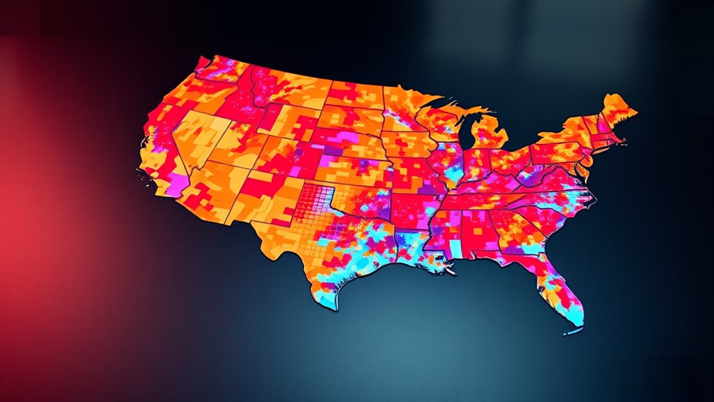
A choropleth map is a powerful visual tool that uses different shades or colors to represent data values across geographic regions. When you look at one, you see a map where each area is filled with a color that corresponds to a specific data point, like population density, income levels, or election results. The key to understanding these maps lies in how they use color schemes and data normalization. Selecting the right color scheme is essential because it impacts how easily you interpret the information. For example, a sequential color scheme, which transitions from light to dark, is perfect for displaying data that has a natural order, like poverty rates or temperature variations. Diverging color schemes, which use two contrasting hues, help emphasize differences from a central point, such as median income. Choosing the appropriate palette ensures that the map communicates the data clearly without causing confusion.
A choropleth map uses colors to visually represent data across regions, highlighting patterns and differences effectively.
Data normalization plays an equally important role in creating effective choropleth maps. Without normalization, raw data might give a misleading picture, especially when regions vary greatly in size or population. For instance, showing total population instead of population density could exaggerate the importance of larger areas. Normalization adjusts the data values to a common scale, allowing for fair comparisons between regions. When you normalize data, you convert raw figures into standardized values, such as percentages or per capita measurements. This process helps reveal true patterns and trends, giving your map more accuracy and interpretability. If you neglect normalization, viewers might misinterpret the data, assuming larger regions always have higher values, when in fact, it could be a matter of size rather than significance.
Additionally, understanding the importance of geographic data accuracy enhances the effectiveness of your choropleth map, ensuring that the visualized information reflects real-world distributions. You also need to think about how data is classified into categories or ranges. Often, you’ll use techniques like equal intervals, quantiles, or natural breaks to divide your normalized data into segments. These classifications influence how colors are assigned and, consequently, how viewers perceive the map’s message. For example, using natural breaks might highlight clusters in the data, making it easier to identify distinct groups. Conversely, overly broad or narrow ranges can obscure meaningful differences or exaggerate minor ones.
Ultimately, creating an effective choropleth map involves carefully selecting your color schemes, normalizing your data, and thoughtfully classifying your data ranges. When you do this well, your map becomes a powerful communication tool that conveys complex geographic data in a straightforward, visually engaging way. It allows viewers to see patterns, disparities, and trends at a glance, making your insights more accessible and impactful.
Top picks for "choropleth maps demystifi"
Open Amazon search results for this keyword.
As an affiliate, we earn on qualifying purchases.
Frequently Asked Questions
How Do I Choose the Best Color Scheme for My Map?
When choosing the best color scheme for your map, focus on selecting appropriate color palettes that clearly differentiate data ranges. Consider accessibility considerations, such as colorblind-friendly options, to make certain everyone can interpret your map accurately. Use contrasting colors wisely to highlight important areas, and avoid overly complex palettes that may confuse viewers. Ultimately, pick a scheme that enhances readability and effectively communicates your data story.
Can Choropleth Maps Display Multiple Data Variables Simultaneously?
You can display multiple data variables simultaneously through multivariate visualization and layered mapping techniques. By combining different shades, patterns, or overlays, you effectively represent various metrics on a single map. This approach helps you analyze complex relationships, but be cautious to avoid clutter. Layered mapping allows you to add multiple data layers, making it easier to interpret the interplay between variables while maintaining clarity and visual appeal.
What Are Common Pitfalls to Avoid When Interpreting These Maps?
When interpreting choropleth maps, you should watch out for misleading color choices that can distort understanding. Avoid ignoring data scale, as it impacts how you perceive differences across regions. Verify you understand what the colors represent and consider the legend carefully. Don’t jump to conclusions based solely on color variations, and always check for context to prevent misinterpretation. This helps you make accurate insights from the map.
Are There Tools That Automatically Generate Optimal Choropleth Maps?
You’re wondering if tools exist that automatically generate ideal choropleth maps. Fortunately, cartogram automation and interactive mapping tools help simplify this process. These tools analyze data distribution, choose appropriate color schemes, and adjust map parameters to enhance clarity. They enable you to create visually appealing, informative maps quickly and efficiently, saving you time and reducing guesswork, so you can focus on analyzing your data rather than map design.
How Do I Handle Data Privacy When Creating Detailed Maps?
When creating detailed maps, you should prioritize data privacy by implementing data anonymization techniques, such as aggregating data or removing personally identifiable information. Always stay compliant with privacy regulations like GDPR or HIPAA to avoid legal issues. This way, you safeguard individual identities while still providing valuable insights. Regularly review your data handling processes, and consider consulting privacy experts to ensure your mapping practices respect user confidentiality.
Conclusion
Now that you understand choropleth maps, you can see how they reveal hidden patterns. For example, in the US, states with higher obesity rates often have lower access to fresh foods. This visual insight helps you grasp complex data quickly. By mastering these maps, you can make more informed decisions and tell compelling stories with your data. So, next time you see a choropleth map, you’ll know exactly what it’s showing you underneath the colors.